Critique Style Requested: Standard
The photographer is looking for generalized feedback about the aesthetic and technical qualities of their image.
Description
My family has started a project to turn our land into a friendly place for nature. We have restored our pond to its natural state, leaving the fallen trees and grassy bank untouched. We have also planted a wildflower garden to attract Hummingbirds and Butterflies.
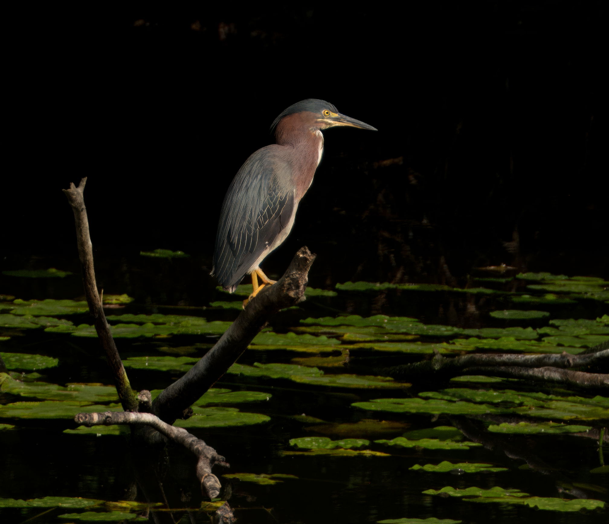
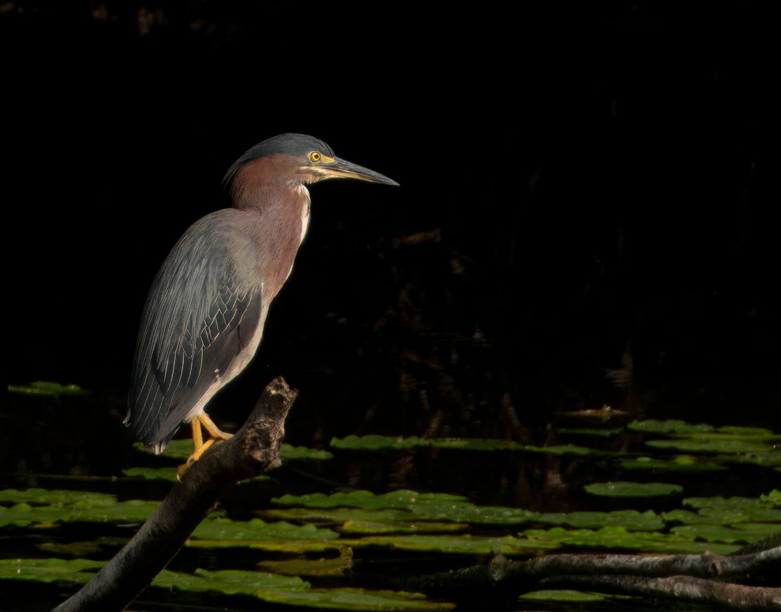
This Green Heron and a Great Blue come to the pond to fish around 4:30 PM almost every day. We also have a Family of Muskrats as neighbors.
Specific Feedback
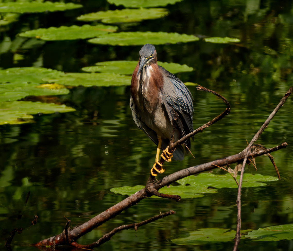
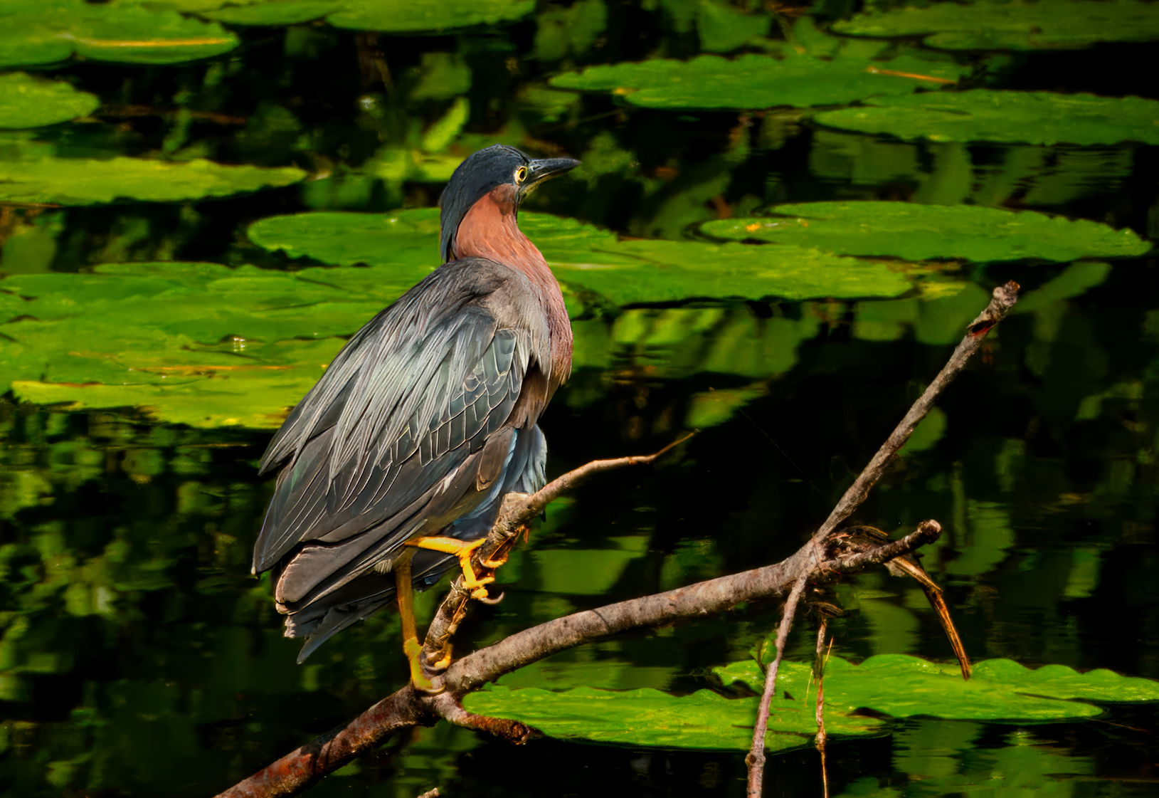
I am having trouble with cropping - always seem to put the birds in the center.
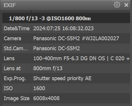
Technical Details
Critique Template
Use of the template is optional, but it can help spark ideas.
- Vision and Purpose:
- Conceptual:
- Emotional Impact and Mood:
- Composition:
- Balance and Visual Weight:
- Depth and Dimension:
- Color:
- Lighting:
- Processing:
- Technical:
1 Like
I’m really liking that first shot. It might benefit by adding just a touch of frame on the RH side. By the way, these guys will eat a muskrat.
These are great Steve. Thank you for sharing your family project with us. It looks like it is working really well. I agree with you that these could use a bit of a shift off center to give better visual balance to the compositions. You might consider going vertical with them too.
Hi Steve, love the bird with the lily pad environment shown here. The pose in the first image is really nice as the bird looks over his/her domain. I’m okay with the composition on the first one as including the full branch on the left brings the bird into center more. Think you could just crop in on the right in the second image and crop in on the left in the third. Adding more space in front of the bird might help in each photo.
Hi Steve. The center presentation works reasonably well on the second and third images, though I could certainly see Allen’s suggestions for a bit less on the rear side of the bird and a bit more on the front. In the first image, I downloaded it and cropped it to give an example of how I would approach an image like this (not that that makes it right).
Lastly, the third image shows the plumage beautifully, but the legs and lily pads look over saturated to my eye.
A nice series, and glad to hear you’re getting such nice results from your naturalization process.
Steve: i’m OK with the pose in the first photo as trying to move the bird off center would require lots of time with the remove tool. Sometimes we just have to accept what Nature gives us.
If you have the room in your original photos, a slight positioning of the bird to the right on frame 2 and the left on frame 3 would be a very acceptable option.
You mioght want to desaturate the greens and yellows a bit.