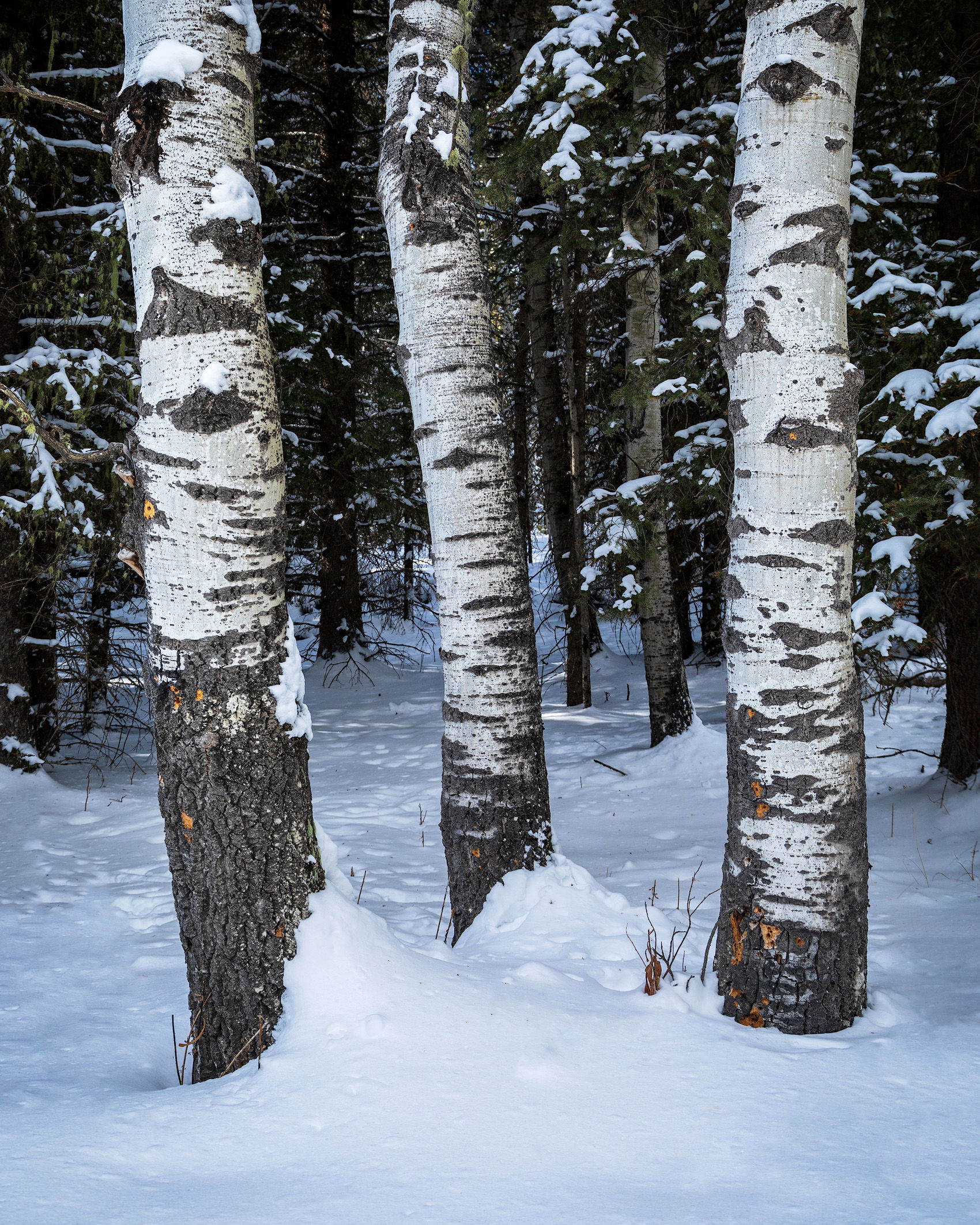
I posted a similar image to this one but shot in a different season in November last year and I said then that I’d like to go back a try shooting this in winter. Well, I went out to the spot last weekend and here is the image.
Aesthetic: Feedback on the overall visual appeal of the image, including its color, lighting, cropping, and composition.
Specific Feedback and Self-Critique
On it’s own I don’t think that it’s a bad image but when I compare it to the late summer/early fall version I like that one better. I’m curious though what others think of it.
Tom, I like your idea here. Thanks for providing the original too for comparison. Although it takes good seasonal changes to make an impact as you’ve provided here. Other than monsoonal deluges we rarely see enough changes to provide a neat project as you’re working on…
Anyway, these birches have some definite character to them with growth marks and other scarring overall. The years I spent in Alaska it was interesting to see trees scarred by deer, elk, moose rutting or even bear clawing…
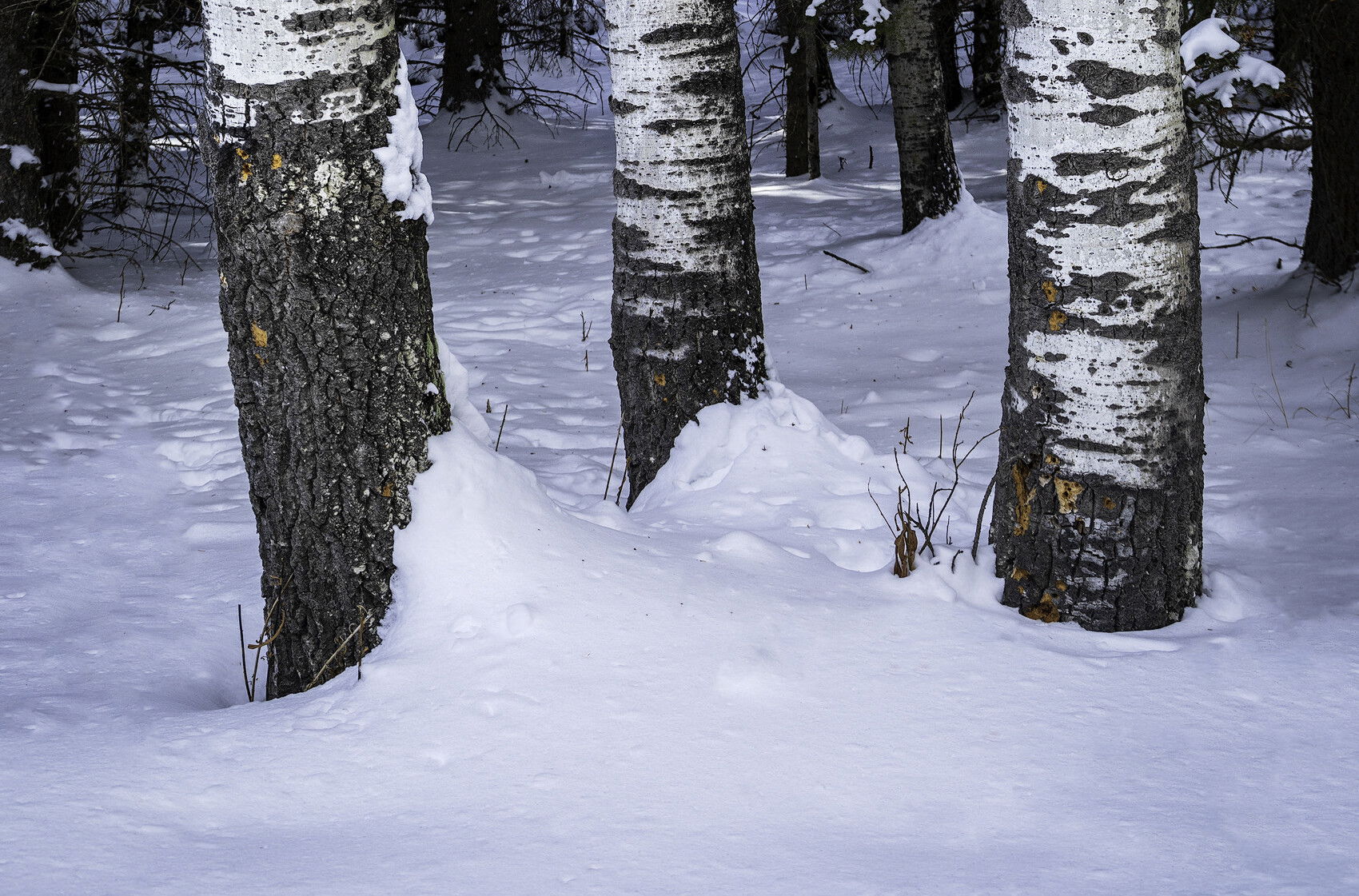
Having the two versions and having taken care to take both from the almost identical perspective makes for an intriguing comparison. The summer version is vastly superior in my view. But, it is especially interesting for me to consider why I feel that way since the light is very similar in both. The summer version has the colour, of course, but you’ve kept it muted, which gives the image a much needed touch of mystery and depth, while in the winter version, I feel like a quick glance and I’ve seen what there is to see. In the summer version, the question of what this image is “about” is much more evident to me, while the winter version, and I don’t mean to be harsh, doesn’t feel like it is about anything in particular other than birches in winter, which in itself isn’t all that compelling. So, it is intriguing to see the two pictures together like this. That being said, did you take other winter pictures, more abstract or zoomed in? For example, the way the snow piles up at the base of the tree on the left might make an interesting study that says something a little more interesting about birches in winter. Thanks for posting these two. A very interesting comparison indeed.
Before seeing the summer version or reading the comments I came to my own conclusion about the strong points and weak points of this image. Therefore, I will write those ideas.
I understand why this image was shot the way it was and what you were trying to get across. The problem as I see it is that your background confuses the statement rather than adds to it. The many white and black shapes in the background make the shapes of the 3 central trees less obvious and diminishes their presence. They make the image more chaotic in the process. Busier. I cropped the upper part of the image but not all the background and now the trees become more prominent and the statement becomes clearer. I’m not suggesting this crop because it’s too much of an alteration. It’s just an attempt to show my idea. Hope you find this useful.
Tom, I like the winter image. There is so much more tension in it.They also look stronger as guardians ! Compared with the original witch I than find a bit dull.
I feel much the same way that @Kerry_Gordon feels about the image comparison. The summer version simply has more depth to it and it begs to be combed over while the winter version doesn’t have that same appeal. However, I do find the orange gouge marks in the bark of the tree trunks to be pretty interesting and I also love the snow build up near the base of the three trunks. I think @Igor_Doncov crop is very compelling and more interesting as a concept and tells more of a story. I appreciate you showing both for comparison purposes. That was well thought out, Tom. I’d love to see a Spring version and a summer version as well for more of a project feel to it and perhaps why each tells a different story.
Well seen and photographed. The birches to me stand out very well and your title and/or story/message of “guardians” comes across very well for me.
I think the summer and winter images are completely different. I like them both very much. The bg in the summer image is much less distracting and the trunks stand up well. I agree with some others that the bg in the winter image is a bit more distracting, but not an image killer per se. I do really like Igor’s crop as it greatly simplifies the scene. Perhaps the “guardian” message is diminished, but the crop is much cleaner.
I both cases, you’ve got a great trio of trees here. I’d be willing to bet it’s not the last time you’ll photograph them either!
@Jens_Ober , @Paul_Breitkreuz , @Kerry_Gordon , @Igor_Doncov , @Ben_van_der_Sande , @David_Haynes and @Lon_Overacker - Thank you all for the comments and feedback!
It seems that most of you are of the same opinion – that the original version of the image is stronger. I agree with you guys that there isn’t the same mystery and that the white spots of snow in the background compete with the white bark of the trees and results in a more chaotic composition. So like I said before I think that the image is technically solid but it simply doesn’t excite me nearly as much as the early fall version.