Please share your immediate response to the image before reading the photographer’s intent (obscured text below) or other comments. The photographer seeks a genuinely unbiased first impression.
Questions to guide your feedback
Do you feel the use of negative space here is adding to the emotional impact?
Other Information
Please leave your feedback before viewing the blurred information below, once you have replied, click to reveal the text and see if your assessment aligns with the photographer. Remember, this if for their benefit to learn what your unbiased reaction is.
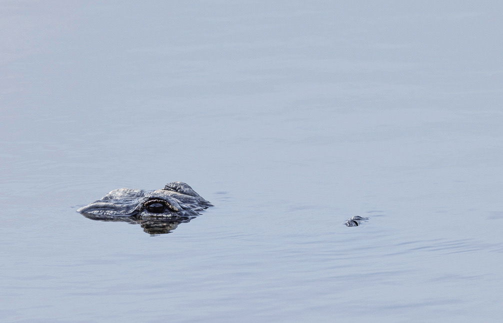
Ariel , My reaction is one of caution. The eyes and tip of the nose signal a mighty animal just below the surface of the water. Beware, they are most dangerous when you stray into their space in the water. All the still water could soon explode.
Hi, Ariel. First of all, I want to say how much I like the color tones in your photo. Not only is the subject menacing, but the cool tones add to the chill the photo brings to me. On to your question.
It does not add for me. It is likely because the negative space is vertical instead of horizontal, which is the direction the alligator is heading. I think my reaction would be totally different with more negative space horizontally, particularly on the left side of the frame. I would be asking myself what lies ahead keeping those eyes so fixed on the negative space. If your original image has more room to be included on the left side, I would suggest a different crop. I know that sometimes that is not possible.
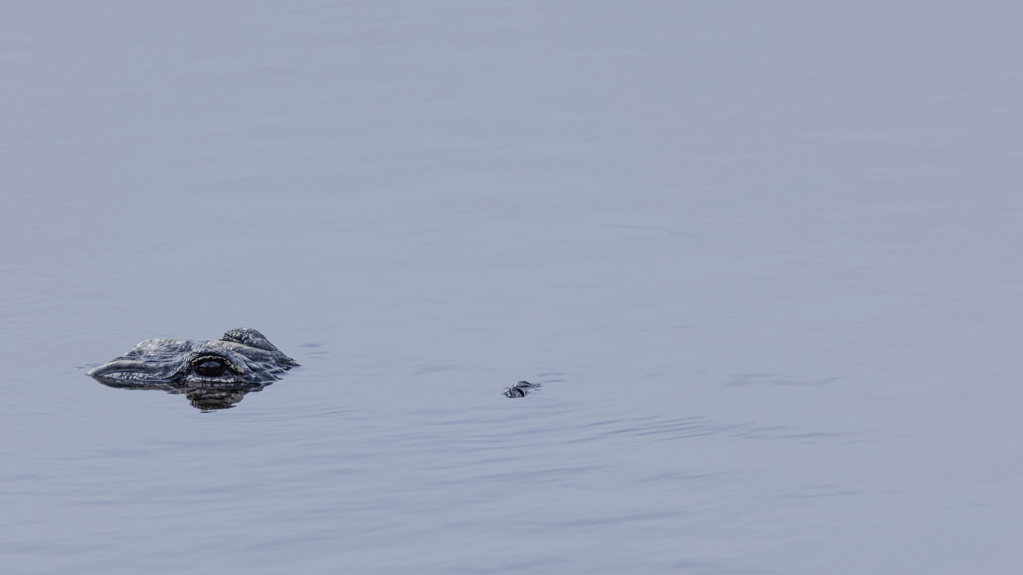
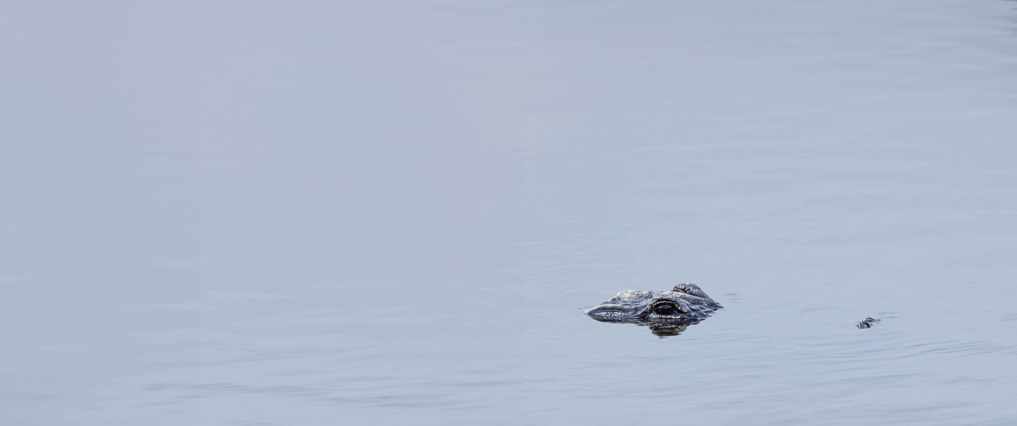
Is this better? I appreciate your feedback! Since you got me thinking, I tried a 16x9 crop, thinking it might also help with that lurking feeling. The color is a bit off on this one I was just focused on the crop.
Ariel, thanks for understanding what I was trying to get at with my comment. I think the lurking feeling could be more pronounced with more space in front of the gator. I believe that is when the negative space could be more efficient. I don’t see any technical information, but I wonder if the image was very cropped or whether you zoomed in to get the gator up close. The details and reflection are really good, I feel like the image needs a bit more space in front of the gator. I hope you won’t mind my downloading your image and showing what I tried to say (poorly, perhaps). Of course, I understand that maybe there is not more space in front of the gator in the original image.
Definitely a different feel to your crop. The tension is different. Thanks for the feedback. It is interesting to see how different people perceive an image.
And I’m certain that others will likely differ from my opinion. In order to get to that edit, I had to cheat and use the Generative Expand in the beta version of PS. That allowed me to add the negative space ahead of the gator. I edited my response above to include that piece of information.
Ariel, I think the empty space at the top adds nicely to this view of a Gator lurking (and watching very carefully). The details in the gator and the subtle ripples in the water look good. BTW, this also works as a high key view and it might be fun to push the exposue higher just to see what it looks like.