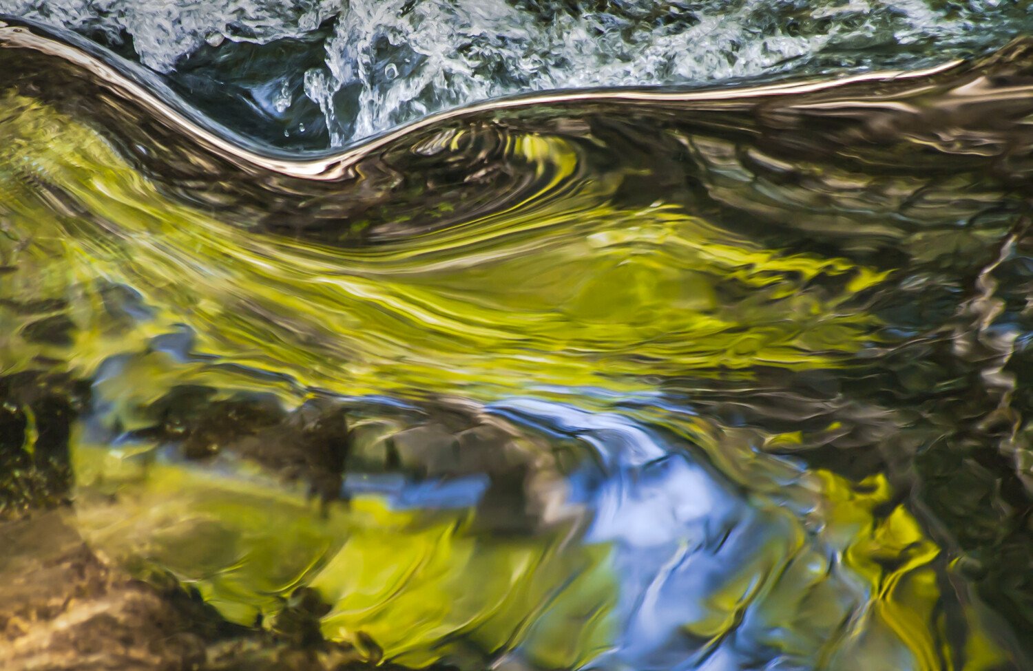
I enjoy isolating pieces of reality and seeing them as abstractions. In this case a small ripple on a stream and the resulting reflections and bending of light. Sometimes I leave just enough of “reality” to be able to place myself nearby, in this case the tumbling water at the top of the image.
Specific Feedback Requested
any and all
Technical Details
Pentax K-7, 1/80, f/5.6,260mm, ISO1600 with adjustments to tone curves in LR
John, this is a super fascinating abstract image! I love the swirling patterns, the colors, and the layers. I feel like I’m viewing something under a crashing wave. Really nicely done. The only area that stands out to me is the lower left corner with its earthy color. Regardless, I very much enjoyed your image.
This is really quite nice! I agree with Alfredo that the only thing that distracts here is the lower left… could easily be resolved with some burning perhaps.
A stand-out image!
John, I love your abstract with its predominant green color taking center stage. There is something captivating to my eyes when green and blue are put in the mix, as you did here. The LLC earth tone does not bother me at all. I can see, as suggested, that a tad of burning would hide it some more, but the light in the green and blue are strong for my eyes not to wander.
Love this abstraction as well. For me the upper part above the horizontal line doesn’t work that well with the content below the line. I would prefer the image with just the gold and blue patterns and shapes.
This is a delightful swirl of light and colour. It brings to mind a wonderful installation created by glass artist Pae White. Her long river of hand made glass bricks , entitled Qwalala, was part of the Venice Biennial in 2017.
Very cool John! I too love the inclusion of the upper “reality” ; but that “metalic” separation between that and the glossy reflection is quite unique and fascinating.
Would agree with the LLC - it just seems out of place color and otherwise; I think that part is see-thru rather than the reflection. If anything I could see darkening that patch to counter balance the darker browns in the upper right.