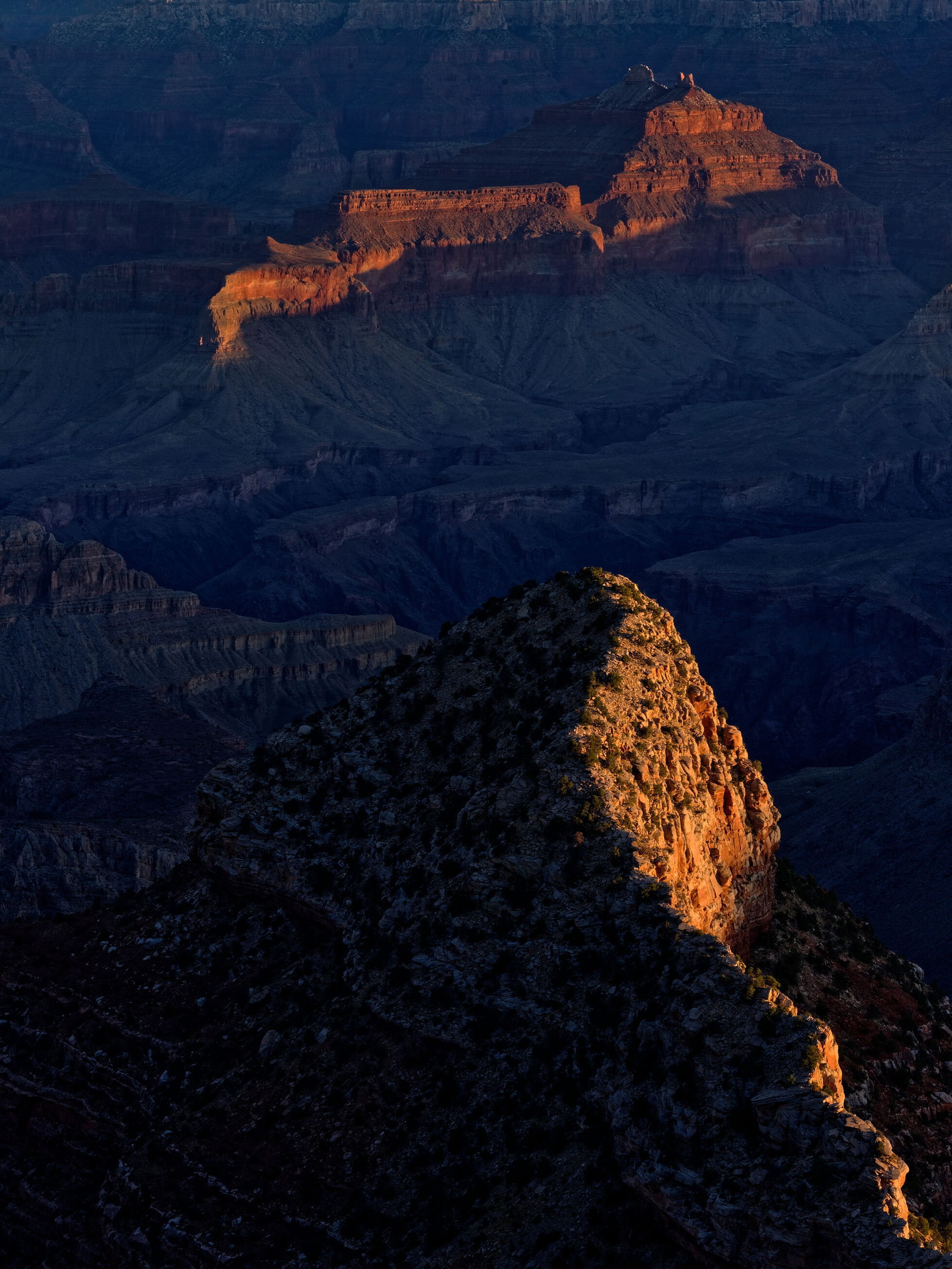
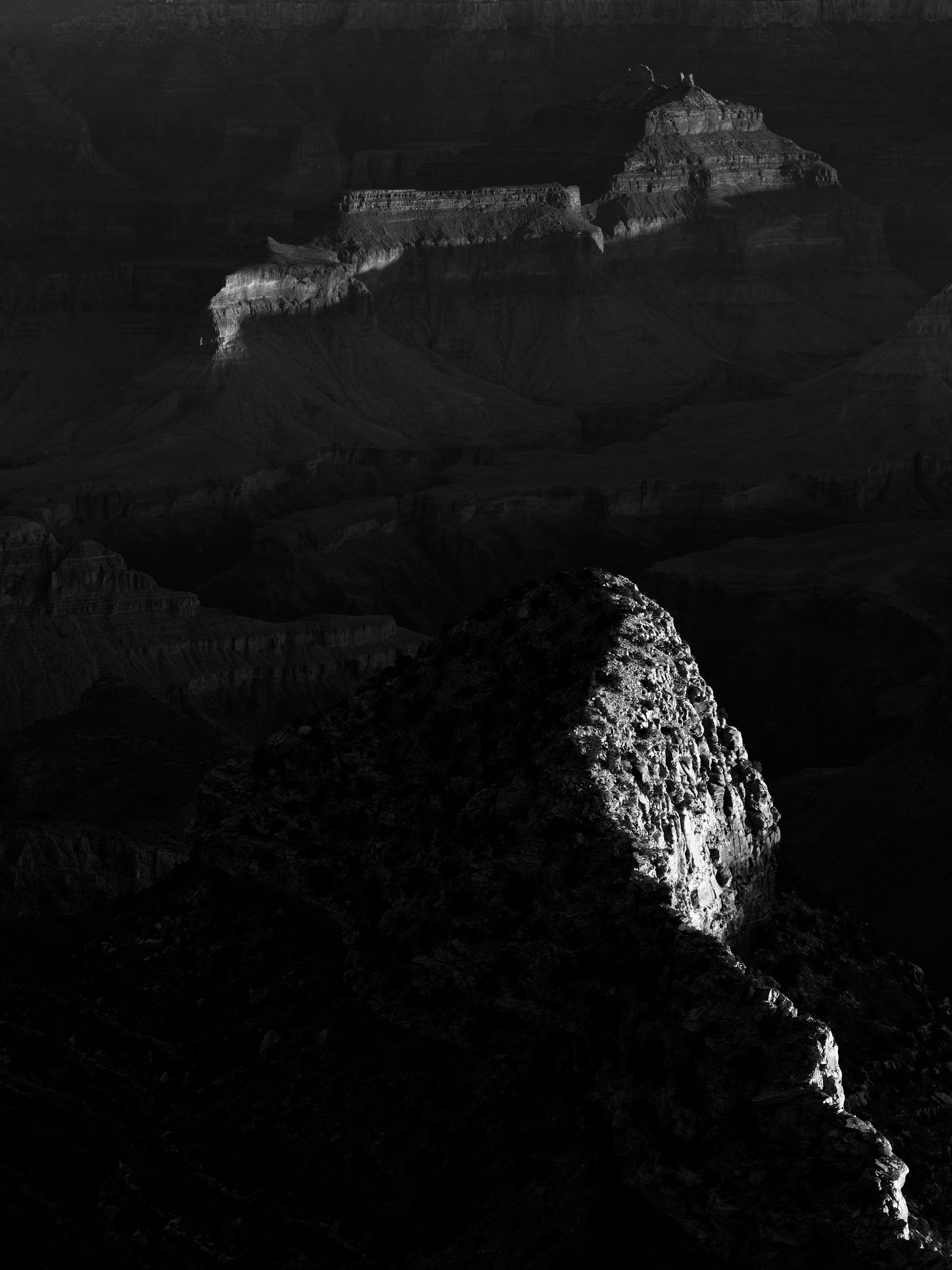
I know the Grand Canyon has been photographed to death, but when you’re there, you just have to take pictures The sky was particularly boring that day, so I excluded it completely and focused solely on the interplay of light & shadow on the inner canyon walls. In post, I wanted to emphasize the two diagonal lines caused by the lit canyon walls, so everything else is quite dark. I post 2 versions, which one do like better and why?
(If this is a composite, etc. please be honest with your techniques to help others learn)
f/16, 80mm, 1/8s (on tripod), ISO 100
If you would like your image to be eligible for a feature on the NPN Instagram (@NaturePhotoNet), add the tag ‘ig’ and leave your Instagram username below.
Welcome to NPN! I hope you find a lot of value in the community. It’s a great place to learn.
I’ll say a couple of things. Excellent use of the “grand” intimate. I love GCNP; honestly I don’t think it can be over photographed when you consider this type of image and other intimate scenes. While the image shows a lot of space in reality, it has a smaller feel, leaving a lot to the imagination. The composition is very nice and leads the eye into the frame.
I personally like the color as it gives not only the contrast in light and dark but warm and cool too.
I do like the B&W but think that’s the version that could use some tweaking. It looks like it has too much contrast in that you’ve crunched your blacks in the lower half of the photo. Having less contrast in the upper half—the back ground—does elude to a sense of depth, but the difference is kind of striking. Looking at the color image, I know you have detail information in the lower left corner. You might be able to liberate that shadow info by just opening up the black point or bringing down the contrast you created in your editing process.
I quite like both, but prefer the B&W more. That said, I agree with @Adam_Bolyard about backing off the blocked up blacks a bit, but still keeping that mood and feel. Hard to go wrong with either, a real nice abstract take on the Grand Canyon.
What a great intimate of a grand place. I am normally a black and white preference kind of guy but as has already been stated the blacks are just crushed a little too much while the color version has lots of information in the darker areas of the image that carries the views eyes around the image more than the B&W does. That said, if you are looking for stark contrast then I think you actually have something with the B&W. It certainly makes you wonder more than the color version and the leading lines are very nice leading all the way through the frame. I believe if you added just a tiny amount of information to your black points and darker shadows I would prefer the B&W.
Hope that helps and loving your work so far. Welcome aboard!
Welcome to NPN, Katharina. I hope you’ll join us permanently. Of the two versions I greatly prefer the color image. I find the contrast between the warm golden faces and blue tones in the shadows so appealing. The B&W needs some adjustments IMHO to compete with the color version, but it wouldn’t take much to accomplish that. Excellent composition and concept, and great follow through in the processing.
Welcome to NPN @Katharina_Hilgers. While the B&W versions are nice studies in light and shadow, the color version has a lot more emotional impact for me, and I react more viscerally to it. For me, this is one of those rare images where color does a better job of conveying contrast and mood than B&W tones do. Very nice work , I hope to see more of your stuff here.
Welcome from me as well. I really like this intimate landscape. The color version has wonderful impact here. The muted blues and reds in the middle to background add much appeal for me that the B&W misses here. I look forward to seeing more of your images.