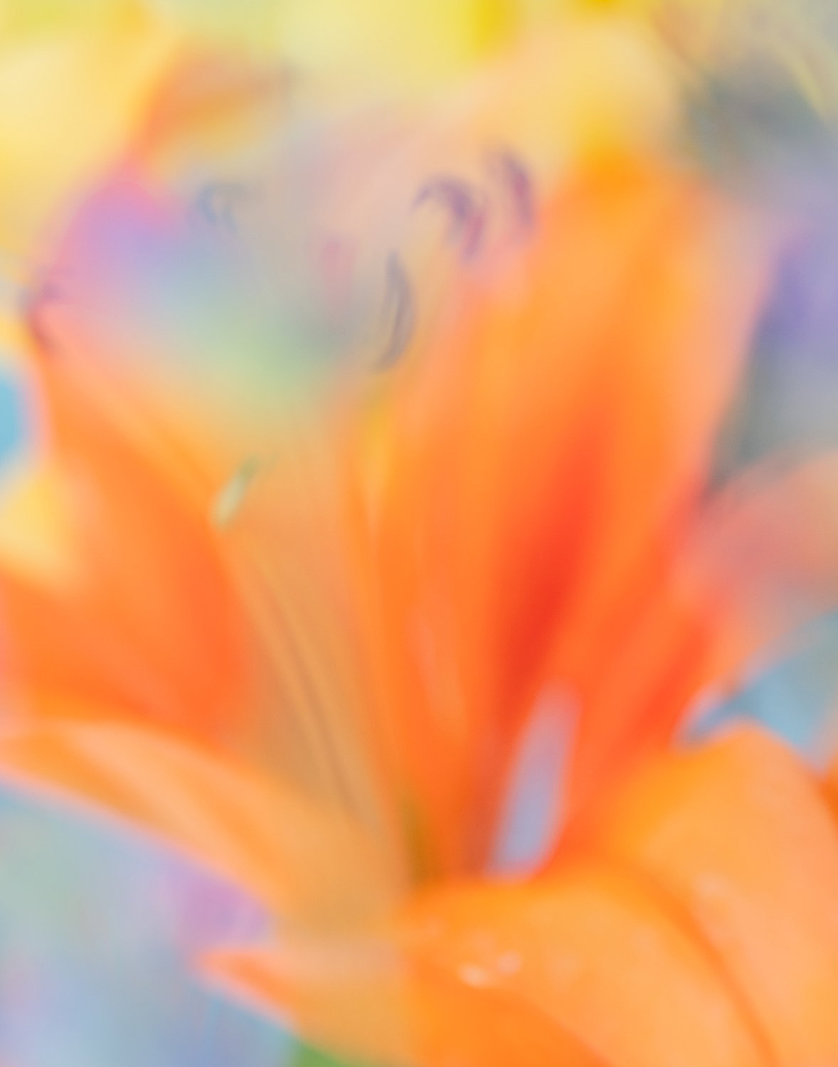
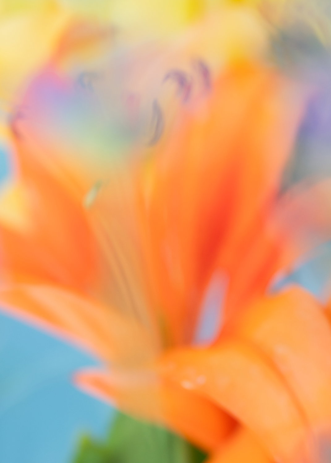
What changed: I cut and pasted the lavender color from another similar image to fill the lower left corner. I also lightened the dark section of the lower petal.
Added after receiving feedback from the community.
Hey there you. Nice to see another photo since you’re always doing something creative and interesting. No exception here. It’s striking how OOF this is, but also recognizable as a lily. I wouldn’t have figured out your technique though if you hadn’t explained it. The colors are so harmonious and the contrast adds some zip if you know what I mean. The only thing I might do if a do over is possible is to add something into the lower left corner to break up that big patch of blue. Overall I think the image has a lot of energy and positive vibes.
Whoever claimed that micro four thirds sensors were constitutionally incapable of a decent blur clearly hadn’t met this image. Achieving it without an f/0.95 lens and a second mortgage is all the more commendable. The upper portion is genuinely lovely: petals dissolving into washes of lavender and gold, hovering somewhere between photography and watercolour, between observation and reverie. It has the quality of a painting done from memory rather than from life, which is no small thing. The lower section is less certain of itself, enough definition remains in the petals to pull the eye back toward the literal, introducing a mild tension with the dreamlike softness above. Whether that reads as useful counterpoint or simply unsettles the mood is perhaps the one question worth returning to next time.
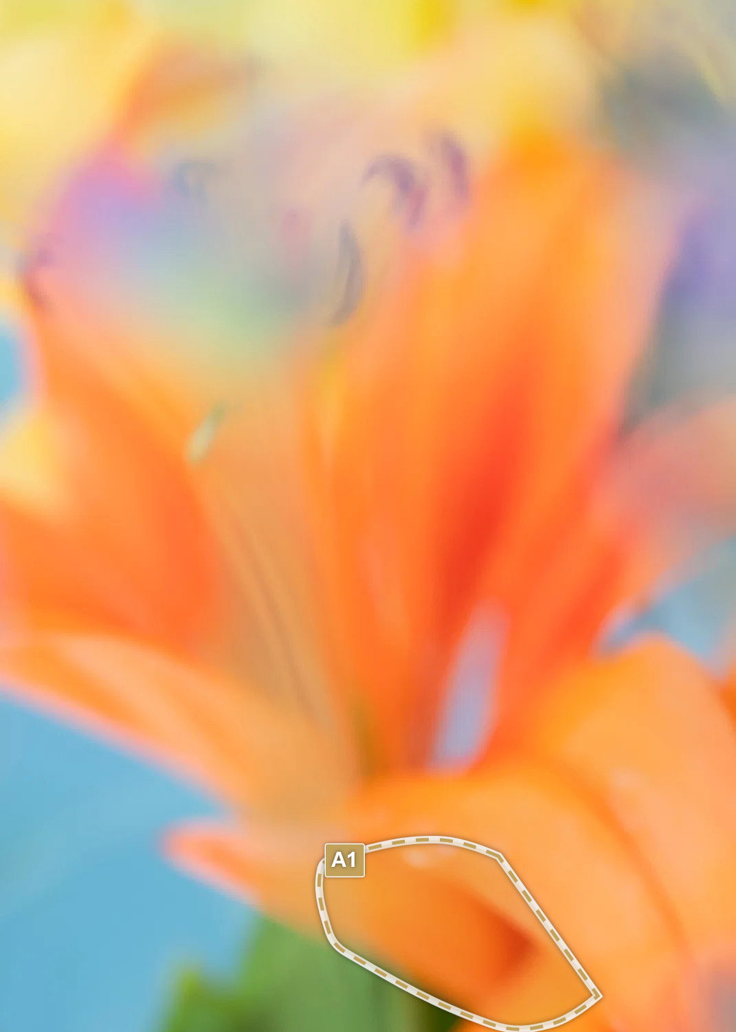
I love the soft look of this image Ann Louise, but the darker orange area in the facing petal does tend to grab my attention more than I would like. I guess I’m thinking of that petal as leading me into the image and instead it tends to stop my eye. I think blending it in with the surrounding petal would make an interesting change.
Visual notes based on the original image:
[A1] The saturation in the oranges here tends to stop my eye.
Love this! The colors are bright and beautiful. The softness is just as beautiful. Just delightful, cheery… trying to think of more adjectives. So yeah, those are emotional reactions for me. How about joy and happiness?
Great job shooting thru or I guess they call it “cramming” thru the lavendar. Just love the color and results here.
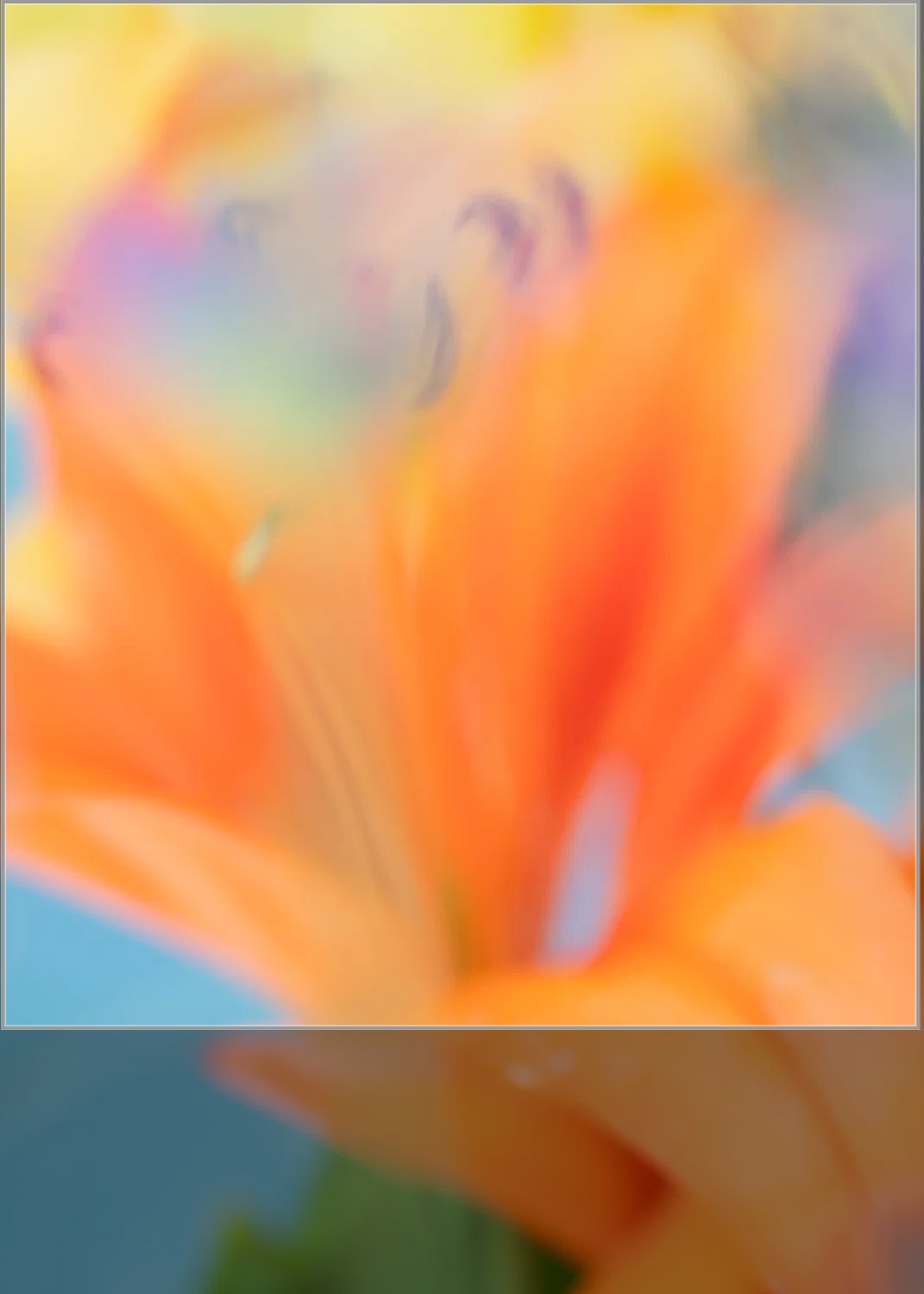
The only suggestion I have, and of course it’s just a personal preference, is the suggested crop. Just my own personal bias, but the taller digital format always seem to carry too much information. The upper 3/4 of the image is where all the beauty is. But that doesn’t make it right or wrong. This is beautifully created.
Ann Louise: I was looking at this earlier but got pulled away and while I was gone you made some of the adjustments I was going to suggest and a few more that are even better. We used to call this technique of shooting through intervening FG elements cramming. This last version is simply marvelous. top notch in every way. >=))>
What a very clever image with magnificent colours.
Truly inspiring - shooting through foliage is a technique I use but never been as successful as this.
Presumably you did focus on the stamen of the lily flower which appear blurred 'cause shooting through lavender? - or did you decide not to have anything in focus?
I was out in the garden taking lily pics today too
@Lon_Overacker@Kris_Smith@Dennis_Plank@Bill_Fach@sebastien-maloron All of your comments helped me see things I did not notice when first editing this photo. I was so excited about the color and blur. It was not hard to fix. Now I will print and hang this on e for sure! Thanks to all.
I was lucky to get this image shooting through the lavender. I did not really focus on any point. I find this technique serendipitous…a happy accident! I was trying to create similar scenes today. Lots of shots and maybe one good photo… Too much fun.