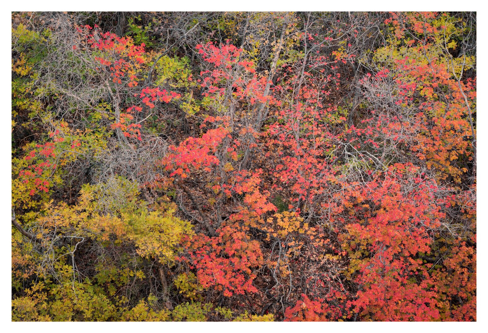
This is a vignette of Fall colors in Zion canyon where oaks and maples are abundant. Even though the oak tree leaves can still become more yellow, this lime color stage is actually my favorite; especially in Zion where they can be contrasted with the red rock in the background (though not in this picture). Fall color tapestry composition starts to become somewhat a cliché but hopefully not boring yet.
Adhika, I really like the fall foliage collection here. The only change for me is drop the cyan cast / saturation overall. Regardless, a fine fall scene…
I’ll never tire of a tapestry that has some interesting structure, and for me, this one does. I love the mix of trees and the subtle colors. The color correction is interesting but there is something about the cyan that I like – maybe go halfway? Or intensify the reds and yellows a bit and just lower the cyan a bit?
Curious, because I actually like the cooler color on the branch. This is actually very prominent even to the naked eyes in Zion. I shifted the Cyan towards Blue and posted a revision above for comparison. Let me know what you think.
To the point @Harley_Goldman makes is what I see in my own images that have a blue or cyan cast. It’s not the color so much it’s that “fogged” look that seems to flatten or rob the color potential. It’s always subjective and not a nit by any means. Personal tastes are what it’s all about in the end…
I just love this composition. This is precisely why I wanted to go to Zion this year. For compositions of the red maples. I wanted to make some suggestions but after doing a rework I find that it’s pretty much what @Paul_Breitkreuz did. Move black point go the left and white point to the right. Desaturate the blues completely and raise their luminosity values. Warm everything up a tad but not as much as Paul. Having said that I don’t think that’s your vision and that’s what’s important. Wonderful combination of colorful shapes and white lines. Love it.
I listed these changes as it was simple and can be totally adjusted to one’s preference of amount. Basically making these changes and keeping each layer active the opacity amount can be easily decreased for a given look and taste. PS has truly spoiled me for what would take hours in a dark room or not even possible in many cases…
I have to say this is a very striking fall tapestry, Adhika! They are not boring for me as I find each one slightly different color wise or pattern wise. Each is different and unique in their own way. FWIW my preference is for the cooler version as I would expect the branches to be a little cooler as they are in the shade. Either way this is very nicely done!
There is nothing wrong with a tapestry of fall color when you can include some other elements to lend structure to the composition. Personally, I love the lacy spider web look of the bare branches, they do a great job of adding some structure. I also prefer how they look in the version where you shifted cyan towards blue.
With that said, I like the added warmth and contrast in the rework by @Paul_Breitkreuz , I think it improves the way the fall colors look. But the shapes of the branches become less prominent when he warmed the entire image. I would prefer to see another variation, start with Pauls warmer, higher contrast rework, and mask in the cooler branches from Ahhika’s rework. I think this has more warm/cool color contrast, and the shapes of the bare branches stand out more too (if that is something you want to emphasize, maybe it isn’t).
I’m liking this direction, but not sure the word “mask” is to be taken literally? Colors will mask themselves if you tweak the blue/cyan colors as desired then carefully add saturation to reds/yellows/magentas. Selective color will give more control than Hue-Sat, if needed.
Beautiful Zion fall color rendition Adhika. The blue colorcast is very prominent in all of my Zion images when down in the dry river beds as you tend to be in deep shadows. The river rocks can be really blue sometimes but I think it’s perfectly natural and I actually prefer a slight blue tone to the branches that you have here. I just love the bare branches which are beautifully balances in the scene which is much more difficult than it seems. You certainly have a really nice mix of colors from barely staring greens, to just getting going lime/yellows, to a couple of nice orange patches and then the wonderful red maples and of course the bare branches. Super job at seeing this Adhika. I’m really liking this a lot.
I experimented with the warming filter as suggested above, I still ended up with a cooler image; okay, perhaps somewhere in between what I had and what @Ed_McGuirk suggested. What @David_Haynes mentioned here is pretty much how my mind remembers this area.
That said, I am glad this is not a boring tapestry. This is cheesy but I saw this heart shape when I walked by this cluster which made me take out my camera. The image ends up being about something else.