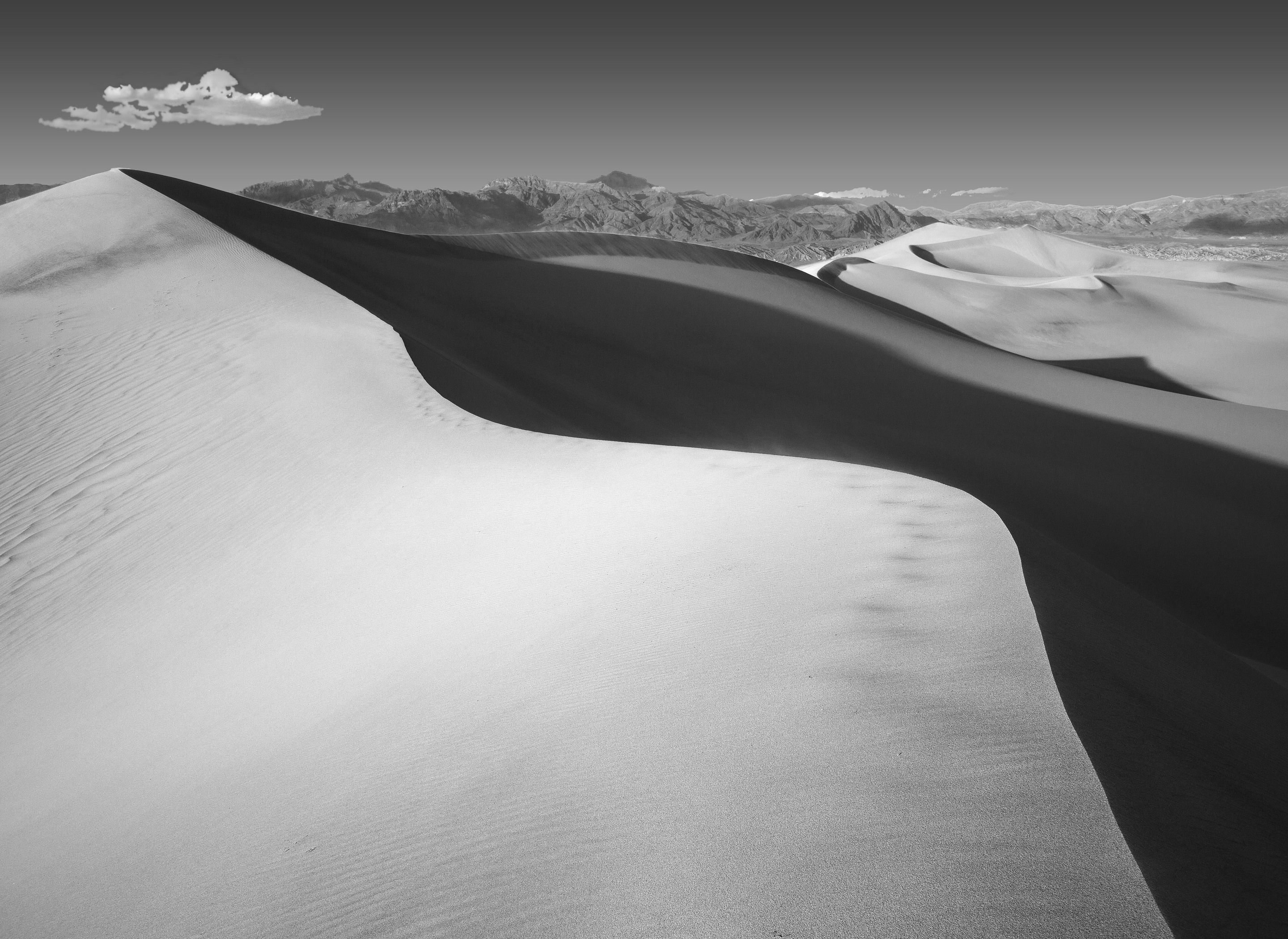
My first and only (so far) outing to the dunes near Stovepipe Wells resulted in this image. In processing it, I became very respectful of the BW dune images I have seen on NPN … they are really unforgiving of processing errors. My biggest problem was working around a sky that turned very blotchy when converted to BW. I suppose the sensor caught uneven luminosity from the dust in the air, so I ended up replacing it with a graduated fill, which introduced more errors … geez why do we do this?
What technical feedback would you like if any? Blotchy sky treatment suggestions?
What artistic feedback would you like if any? Cropping suggestions? I tried cropping off a lot of bottom, but lost too much of the line leading to top right.
Pertinent technical details or techniques:
(If this is a composite, etc. please be honest with your techniques to help others learn)
If you would like your image to be eligible for a feature on the NPN Instagram (@NaturePhotoNet), add the tag ‘ig’ and leave your Instagram username below.
The dune is superb, David, but there is something wrong with the sky especially as it blends with the clouds. Could you share the blotchiness that you saw the first time you converted this? I often see some artifacts if I push the contrast using the color B&W conversion slider too far.
Marvelous work. I like how you have that cloud way up in the left corner. The other tiny clouds - I would remove them. Wonderful powerful curvy line cutting across the entire image. Very dramatic.
Beautiful conversion to black and white. I frequently see sky artifacts when converting to black and white and I’m not sure why but increasing the color noise removal almost always removes all of the blotchiness. Try running color noise up to around 30 or 35 and see if that does the trick.
Great grand landscape capture.
Dick, I really like how you handled the composition here, as @Matt_Lancaster said, my eye just keeps moving up and down the crest of the dune. At first I thought you may have had too much negative space in the LLC, but ended up concluding that you need it as presented in order to fully accentuate the dune ridge line. I also think your B&W processing of the landscape looks great.
To me, the clouds/sky still look a little funky in the first rework you posted, if anything the clouds are even blotchier than the original post. I assume that you have done a second rework (not posted yet) that utilizes the color noise trick mentioned by @David_Haynes to address the sky. For educational purposes, and if you have the time, would please post a second rework with @David_Haynes technique applied to it, in order to see the difference.
This is, I think, ready to print. The sky artifacts became manageable using a color noise reduction in the raw file ( level 38) as suggested by @David_Haynes . That allowed the clouds to be not subject to selection, avoiding the off-putting clunkiness noted by @Adhika_Lie and @Ed_McGuirk .
I also accentuated shadows on the face of the dune, and found some detail in its whitest area.
Thanks Ed! I happened on to this little secret accidentally when I converted an image from color to Black & White and noticed how much noisier the black and white image was. I went to pull on the luminance slider in LR and accidentally pulled on the color noise slider instead. Wow, does it make a huge difference in black and white. Not sure what’s going on with that but it sure does work. In color, I never saw it do much of anything and I’ve pretty much left it alone in my color workflow.