The photographer is looking for generalized feedback about the aesthetic and technical qualities of their image.
Description
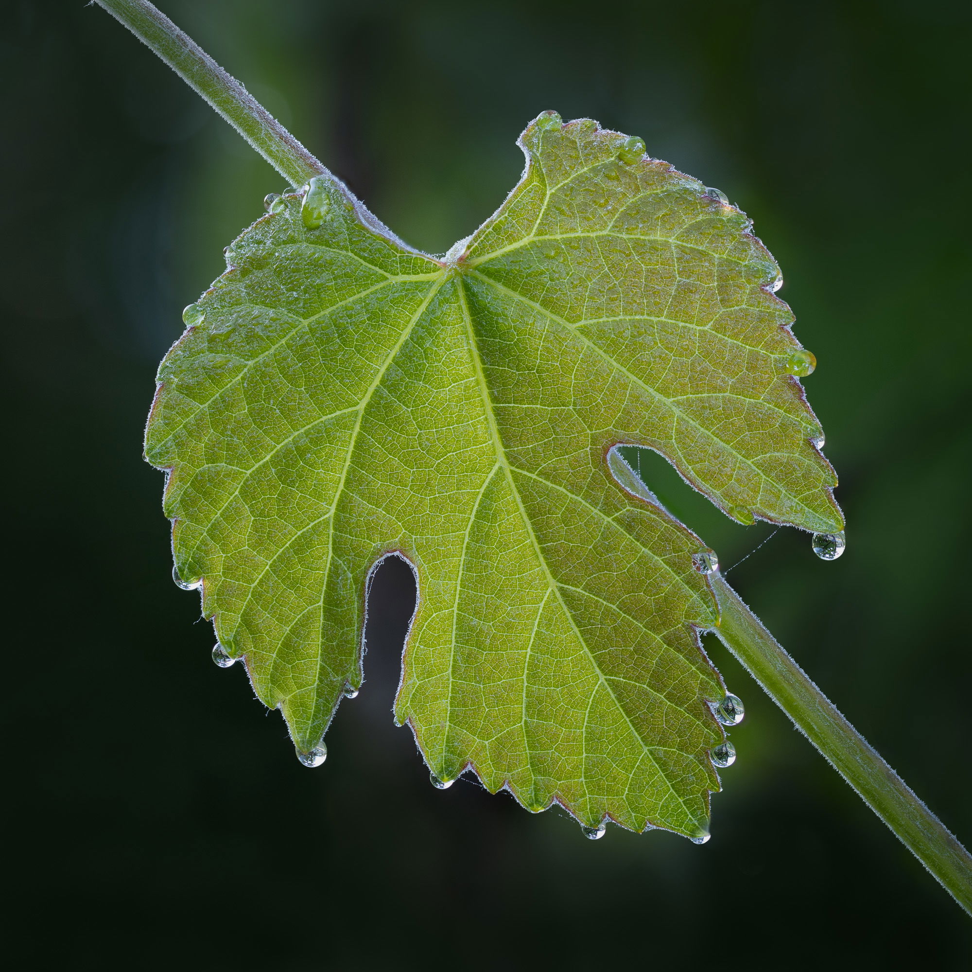
We have had wild grape on our property for years but the main stand of it got destroyed with some landscaping several years ago. Last spring I was delighted to find some sprouting from some bark mulch and put cages around it. This spring it’s big enough to pose for pictures. (And in a few years I’ll probably be out with a machete trying to subdue it.) This is from a couple of weeks ago on a foggy morning with a blush of light from the start of clearing.
Specific Feedback
All comments welcome!
Technical Details
The usual global tonal work in LR for a focus-stacked set. Then into PS for denoise, some retouching of stacking artifacts, and a crop.
Critique Template
Use of the template is optional, but it can help spark ideas.
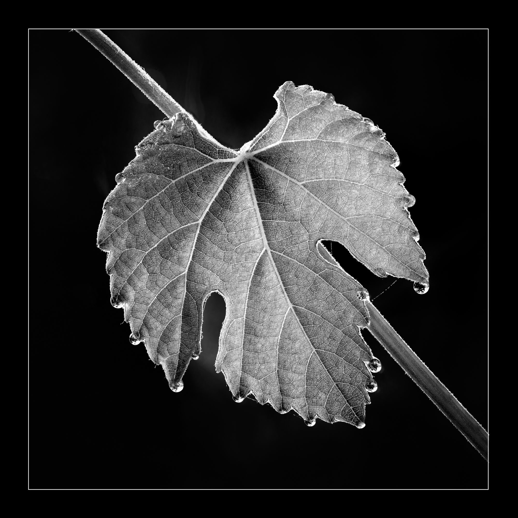
Thanks, @Gill_Vanderlip! I hadn’t thought about B/W and had to give it a quick try. I opened a copy and flattened it to just a BG layer. Then put a B/W adjustment layer above it (using the split-circle icon at the bottom of the Layers panel) and played with moving the color channel sliders. There isn’t much color so I didn’t get a very exciting result, so in between the two layers I added a Curves layer (using the same circle icon). Levels would have worked too, but Curves is more flexible.) Increasing contrast gave it more punch. I’m not sure I quite got to the wonderful silvery mid-tones that I admire so much in B/W but I do think it’s interesting. Posted above. Thanks for the nudge!
Both Images work great. B&W has a soul to it and really shines in the texture in my opinion. I think you captured in both images that simple beautiful vibe that i love. Outstanding Photography.
Diane: Both iterations are superb and actually altogether different images. I’m a color junkie so I do prefer the color version but I’ll be happy to have one of each. The drops and the refractions in them are icing on a very fine cake. Most excellent.>=))>
Gorgeous detail and all those drops at the points of the leaf are wonderful, Diane. Mostly, though ,it’s the light coming through the leaf that makes this image for me. In this case, I don’t find the B&W nearly as appealing as the color because it doesn’t convey that translucent quality in the leaf the way the color version does.
Both iterations have a lot going for them. With the color, we naturally study that more than form or shape, but there’s still some of that. I think the water drops are more obvious as to what they are in the color. Leaving the spider thread in there makes me smile.
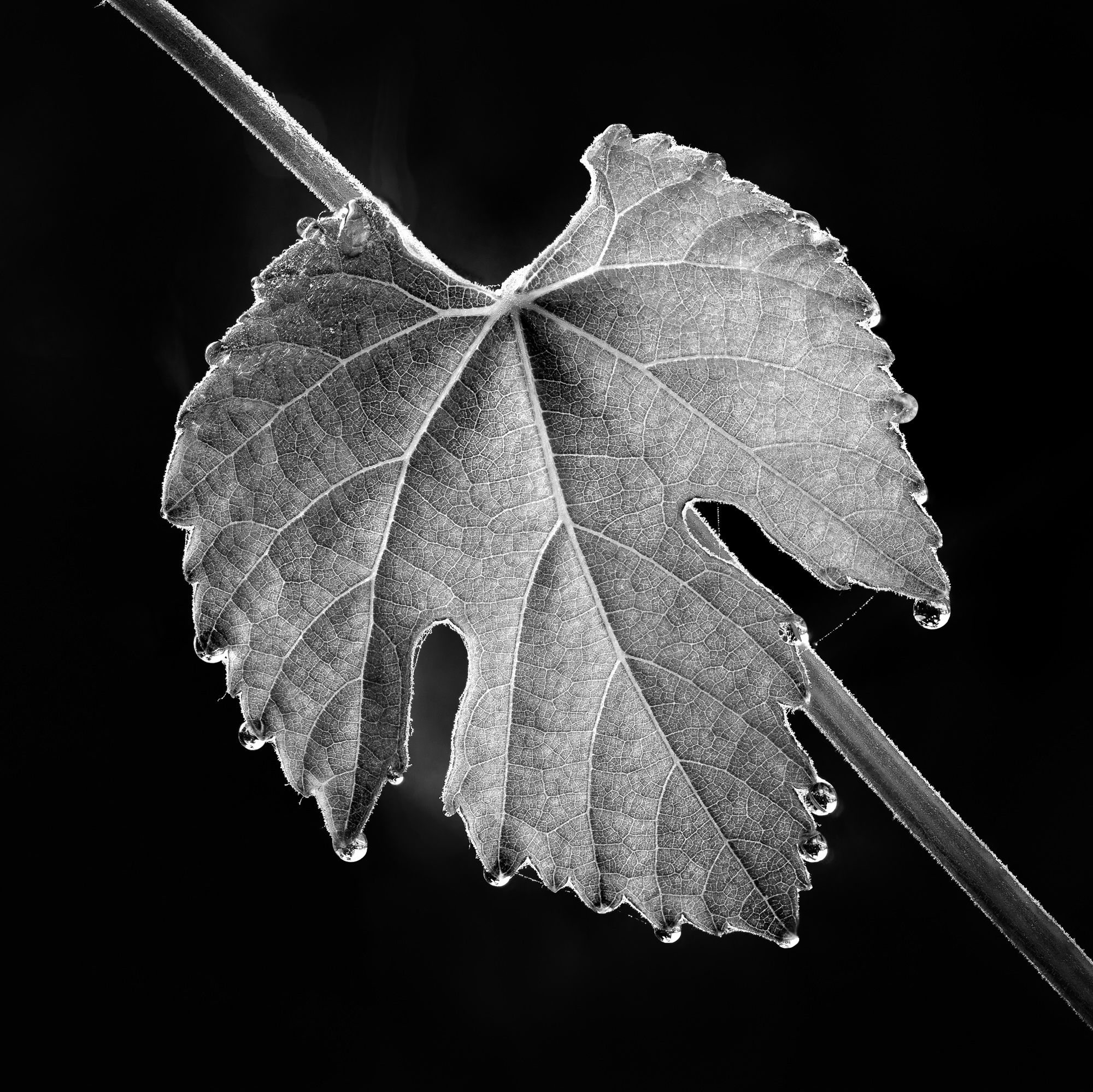
Thanks, @Bill_Fach, @Dennis_Plank and @Kris_Smith! Bill and Dennis, is I have to choose I do prefer the color – the subtle backlight really made this leaf stand out. But I’m happy to have the B/W for a twofer. I felt something wasn’t right with it and realized it was just too bold in the frame. @Gill_Vanderlip, the in-your-face look didn’t feel right for a small leaf with delicate lighting, so I added a border, for whatever interest it may have. (Posted above.) Kris, I thought you might like the little web. That spider must be microscopic as the leaf is no bigger than my thumbnail – and I have small hands.
The Border is a good idea. Really frames the leaf in a nice way. Gives a studio kinda look in my opinion. I never thought of adding a border to anything. But it works real nice Diane. You have that Creative touch. !!!
A simply gorgeous image. Simply one leaf; I didn’t realise it was so small until I read your comment. If I had to chose I would pick the colour version. The B&W with the border is also so lovely.
The spider web is a nice touch.
I noticed a change in the tone of black between the bottom lobes. Not a nit. Just a passing thought.
Diane, As an astro maven, you certainly get down to earth with this wonderful grape leaf. The detail and dew drops move me ahead to tasing the fruit - delicious intimate landscape. The extending stem on each side of the leaf completes your simple and effective composition. I prefer the color image here, but the B&W also works communicating a more abstract feeling.
Thanks, @Gill_Vanderlip, @Glenys_Passier and @Larry_Greenbaum! Gill, I tend to think of borders for more formal-looking images. Glennie, the lighter area is from one of the hints of BG that show in the color version. When I started tweaking the B/W sliders, all of them dropped almost to black except that one, which is more bluish. I was surprised but decided just to leave it. I could have backed off on some of the sliders to leave a bit more of the BG but that changed to tonalities on the leaf and I decided not to mask, although it would have been easy. Larry, I’m an equal-opportunity shooter – anything I can get in a viewfinder!
Equal Opportunity Shooter. I love it. YES That’s I’m feeling these days. I’m 73 and make the most of my time.
Do the best images and music I can and have fun doing so.