CLICK TO SEE DETAILS IN PIC. NOT SHOWING IN SMALLER IMAGE ON MY SCREEN
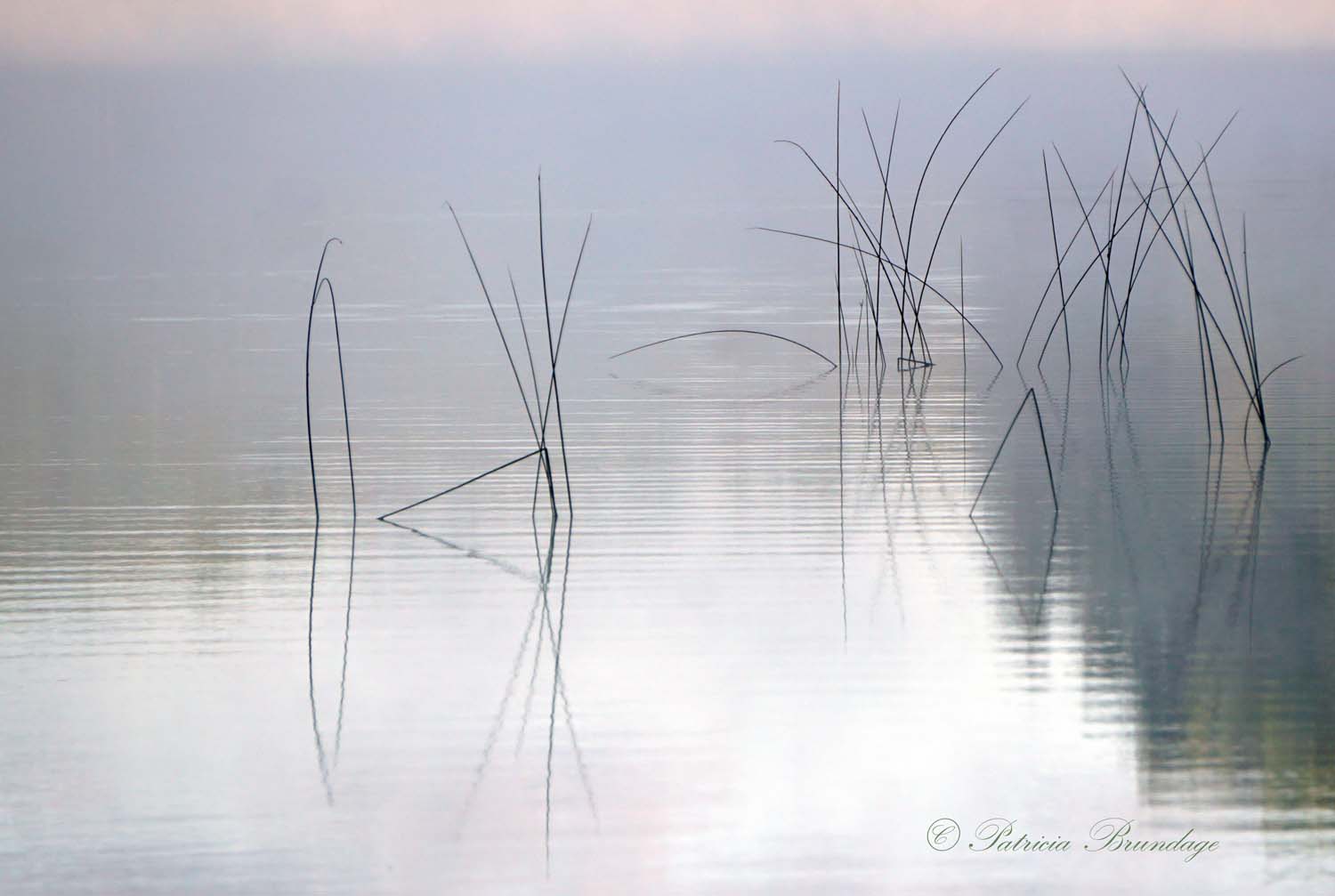
Nice subtle little waterscape, Patricia, and a good example that less is more. The patterns of the water work well with the grasses.
This turned out real nice, Patricia. I am a bit on the fence about the light band at the top, but not a real big deal. This is enjoyably simple.
Simply wonderful. Love the horizontal bands in the water. Well composed with respect to the grass distribution. Would be stronger without the band on top which pulls my eye.
Ditto on the band but very nicely done. Fog is always difficult to capture well. You did good!
The quiet stillness of the water, the placement of the reeds and the subtle colors in the background come together very well, Patricia. This is very calming to view.
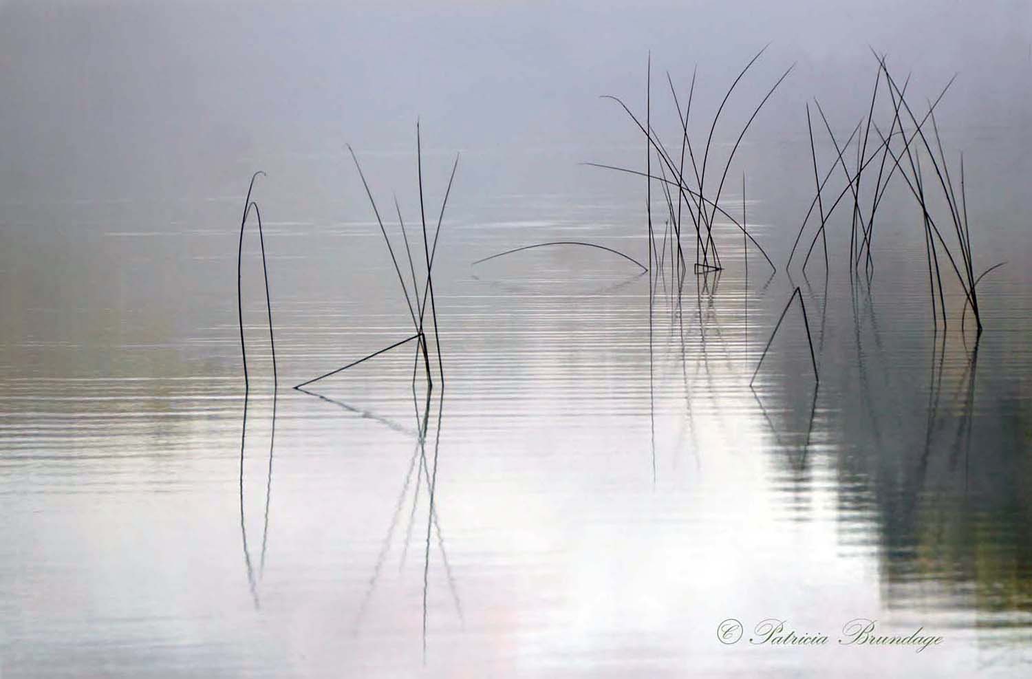
The repost looks great. It simplifies the image and I think improves the mood. Real nice image.
Patricia,
Love this. Reeds, grasses in water are most always a great subject and this is no exception. Of course the fog is key and I think the ripples are an added bonus.
I’m surprised no one has suggested this yet. What about b&w? I think that would eliminate or at least reduce the impact of the band up top. Also, and this was going to be my only nitpick, I think the colors on the right take away slightly from the impact of the image. Most of the scene is pretty monochromatic and the scene isn’t about color, so I thought of the b&w. Of course that may not be y our vision. Still a lovely image as presented; well seen and captured.
Lon
In my opinion, there is no such thing as too simple. This is gorgeous, Patricia. Simple indeed, but elegant and striking as well. The small pinkish line at the top; I can’t decide if that’s a help or hindrance. I might play with that if I were you to see which way is better. I wouldn’t crop the line but I might would clone it out just to see. A beautiful shot!
Beautiful image Patricia, The re-post sends it to another level. The soft colors add so much to the graceful shapes.
A wonderfully seen collection of graceful curves. The pink layer on top improves the image because it adds lightness to a subject that is largely about light. Cropping it off gives the image a heavier feeling. If you could lighten the shadows in the lower right that would correct the loss. B&w would likely be inferior. If anything I would process to enhance the look of pastels. Love this image. Many shoot this subject but finding and spacing the curved arcs seems to be difficult to achieve.
Wonderful grasses and muted reflections in the water, well done, Patricia.
Beautiful shot, I prefer the repost without the white band at the top.