The photographer is looking for generalized feedback about the aesthetic and technical qualities of their image.
Description
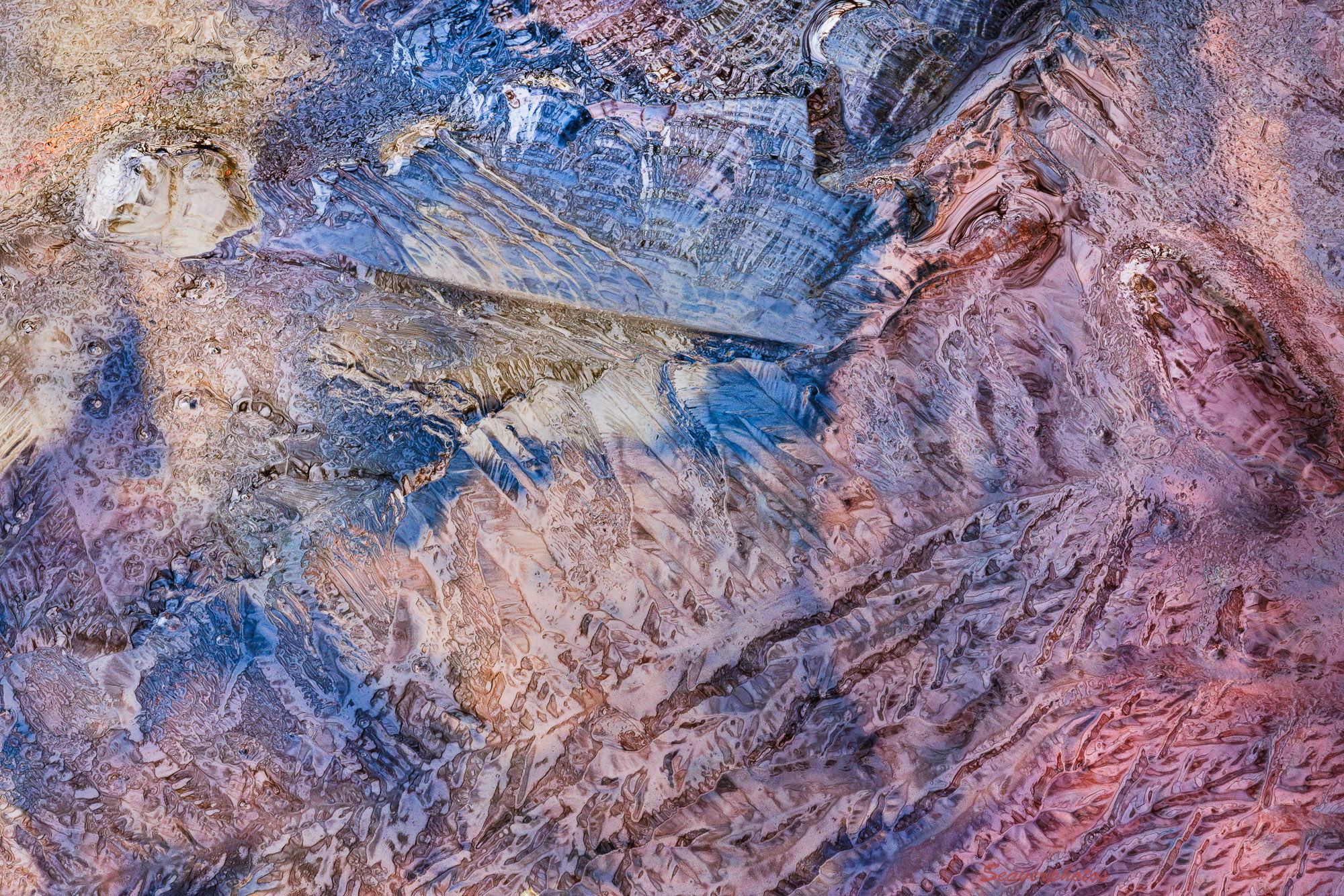
We had an overnight freeze on Tuesday that created ice on some edges of my pond, so I spent some time exploring those areas. It was overcast, so even with using my polarizer the raw files are low in contrast. Adding mid-tone contrast in Adobe also adds lots of saturation. The colors are from leaves and algae on the bottom of the pond. The long axis covers about 9 inches.
Specific Feedback
I’ve backed off the saturation by 10 points in Lightroom to reduce the “dayglow” effect but wonder if either more or less saturation might be in order.
Technical Details
R5, 180mm macro, 1/13 s, f/13, iso 800, tripod and polarizer. A 10 shot stack.
I think this saturation works pretty well, Mark. A nice find. I do sometimes have fun using the point color tool in LR to bring out specific tones, but I really don’t think it would get you much in this image.
Mark: Since we’re scheduled for record high temperatures in the next few days I’m having a hard time envisioning ice so I was wondering if this was something else. I think that impression is enhanced by your use of the polarizer which very effectively reduced the reflections one would expect with an ice image. The saturation and other processing choices you made work very nicely for me. You’re the undisputed champion of this genre. Most excellent. >=))>
Hi Mark,
I never tire of your ice abstracts, and this is no exception. I love the color palette and the angular texture combined with subsurface globular color. Saturation looks great to me.