Repost-Exclusion on top but erased over the purple leaves with soft light brush to bring out purple from layer below. Painted a bit of low opacity white over darker trunks and used a curves layer to bring up everything. Capped it off with desaturating and boosting luminosity on the greens and increasing saturation on the purples plus some more boosts to both highlights and shadows to increase the ethereal feel in LR.
The photographer is looking for generalized feedback about the aesthetic and technical qualities of their image.
Description
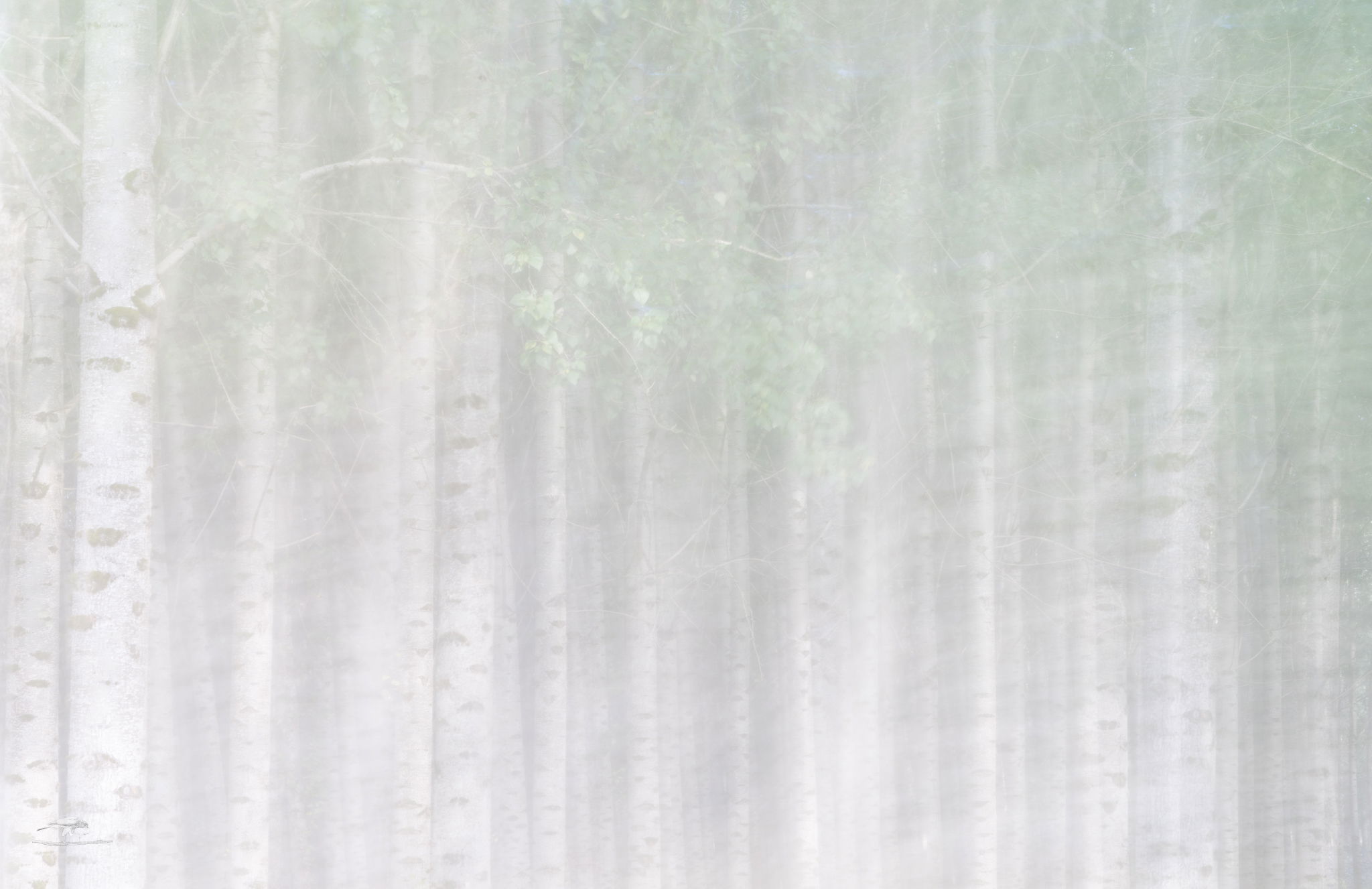
A nearby town established a Poplar plantation that gets watered with the purified effluent from their sewage system. You can’t go in, but you can park at the entrances and shoot in. In this case, they had a gate partially open and I was able to avoid shooting through the fence. These three images all started out as a composite of two images: one photographed normally and one with a lot of ICM. I put them on separate layers in PS and combined them using different blending modes and hinted at by the titles. All were cropped the same and they all had a tiny bit of cleanup here and there.
Specific Feedback
I’m interested in which, if any, of these images appeal to you and if you can elucidate it, why. I’d also like suggestions for further/alternative processing. I like the ethereal mood of the lighter presentations and would like to stick with that feel.
Technical Details
Both images were taken with a Sony A7Riv, FE 70-200 F/4 macro @ 70 mm with 6 stop ND filter tripod, f/4, iso 50. The normal had the tripod locked down and was exposed for 2.5 sec, the ICM was panned left to right with an 8 sec exposure (mixing the dark areas between trees with the lighter trunks).
Dennis, Is this the plantation near Adna? If so, my first impression was confusion. I don’t remember any flowering trees. Was one photo taken elsewhere? Then it might be my faulty memory. In any event, I prefer the second image. The left side trees in the first are too prominent, and the third is too bright losing the color of the blooms. The second is excellent.
It is indeed that farm, Jim. However, the blossoms aren’t blossoms. Those blending modes in PS do weird things. If I understand right, they’re comparing the color (or tone or saturation, etc) in each location between layers, applying some kind of formula and coming up with a different value for each pixel. In the two cases with “blossoms” the leaves changed colors to that purplish hue.
Clever! And clever hints in the titles! For me it’s #1 by a wide margin. From the thumbnail, I thought you were playing with an IR camera with one of the weird conversions.
To further the fun, try putting various adjustment layers above the bottom layer, or on the top layer and grouping them to that layer so they only affect it.
Great technique, Dennis. The three variations are all unique, but I love #1. The textures and subtle colors blend beautifully together. Creative idea and nicely done!
Awesome work Dennis and very creative! I recognize those “blossoms” that result from blending modes in Photoshop. Yep you’re right. Those blending modes can create some interesting effects.
I’m having a hard time picking a favorite here. The one titled “Screening” has a great ethereal quality to it and with a hint of textured paper with those repeating tree bark patterns. The "blossoms in the first one look great. I think I would prefer the trunks on the left side to be a bit brighter so flow with the rest of the image. It may a worth experimenting blending #1 and #2 together with masks. Whatever the outcome, you’ve presented three fantastic interpretations of a forest scene that reminds me so much of a bamboo forest in Japan.
Thanks, Alfredo. I’m definitely going to play with these some more. I agree that those dark trunks in the first one dominate too much. Hopefully I can find time to play with it tomorrow.
Dennis, beautiful images! The first one is definitely my preference. Your ICM technique works well, the tree trunk details add to the image, and the purple leaves (aren’t blending modes fun to use?!) are lovely. I like the greenish tint on the right. Alfredo’s idea to experiment with blending #1 and #2 is a good one, and I agree that the images have a feeling of a Japanese bamboo forest. PS The third image almost works for me, but it is a little too subtle.
Dennis, Oh for the fog. Not to be a contrarian, I prefer the second and third images. The repetition of the trees and pastel greens and purple combined with the white markings on the trunks create a gentle, restful mood with interesting texture. For me, the black trees in the first image have too much contrast and infringe on the soft mood, although picking a favorite is certainly personal preference. Wonderful image.
Super late to the party here Dennis but I have to say that these are so different from each other I’m having a hard time deciding but I think I slightly prefer the second image over the first but it’s just barely. The second image is both soft and contrasty and I love the really dark trunks on the left. It really looks like a painting to me. It provides a real sense of depth that I think is ever so slightly lacking in the first image. The first image is just slightly too washed out for me but I still love it. Very imaginative processing. Super cool.