Critique Style Requested: Standard
The photographer is looking for generalized feedback about the aesthetic and technical qualities of their image.
Description
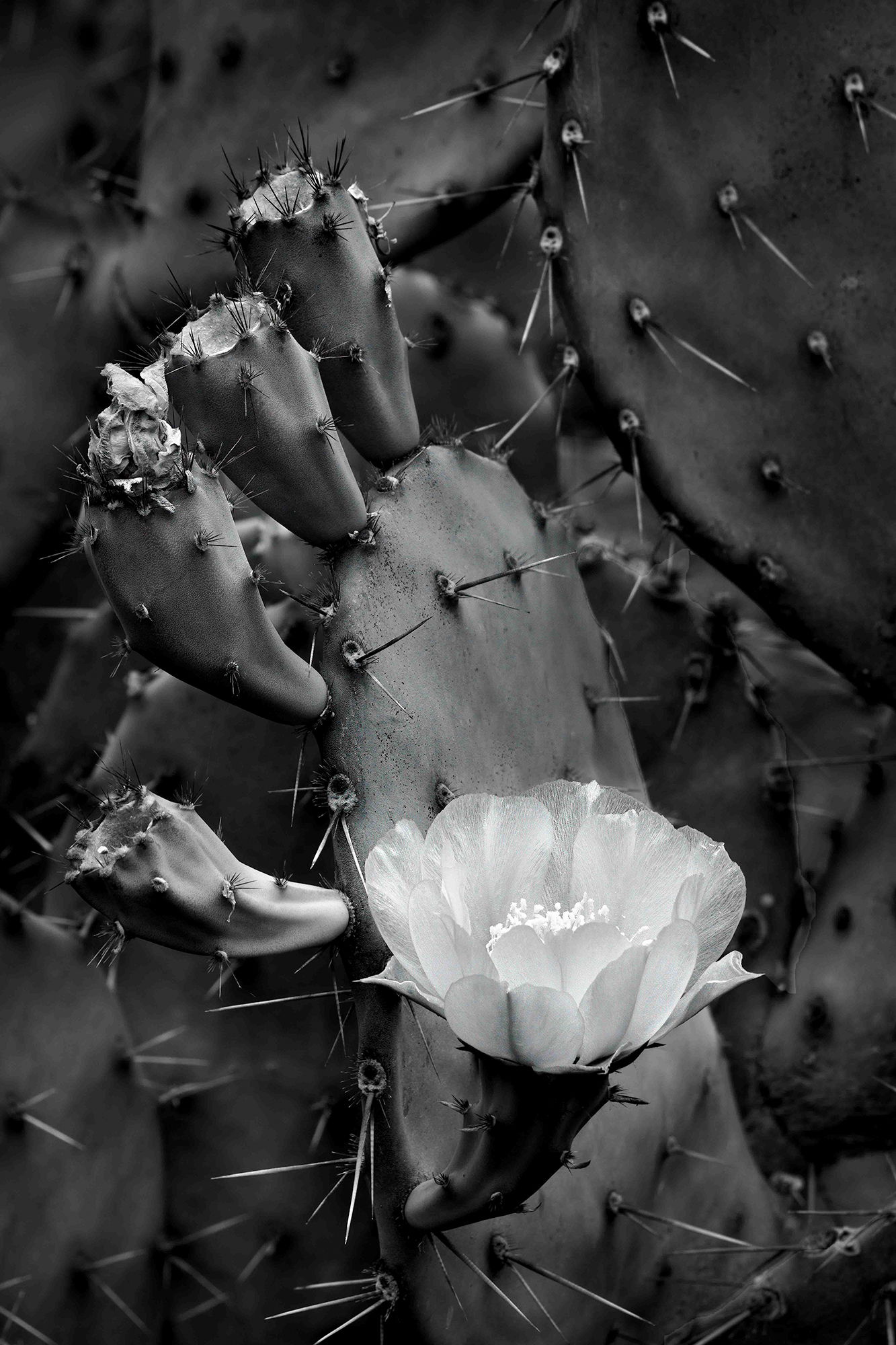
Black and white may seem like an odd choice but the flower’s color (yellow) wasn’t very interesting. Black and white also tended to shift attention to the flower’s surroundings. I tried to make them interesting and appealing.
Specific Feedback
All comments welcome.
Technical Details
ISO 100, 213mm, f/11. 1/15th sec.
Critique Template
Use of the template is optional, but it can help spark ideas.
- Vision and Purpose:
- Conceptual:
- Emotional Impact and Mood:
- Composition:
- Balance and Visual Weight:
- Depth and Dimension:
- Color:
- Lighting:
- Processing:
- Technical:
1 Like
I think B&W worked well in this image, Don. It accents the geometry of the plant structure, which I find quite interesting. The array of spent blossom supports forms a wonderful curve. Very nicely done.
Excellent! I have been very frustrated with past attempts to shoot these gorgeous little flowers, but always in color. Never thought to try B/W. It does balance the flower and BG very nicely and you have brought out some very interesting tonal differences in the BG. Thumbs up!
Sandy, Diane, thanks for the comments.
YES !!! B&W. Works great. It has that Film look to my eyes. Really Cool.!!!
It now has a soul in my opinion. Great Tone and Composition. Don’t change a thing. Gets My Vote !!!
1 Like
Don: Terrific comp and a good idea to go B&W. I don’t do much B&W so I’m reluctant to critique too strongly but for me the flower ought to be just a touch brighter. I think it gives it more pop although you may not want any pop at all. Back to you. >=))>
Bill, I think you’re right. I brightened the perimeter of the flower while leaving the flower’s center alone. Thanks for the feedback.
Very nice, Don. And I am with Bill here. The first thing I thought was that the image could use a bit more contrast, that the flower could stand out a tad more by either darkening the center plant or having the flower just a tad brighter. I am glad we all could agree on that. Otherwise it is just a beautiful and classic black and white that needs to be printed and framed. Up on the wall with this one and thanks for sharing!