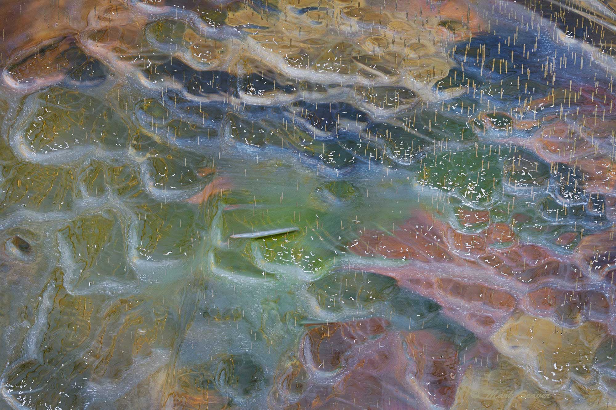
I love this! How cool to have your own ice pond. I have to go out searching for ice. The mix of colors is like an artist’s palette. The textures and wavy lines are entrancing. The tiny vertical lines add an interesting dynamic. The dark line right in the center bothers me and I feel that the brown wedge in the UR corner doesn’t quite fit. But I just love the image.
I like this a lot, Mark. The wavy patterns with the underlying colors and the streaks that look like rain do give it a restful feel. The only jarring note for me is that elongated element almost in the center of the image that, for me, interrupts the flow of the image.
Wonderful, Mark. Everything; the colors, textures and movement all work harmoniously to create a lovely scene. The “elongated element” @Dennis_Plank referred to, is that a fish?? I am also curious about the “tiny vertical lines” @Chris_Baird talks about. They do add nicely to the image, do you know what they are? Nicely seen and captured. Great shot!
Very cool – or probably more like really cold. I love the unusual shapes and unexpected colors, and the little vertical columns. I do think the stick(?) dead center could be removed.
What a colorful and unique pond, Mark. The image is terrific. I agree with @Chris_Baird , @Dennis_Plank , @linda_mellor , and @Diane_Miller’s comments. I tried to reduce the glare a bit by using a mids 1 mask with Curves in the multiply blend mode at about 40% opacity. I tried not to add contrast to retain the restful look, hence the lower opacity. This is really minor and can be ignored if you don’t like it.
This is terrific, Mark. I agree about removing the object in the center. I’d also consider a crop that gets rid of the upper right-hand corner, which breaks the flow of the rest of the image.
Your pond is the gift that keeps on giving, Mark. My first thought after reading the title was that the little thing in the middle was resting on the surface. I’m thinking maybe brightening it up a bit would be nice. You don’t want to increase the saturation, though, so the colors remain pastel-y.
Another magnificent ice image. I certainly agree with all the other positive comments, but I like both the oblong object and the upper right corner dark area. It looks like a wild rain storm at sea with an upturned boat. The dark area in URC looks like a beach and land that the occupants of the boat will probably never set foot on. How’s that for a wild interpretation? Awesome image.
@Chris_Baird, @linda_mellor The tiny vertical lines are formed as the muck on the pond bottom decays and emits bubbles of gas. I suspect that there’s something in the muck that acts as a nucleation site, which is why the bubbles line up (come from the same place on the bottom). There’s enough delay in the bubble formation that more ice is formed between bubbles, so if you look carefully, you can see that the sides are not smooth. Sometimes the sides are smooth, if the ice is forming slowly and the bubbles form quickly (determined by the temperature in the air and the muck). The linear bit in the middle is just a different shape in the ice…
Another great abstract image from you pond Mark! I love the pastel colors and those rain drop like shapes are super fascinating especially after reading your explanation. My keeps drawn to the URC and lower left corner (LLC). They seem incongruent with the gentle patterns in the rest of the image. The saturation of the colors is spot on to me. Awesome work Mark.
Beautiful work Mark. It certainly deserves an EP. For some reason it looks ‘Arabic’ to me. It think it’s all those fine details. I can see this image without the horizontal object in the middle. I think it acts as an accent but there is greater consistency without it.