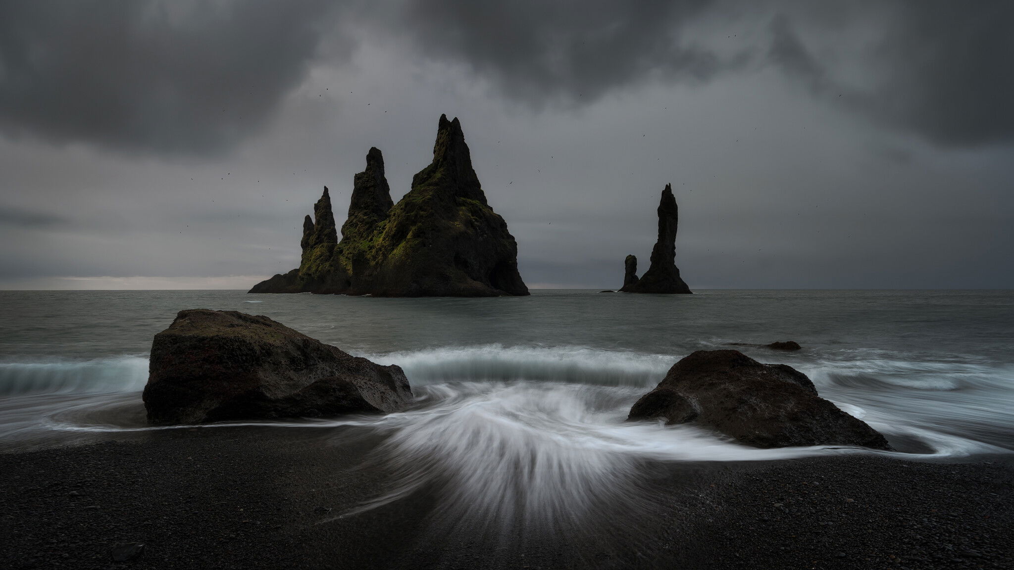
Here you can see Reynisdrangar, which are basalt sea stacks located on the south coast of Iceland.
When we got up that morning, we were of course hoping for a dramatic sunrise. As you can see, things turned out a little differently. So we got some nice moody shots.
Specific Feedback and Self-Critique
I keep struggling with the colors in this image. Does it work with the subtle colors or should it be converted to B&W?
I combined two shots here. In the field, I played with different shutter speeds for the waves (at home I decided to use this foreground shot). In between, however, I kept using faster shutter speeds to avoid blurring the seagulls.
I think you found a good, realistic tone in the colors and personally, I think this should be left color.
It’s nearly B&W as it is but there is just enough color to keep it real.
Edit: I feel that if you convert it to B&W, you would lose that nice green moss on the stacks.
I like how the clouds mimic the shape of the stacks (more or less).
The texture and shape of the trails of water in the FG look similar to horse hair (that’s just what came to mind).
I like the shutter speed you used, it retains some nice texture in the water, yet produced the trails in the FG and the smooth breaking surf.
Anyway, this is very appealing to me and it’s a very nice alternative to a sunrise.
Hey Jens! The composition for this photo is top notch. I’m really impressed with it! To answer your question, I love the subtle color to this photo. In my opinion it gives the image more character and adds a great deal to the image.
Jens, the mood is excellent, nicely stormy. I too like the subtle hints of color and touch of glow in the stack on the left. The center “flash” of water coming at the viewer adds more drama, although I prefer a bit more than half of the bottom shoreline cropped off. For me that gives a better visual balance between the water splash and the sea stacks.
Striking, and very different! I love the subtle bit of color and how the larger sea stack is just a bit off center. I wonder if you have a version with the backwash not cut off at the bottom? I long to see more of the lovely shape and have it end naturally before the bottom of the frame. If not, maybe a gradient burn at the bottom, more for the lighter tones than the darker ones.
@Diane_Miller I’m afraid I don’t have a good version of the image where the backwash was not cut off at the bottom. But I kind of liked your idea and just gave it a try. I ended up using the clone stamp tool (in Darken Mode) and copied some dark areas from the left side to the center.
I quite like that, thank you for pointing that out.
@Mark_Seaver I also liked your idea of cropping a good bit from the bottom of the image. So I brought the image to a 16:9 aspect ratio and let the water fade out a bit.
I love that the sweep of water now isn’t cut off. The top version appeals to me more because it allows more room for the water, which is the unique feature in the image. Without it, I would prefer the second framing.
I agree that the sweep of water in the center is really key to the shot and I like it in its entirety. The way you’ve combined the photos looks realistic and it’s brought out the best in the scene. What drama and ruggedness.
Oh and if you have a mind, you can always edit your OP and add subsequent versions there. It makes it a lot easier to evaluate our choices and view your changes logically. Just a thought!
What kind of monitor are you using at present? I have one 27" (BenQ SW2700PT)
That’s a good idea. I love to print my images from time to time. What kind of paper would you recommend for this image? I love soft textured paper. But I sometimes have problems printing dark images because details in the shadows get lost.
This is definitely deserving of a big print, prominently displayed! The “watercolor” type papers can’t hold the darkest blacks so have a limited dynamic range. Epson Baryta is wonderful for darks. Its surface “feel” and gamut is often compared to silver gelatin prints. There is a newer Platine that I haven’t had experience with but may also handle darks well. You can get a reasonable idea by soft-proofing the profile (its gamut) in PS. I’d imagine there are comparable papers for other printers but I haven’t kept up with it and have been using commercial printing services.
I’m using a set of Samsung 24", 1080p monitors at the moment but they are really cheap, one of them is analog
My computer is a SnowBlind gaming computer, I don’t use it for gaming though, my initial purpose was for 3D industrial design and modeling software used for designing industrial machines, that software allows me to animate very large and complex models and that requires a lot of processing power, so, the gaming computer was the best solution.
These cheap monitors are fine for the modeling software but not photography.
At present I only use the digital monitor for viewing an editing and it’s time for an upgrade.
The BenQ SW2700PT monitors aren’t available anymore.
I was thinking about a set of 29" monitors but most are ultra wide and I’m not sure I want that.
I think I’ll try a set of ASUS QHD 27" ProArt, 1440p (2K).
Those fit my budget since I want two that actually “Match”
I don’t want 4K, they are too sharp IMHO, that might lead me to think that images aren’t sharp enough when the really are.
I don’t care for 4K TVs either, cinematic movies look like the old Soap Opera shows, there’s too much detail and it kind of cancels out the cinematic feel for me.
I edit videos once in a while too and 4K might cause that to get frustrating, so, 1440p or 2K seems like a better choice.
Yeah, using soft texture or even matte paper seems to hide darker details like the pebbles in the FG as well as other darker details in this image.
I have had good results with semi-gloss paper for darker images, I don’t do a lot of printing these days and I’m not up to date on the latest digital printers yet.
I’ve read a few times that acrylic and aluminum are really good for dark images.
There are some good reviews on a company called White Wall and I think there’s one in Germany.
They offer an aluminum print where they add a non-glare coating that retains the details in dark areas, colors are impressive as well, and…they come ready to hang on the wall, no frame required.
The downside is the price, they are kind of expensive, I think a 10x15 print is something like $60 but it might be worth it if you can justify the cost.
I just know that if I had an image like this from Iceland, I would have to print it! And probably spend a few bucks for an aluminum print (but that’s just me).
Metal Prints are great. I’ve done 5 and have them hanging on the hall near my studio.
Beautiful Image. i would not change a thing. You captured the movement and tone is the water perfectly. Try a metal print and see what you think. Peace to you !!!
Download their profile and soft proof to make sure you have the desired detail in the darks. But any metal print should have an excellent tonal gamut in the darks.