Hi Dennis,
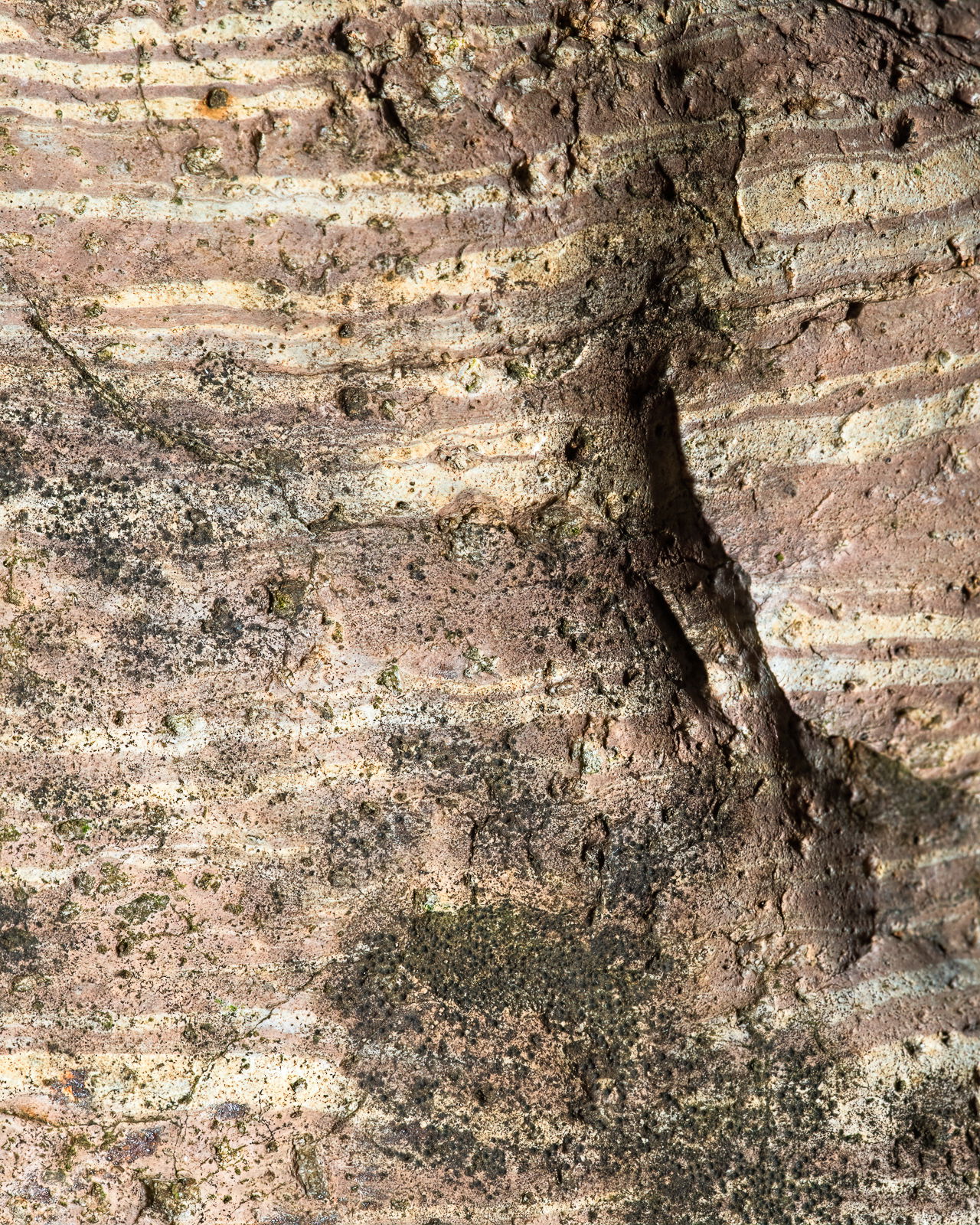
Looking at the smaller image, I had no sense of scale so this could be seen as a large rock face. Interesting image with the streaks through the rock and lichen adding contrast. Well formulated - I like the light with the slight bit of shadow. Well done.
You have a lot going on here, but somehow it seems more “pastel” than my eye wants. A little softer highlights and a little more color in the red streaks would be worth exploring. Dramatic forms well seen, but it doesn’t quite turn the corner for me.
Thanks, Hank. I agree completely. I’ve been playing with this because it seems to have lots of potential, but I haven’t gotten the tones figured out yet. I think I need to look at some of the processing the SW landscape folks use.
Glad you took that in the intended spirit Dennis. I was feeling a little queazy about saying anything because I’m looking at it on a laptop. The SW landscape folks have deep insights about such things and should be a great resource.
This rock continues to look good, Dennis. This looks like a fun and challenging subject, with it’s mix of lichen and flowing lines. The layers could easily be millimeters or feet thick. The colors look realistic, but realism does not always make for good abstracts and it would be interesting to see more “contrast” between the rock layers.