The photographer is looking for generalized feedback about the aesthetic and technical qualities of their image.
Description
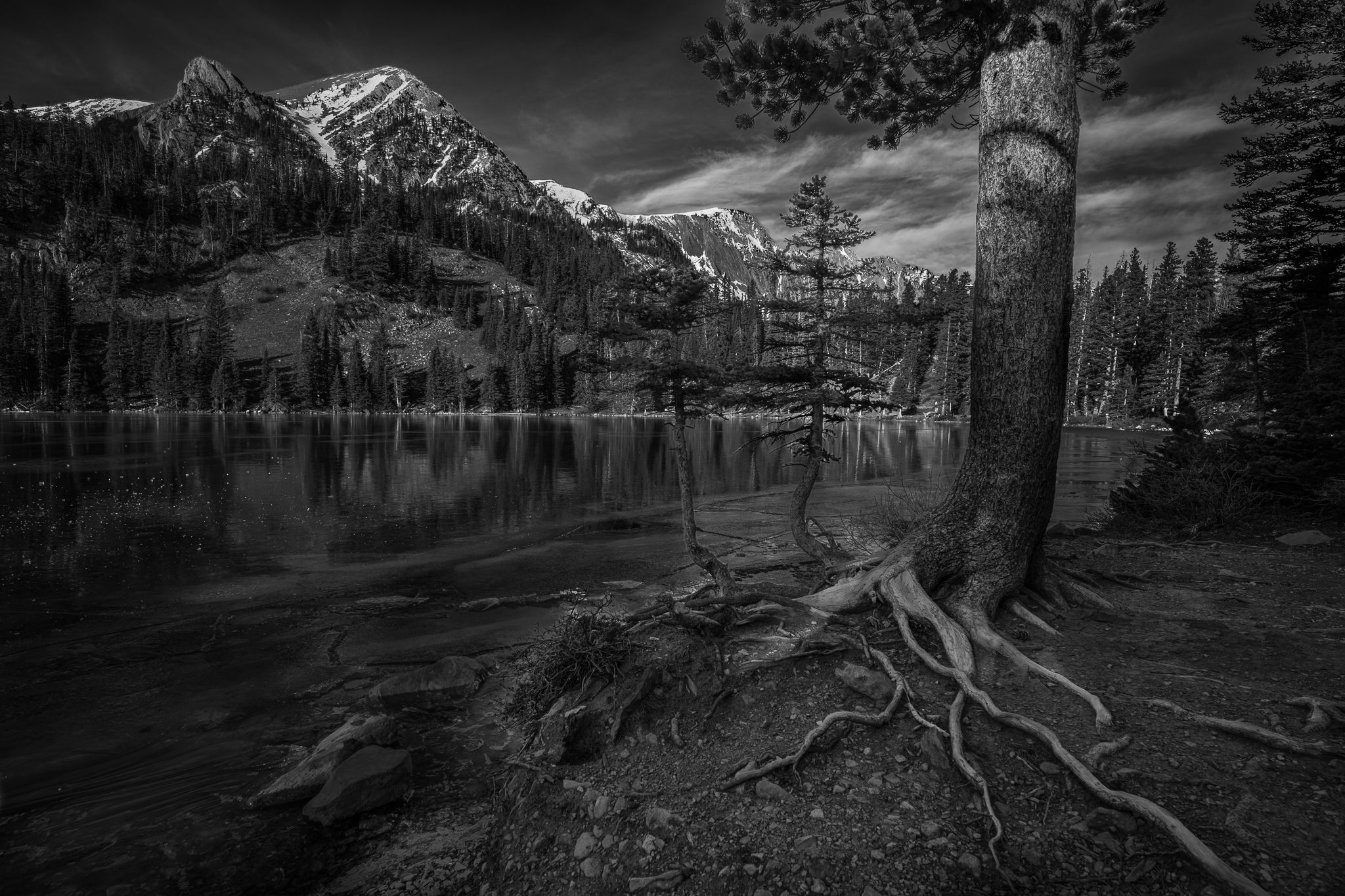
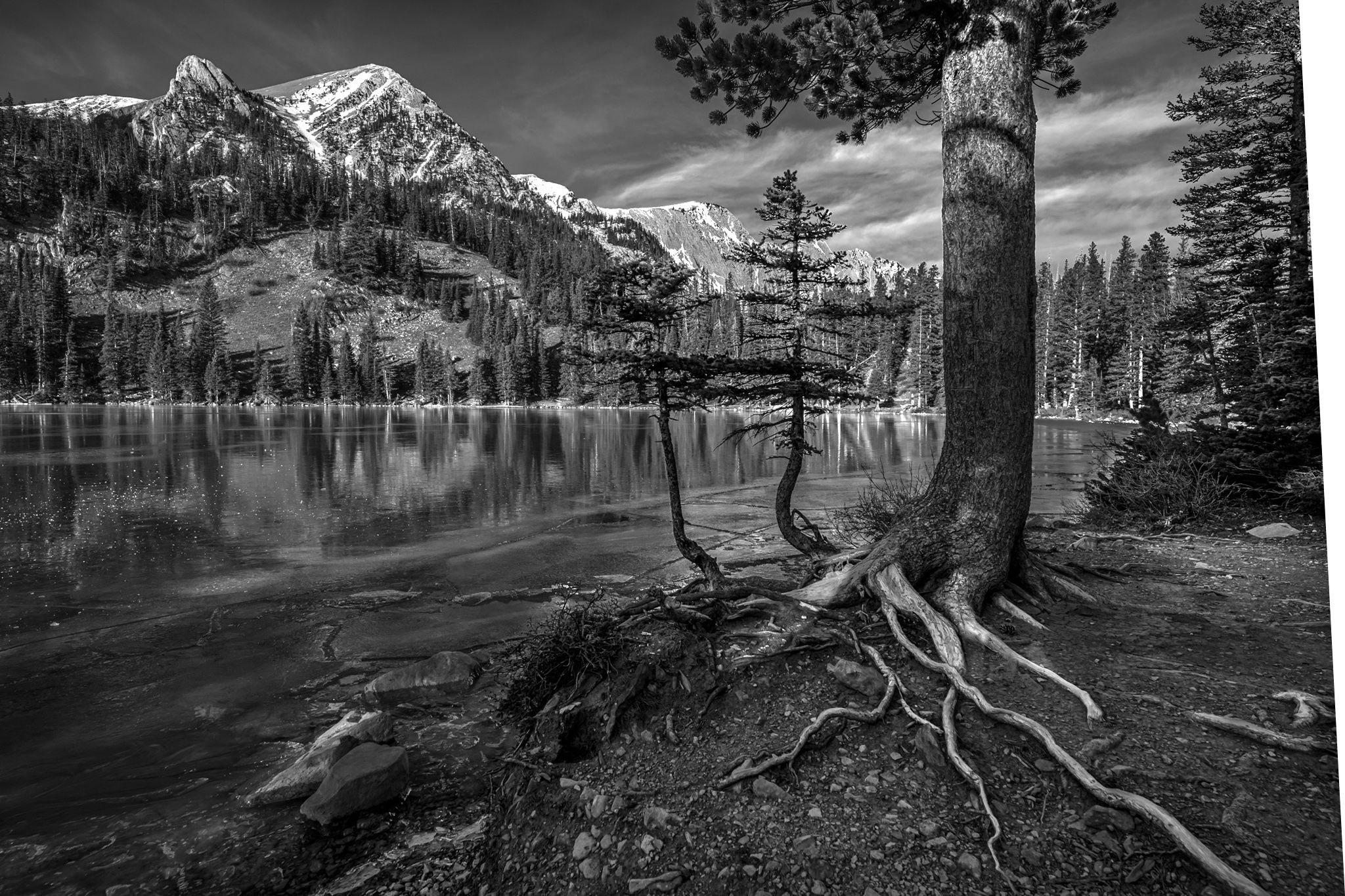
Wind is an imaginative creator that uses a harsh medium to produce grand works of art. Wind can move soil, carve stone, mold wood and move ice. Here, on the windward side of the lake, trees appear more rugged than their actual age. Their roots work hard to brace against the power of air and the pull of gravity. On this morning, the gentle roar of the wind along with the power of the Sun made the ice sing with deep pops and hollow pings. This was captured November 22 in an area of the Bridger Mountains that should have deep snow by this time. It has since snowed quite a bit and shut down access, so I am glad I went up that morning!
Specific Feedback
I tried moving side to side and back and forth but couldnt find a way to get that big tree included in a way that Ioved. In the end I settled on included just enough foliage to try to minimize the distraction of the big trunk. Do you think it works ok? The highlights are clipped a bit. The foreground was much darker in-camera, so I shot it at a speed where I knew I’d have to lighten the foreground to maintain details in the highlights.
Technical Details
Nikon D850
Sigma Art 14-24mm
ISO 64, f/8, 1/60th, 19mm
Critique Template
Use of the template is optional, but it can help spark ideas.
Vision and Purpose:
Conceptual:
Emotional Impact and Mood:
Composition:
Balance and Visual Weight:
Depth and Dimension:
Color:
Lighting:
Processing:
Technical:
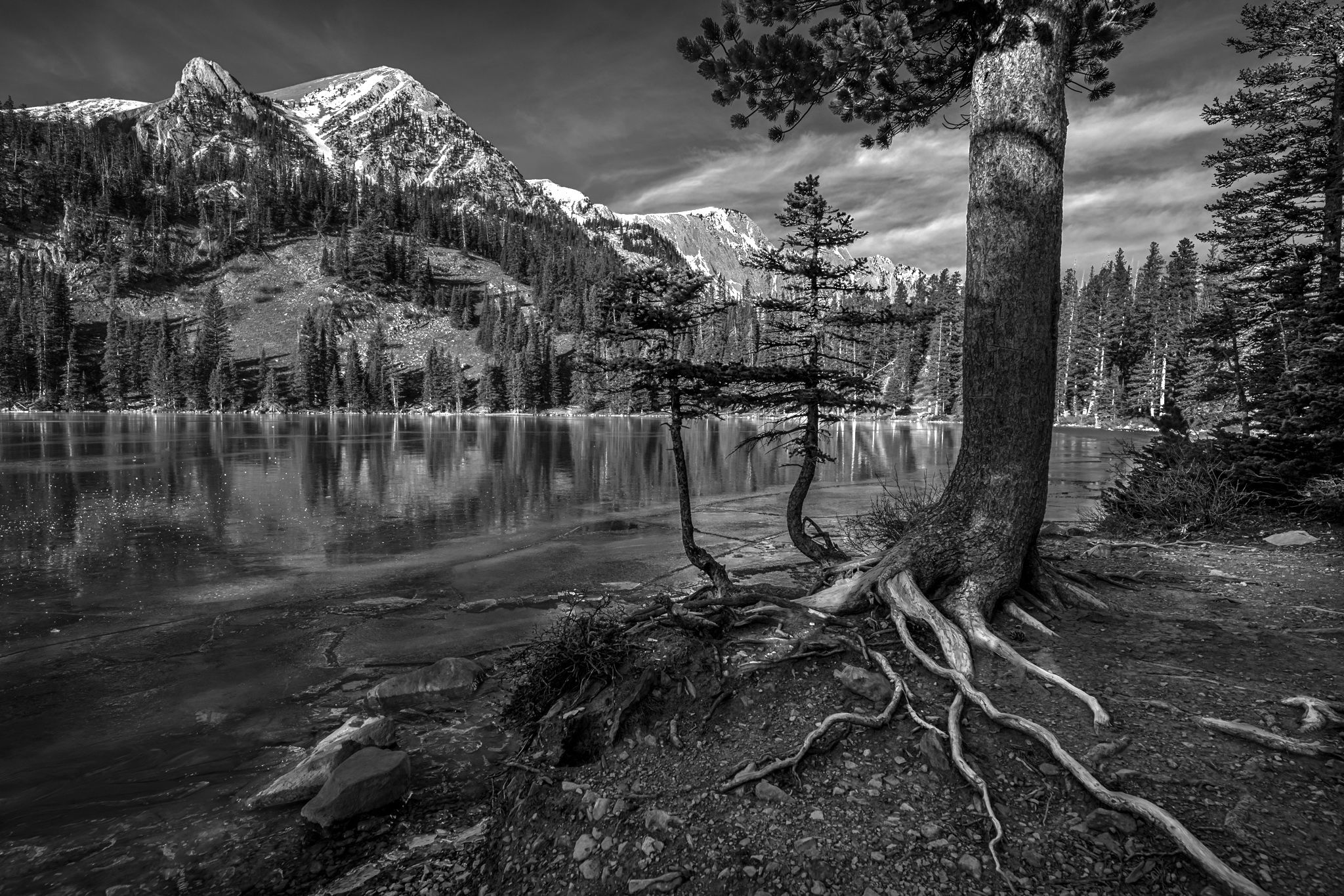
Its a beautiful B&W photo with rich tones. I can’t tell that the highlights are blown. I think you added just enough branches on the tree to make it work. The two smaller trees seem to be in the way for me. The large tree is a strong element in the composition balanced by the visual weight of the mountain peak.
Great description to go along with your photo. Smart decision on including some of the foliage to balance out the large vertical trunk. Those roots are a strong part of the composition. The dark tilted tree at the edge of the RS is a little distracting. Also I feel the image is quite dark for an obviously sun lit scene. Just my opinion of course.
I think you did a brilliant job the way you included the tree with just a few leaves. It nicely fills the empty space in the sky and balances the photo. WIthout the tree it would feel very left sided heavy. I also agree that the original is too dark and greaty prefer @Michael_Lowe’s redo.
A wonderful scene, and good comments above. I think @Michael_Lowe made a good suggestion on the brightness. I think you dealt with the large trunk very well, but it’s lean to the right (and the rest of the trees in the right quarter or so) bothers me. (Full disclosure: almost everything bothers me… ) If you have extra canvas on the right a slight distort could work well and also solve the dilemma of the trunk on the right edge.
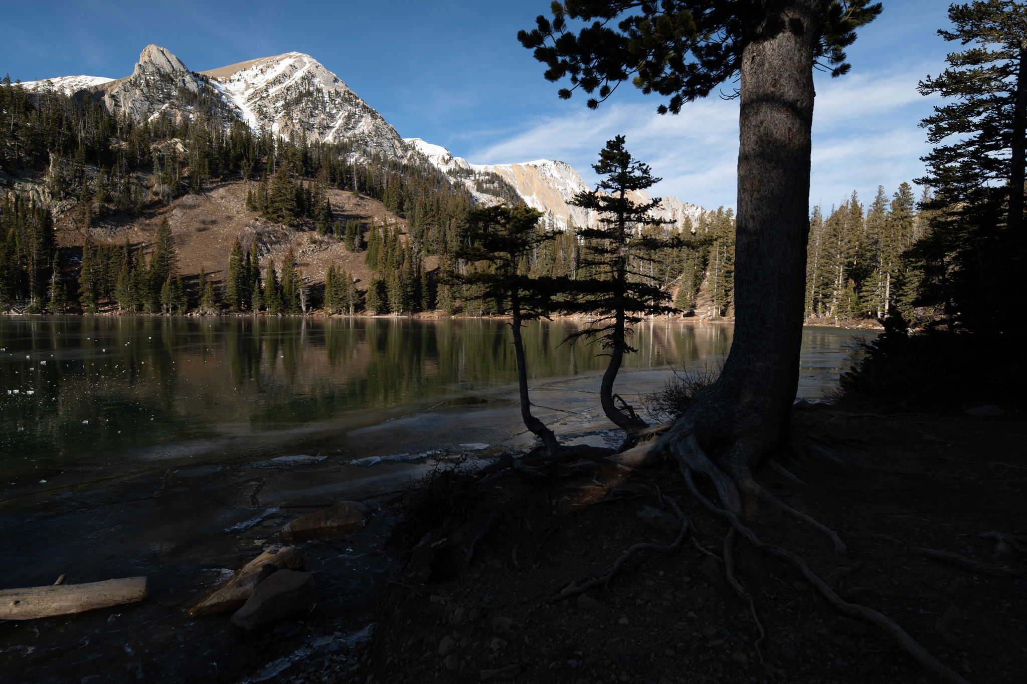
Paul: Love the scene and envy you the experience. My first impression was it’s too dark and I do like what @Michael_Lowe and @Diane_Miller did. Would love to see the color version as well as I think the comp would lend itself to that version as well. >=))>
This tree tells a great story, and you did wonderfully interpreting it. I like the lighter versions above and also like Diane’s idea of straightening some lines. I might even go further and suggest cutting off more of the right side to enable the roots to lead into the scene and give those small trees (kind of the next generation, if you will) a bit of a role.
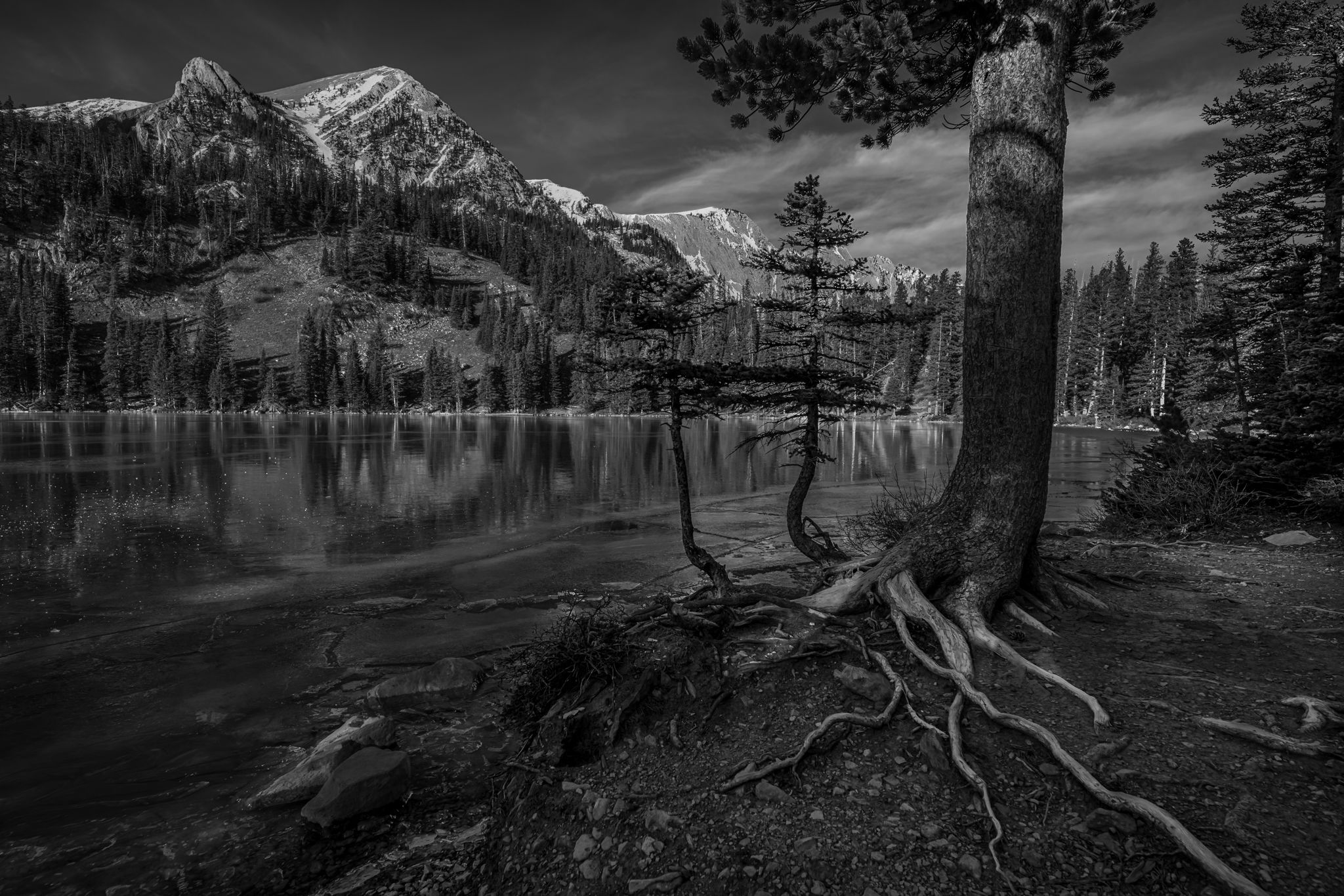
I did a crop that left some of the branches on the right edge, but I didn’t feel like the added length of the biggest root made much difference, so I cut the whole tree out of the frame. It’s just a quickie screenshot, hence the black edges.
If it’s too tight, you could keep more on the right and do some branch removal from the edge–if such removal is within your practice. I love it when folks give me ideas like this, and I hope you feel the same. Lots of great takes here, and you got the joy of being there. I think you shot this location earlier in the season too, where we debated the grasses at the edge? I’m envious of this location. I think it has great opportunities for you.
Wonderfully rich and fairly complex composition. The image focus point seems to be the roots but those two small curved trees are a wonderful second treat. I don’t think they block vision but are a feature in their own right. I do think that the image seems a bit dark but brightening it up has in my opinion made the snow too bright as well as the sky. The tonal issues may need to be dealt with locally and not globally.
Paul - This is a fantastic composition and an obviously beautiful mountain scene. I don’t know if it was intentional but I like how the top of the little tree behind the main one sort of “fits” within the “v” shaped gap in the pine boughs. It’s already been mentioned but I have to agree that your version is too dark. Of all the posted revisions I’m partial to Michael’s. The leaning tree doesn’t really bother me. It’s common for trees to not be perfectly vertical and even though this appears to be the result of wide-angle lens distortion, I’m okay with it. I have the 14-24 too and it’s an awesome lens but boy does it cause distortion if you angle it up or down even a tiny bit. Nice work!
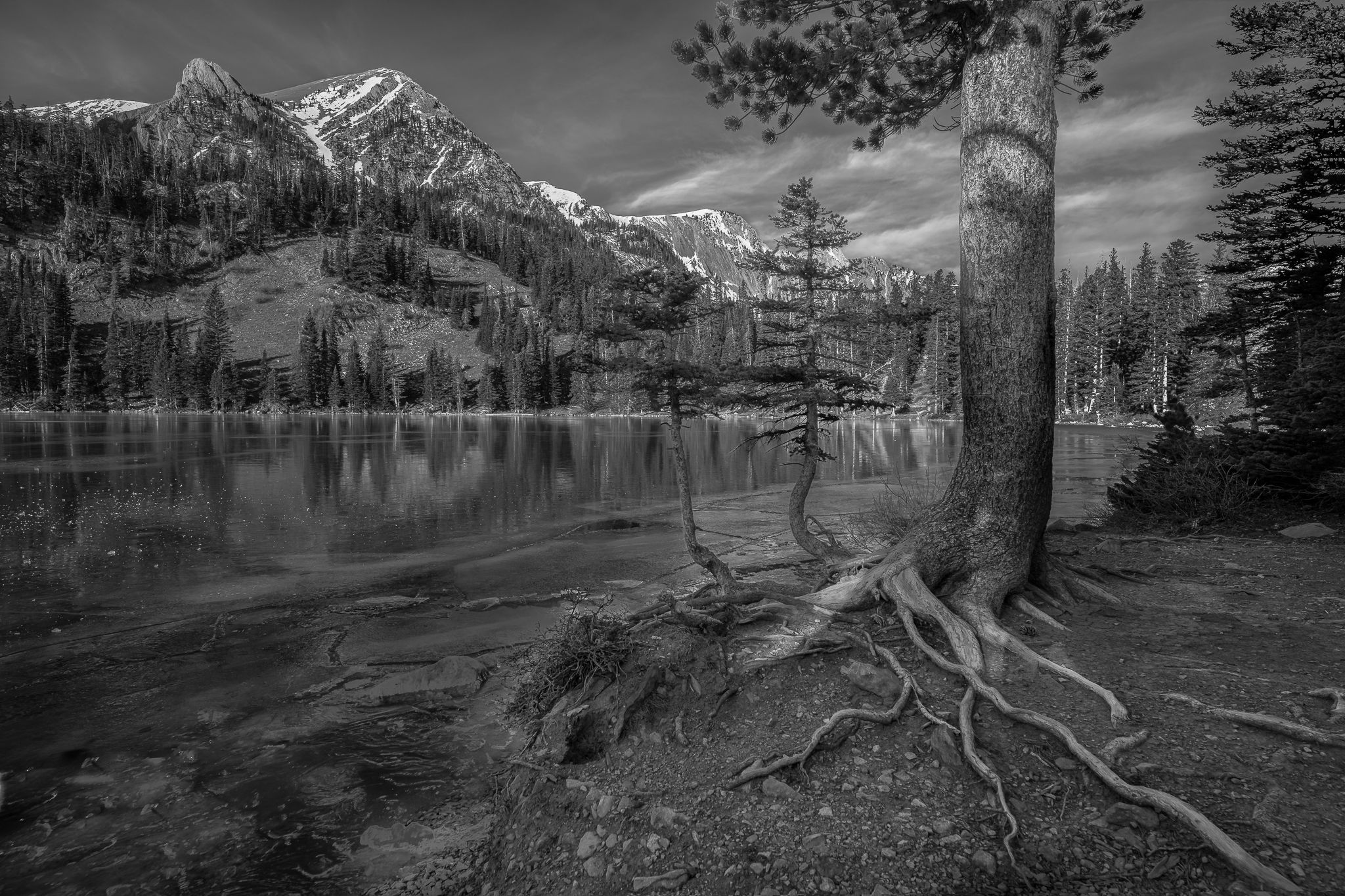
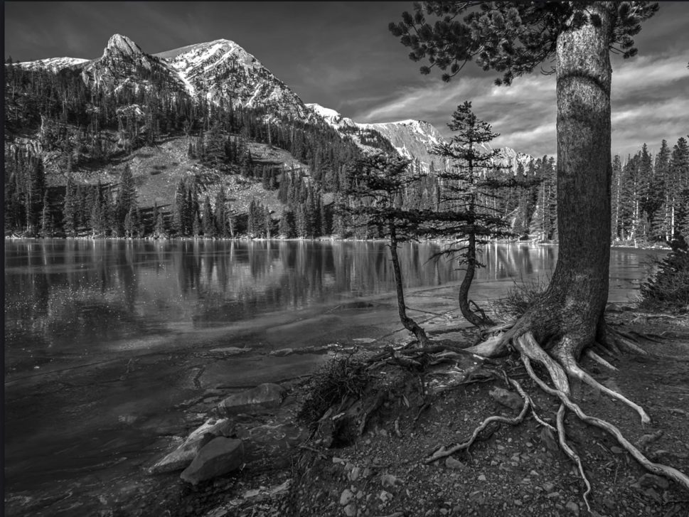
@Youssef_Ismail@Michael_Lowe@Gill_Vanderlip@Tony_Siciliano@Preston_Birdwell@Diane_Miller@Bill_Fach@Marylynne_Diggs@Igor_Doncov@Bret_Edge Ok, I had a go at lightening up the scene a bit. My personal preference is B&W is towards the darker side, but I do agree this one needed some help. I actually like leaning trees, but the dark trunk right at the right edge was distracting so I used the liquify filter to move it off the edge. If you see the unprocessed image above, you can see how shaded the foreground was. I exposed for the bright snow on the mountains but in the process probably lost some detail in the foreground. Anyway, Lightroom’s masking tool to the rescue! I added the new version at the top.
Paul, this is a fine, inviting view of this location. I like how you’ve used the roots as a visual lead in from the lrc. I also like the contrast in the foreground of the original. To me, the repost looks good on the far mountains, but it’s lacking contrast in the foreground and the emphasis on the visual line of the roots. It clear from the roots of the large tree that it must be leaning to the right, otherwise there wouldn’t be so much of the basal roots on it’s left side. I like the darkness of that big tree in the original as it provides more visual weight which better balances the mountains. It’s a complex scene, which gives you lots of possible adjustments.
I think the rework is a good step but I think @Mark_Seaver has a point about wanting more contrast around the roots, or maybe with a “graduated filter” on the entire bottom half?
Hi Paul,
It’s your image, and the shade and darkness clearly appeals to you. To me, we lose the dynamic quality of the roots when the foreground is so dark. If there is a way to add contrast and some brightness to capture those lines without losing the low angle of light feel you remember and enjoy, I think it will have wider appeal.
Of course, wide appeal is not always the goal. Glad we could help you think through the options regardless of where you end up.
ML
I’m well late to this party but I love the image. I like what @Michael_Lowe has done to brighten the entire scene making those roots pop in black and white. I might be contrarian here but I really like those two smaller trees growing out of the base of the larger tree and in Michaels version they really stand out. I suppose the tree on the right edge is a little bit bothersome and it’s easy enough to take care of but not a deal breaker if you chose to leave it alone. Wonderful capture and a beautiful composition.
Also a little late to the party Paul, but I’ll add my kudos. Nicely done. I think what you did with that big tree works just fine; it’s very nice framing for the ridgeline. Of the three you posted, my vote is for the bottom one.
Definitely prefer the third version. One thing, however, I preferred in the original color version is how the two small trees were almost silhouetted against the distance forest. That has been lost to a degree. Their upper branches now meld with the forest. That’s too bad because those two trees make the image for me.