This is my first triptych so I figured I better do some research on why this form of art even exists. It seems that the height of it’s popularity was in the Middle Ages. In those days it was common to tell stories from the New Testament in the form of a Triptych. These works of art were usually found in churches. I then realized that I had witnessed Triptychs during all my childhood and adolescence in the form of iconostasis that exists in every Russian Orthodox Church.
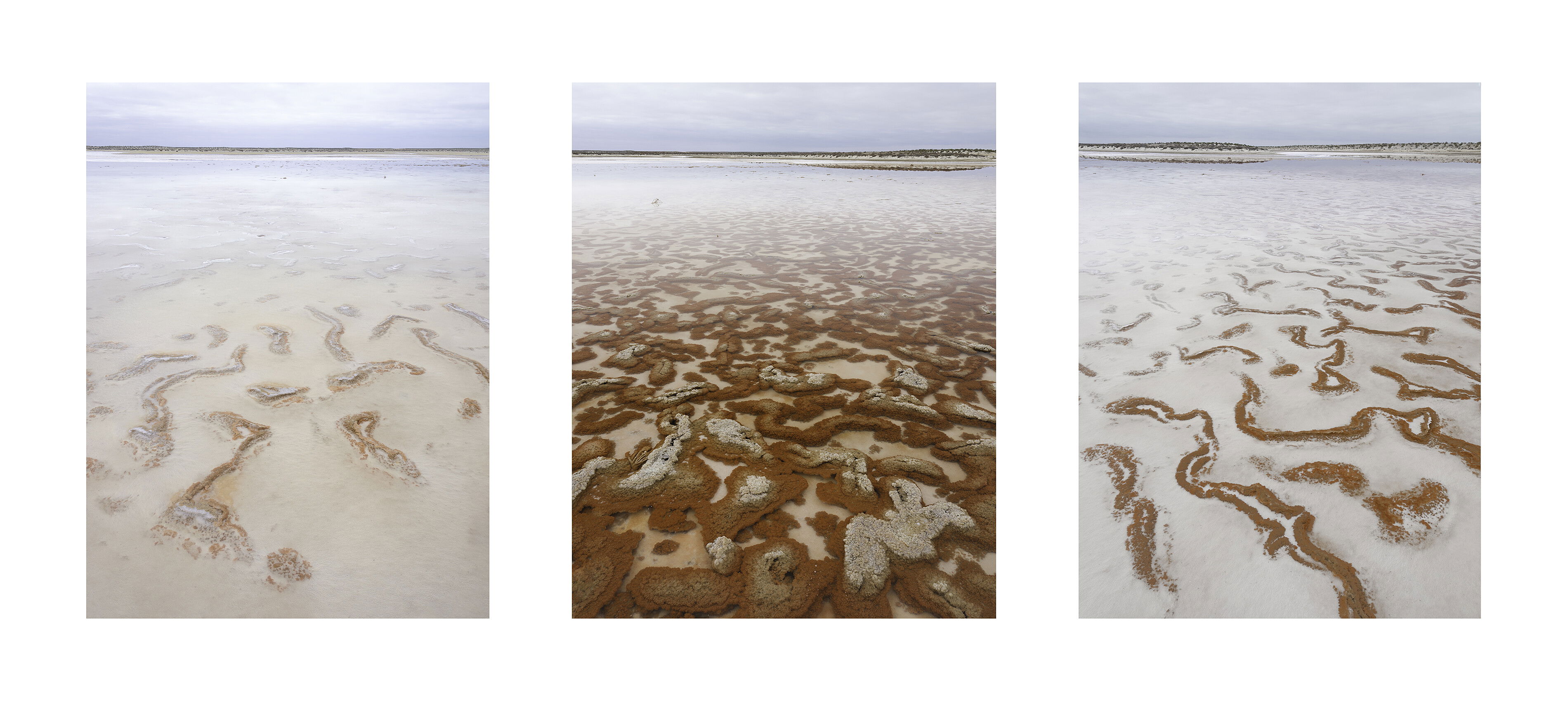
But this is a triptych that doesn’t tell a story. It shows the same pond in three different ways. Rather than show the entire pond with all three aspects included from front to back this shows them individually as three different characteristics of the same pond. I didn’t shoot this with the intent of making a triptych but when I saw how similar the horizon line was within the frame and the aspect ratio was I decided “why not”.
There were only two decisions needed to make this triptych: the width of the white space and the order of the image. My first inclination was to order them in the order as they existed in nature - from light to dark. But when I saw it I decided that the darker image at either end had a strong pull and your eyes were less inclined to look at the images that were further aware from the red one. The one on the left got the least attention. Another words the entire triptych had similar composition issues as each component individually. So for artistic purposes I placed the darker one in the center. There is also some overall symmetry that way. That was my reasoning. The white space I feel could be narrower perhaps, in order for the images to appear larger.
At first I thought that I would have to reeprocess all three images to have a very similar white balance. This was work I was unwilling to do for the sake of just presentation. You will notice that each is slightly different. However, once I made the triptych I didn’t feel that was really necessary.
Finally, are the images better together than apart? In a way yes and in a way no. The highest toned image, the one on the left, looks better on it’s own in my opinion. I suspect that the white background makes it look flatter than it did with it’s own light grey background.
So what are the benefits of this exercise? Well, I suppose that seeing all three images together rather than individually may be it’s best feature. However, I do think that thinking and Planning a triptych before starting one might result in something better. Unlike a painting, that may be much harder to do in photography.
I don’t usually like to critique my own images as I did with this one. However, I did so to see what your thoughts are on my thoughts and of course the triptych as a whole. Order, spacing, and processing.
Thanks, Igor, for sharing your thoughts and processes for this triptych. You’ve brought up many good questions and pointers to consider. Personally, I do like how you have decided to place the images in the triptych, with the darker photo in the middle for the reasons you’ve stated. Also, I would reduce the amount of white space by perhaps half (?) because, at least for me, less white space would put more emphasis on the images. I am totally enjoying seeing them all together.
Igor, this is an outstanding triptych in my opinion. I love how the images horizons line up. I think you’ve chosen the right amount of white space between, and added a bit more around the frame. Are they better together? I like them separate, but this provides a theme that they all can share. So both ways work for me. Great exercise for you, Igor. And a successful one in my opinion.
Wow. I absolutely love this Igor. My first thought was that the horizon of the right image didn’t quite line up with the the image to its left so they seem ever so slightly disconnected. I really like the order you put them. That one in the center absolutely needs to be in the center. Also, because the horizon and the small dune like hill that the center image and the right image share, I think those two need to be in the order that you put them.
I actually like the size of the border that you’ve chosen. I have no nits with that at all. No need to reprocess the images at all. In looking at the sky, they feel very unified. Also, the part of the water in the midground all looks relatively similar in luminosity and tones.
This is extremely beautiful. I would print this and hang it in your home if it fits with the décor. I just love it.
Also, thanks for the history lesson. I had no idea.
Question, how did you frame these together in photoshop?
HI Igor. I do like the idea behind the triptych.
In fact none of the image alone really caught my eye, but together they make a lot of sense. The whole being bigger than the parts.
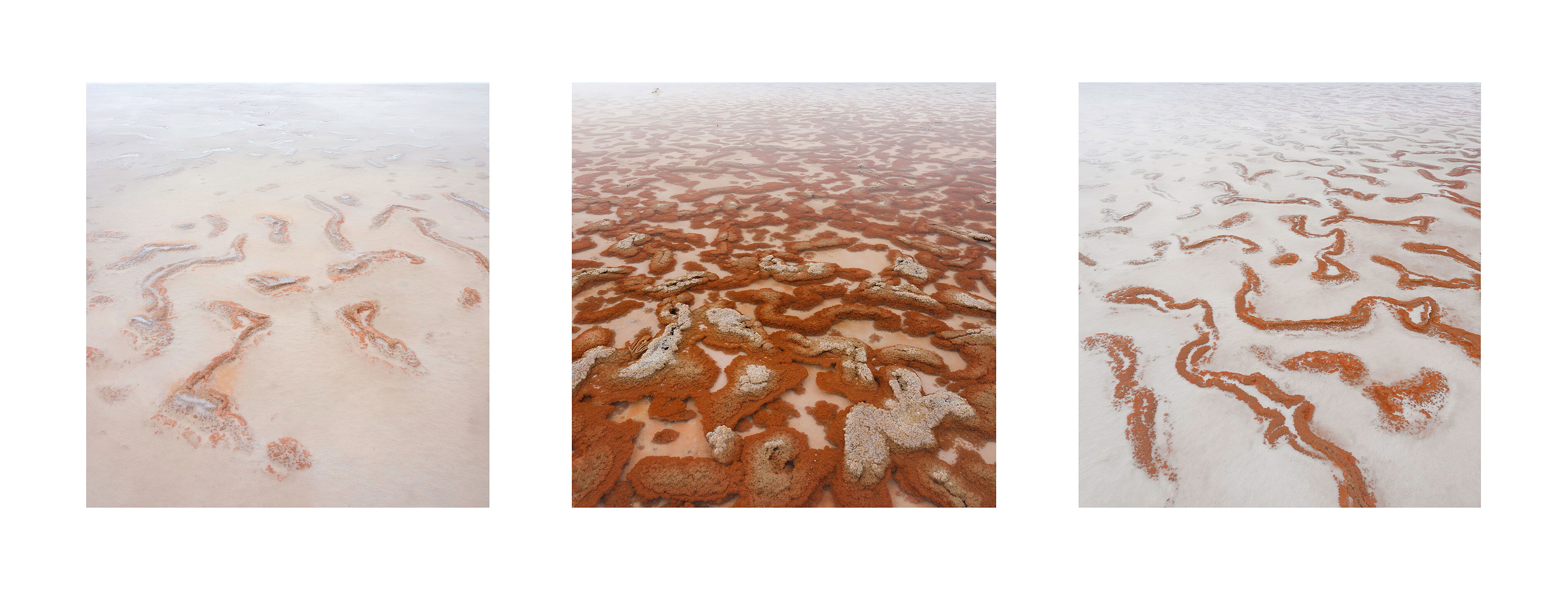
I wonder if you try , using the same horizon line and the small dune that @David_Haynes mention; and thinking in the horizon line only as a way of bind elements together, to reposition the pictures (and using 1,2 and 3 as their current position) to 3, 1 and 2.
Unbelievably simple. First you figure out the width and height of each image in pixels. Then the space between and around each image. Add them up to find the total dimensions of the triptych in width and height. Click on NEW under FILE in photoshop. Enter the dimensions and specify white for the triptych and create it. Then open each file separately in photoshop each in its own tab.
Then for each file
(1) go to FILE and pick COPY.
(2) Go to triptych tab and FILE and PASTE.
(3) pick the topmost tool on the lef in photoshop that is used for moving.
(4) click and drag the image, which is a layer, to the position you want.
Flatten all layers and save image.
I was working with the jpeg files that I already used at NPN to save work. There’s a link to a YouTube video that’s very helpful. I’ll provide the link when I’m at the computer.
Thank you very much Igor. By the way, I think I like these better together in the triptych than on their own. I believe they compliment each other beautifully.
This is really wonderful, Igor! Your three images go really well together and I’m glad you decided to make them into a triptych. Also, the way you arranged the images (left to right), is perfect and over all the triptych ‘reads’ well.
The triptych works beautifully here - I think a great choice. Both the “snakes” and the horizon lines tie them all together nicely. Personally, I don’t see why there needs to be a story to be told or learned here. Actually, the viewer can learn something about the location especially given the viewer has likely not ever been there to witness and experience.
the order/placement of the frames I agree, work best with the darker in the middle. The horizon line going left to right makes me think of multiple images shot for a pano stitch… but of course the tonality of the lower frames in each put a stop to that thought…
Triptych is working quite nicely for me. thanks for taking the time to give it a shot.
Nice triptych. The horizon in just the right place. I have designed a similar sandy beach triptych but with a very long exposure time. These are nice to do, to train the eye and the thought
Thank you for your comments and suggestions. I rather like the current order of the images. I do agree that changing the white space could affect the result and perhaps improve it somewhat. How valuable is such a presentation? Well, if I were to place these images on a wall side by side I don’t think they would be as effective as a triptych. So in terms of presentation it’s useful. I guess it forces the viewer to compare on to the other. The comparison hopefully makes the user aware of something he would not feel if he/she were looking at individual images. I’m not sure this particular triptych accomplishes that. I think @jorma’s do a much better job of that.
On second thought the reworked triptych doesn’t work for me without the horizon line. All three images grow lighter as you go from bottom to top and without a horizon line it’s baffling why that should be. In my view the triptych is better with the horizon and sky.