The photographer is looking for generalized feedback about the aesthetic and technical qualities of their image.
Description
Storm cloud over Ein Gedi,
During the last winter we didn’t experience a lot of big storms, but when those storm cloud arrived they arrived with amazing power and extremely high amount of rain.
During this day the weather forecast predicted extreme rainfall I managed to capture this storm entering the Deadsea - sure a few moments after taking this shot I was covered by heavy rain.
Hi Idan, what a great image and a great mood! Well captured!
There are a few things from my pov that could be done in the editing to strengthen the atmosphere.
You’ve got side light from the right, but there’s no obvious light source. I would try to paint in some diffused, hazy light coming from the right. Also, the mountains could profit from some more haze (sorry, I‘m a haze guy, haha), especially that small part of the mountains further away. I don’t have my laptop right now, but maybe you don’t mind if I give it a try tomorrow?!
Anyway, great image!
Have a nice evening,
Markus
here’s my try. It’s a bit rough, but it conveys how I see the image. I enforced the light coming from the right side with a bit of warmth (mostly in ACR) and blurred it a bit in order to get a transition from warmer to cooler tones. Therefore I changed the color of the clouds to blue, but took down the saturation a notch.
Then I dodged the edges of the salt a bit more. I put some haze on the mountain in the back to convey a feeling of distance and enhance the overall atmosphere. Finally, I blurred the highlights just a bit with an orton effect.
I don’t know of you like interventions like these, but I am always trying to make my images more atmospheric with measures like this. Hope you like it!
Hi Idan,
wow, that is an impressive image. The salt patterns lead the eye nicely into the frame to the mountains in the background with the dramatic clouds above.
I love the dramatic mood and the contrast between the cold and warm tones.
If I had to change something about the picture, it would be the following things:
the small very bright patch in the clouds in the upper left distract my eye slightly. I would burn that area slightly.
There is the red and white colored pole on the left. I would get rid of that. @Markus_Albert already addressed that in his rework.
there are some dust spots in the clouds
the mountains in the far distance are very crips, I would reduce the clarity on the mountains slightly
there is some slight red color cast in the upper right in the clouds:
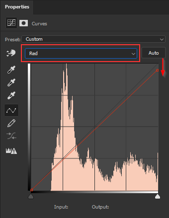
Maybe you can review your workflow to identify where that cast was introduced. Just in case you want to fix that cast, here is one way to do that: I like to use Curves Adjustment Layers in PS or the Curve Tool in LR or ACR for such color work:
Just switch to the Red Channel. Dragging the curve down reduces red and adds green to the image, dragging the curve up does the opposite. That works for the other channels accordingly: Blue → Yellow, Green → Magenta.
After adjusting the curve I just added a black mask and painted with a white brush to reveal the adjustment in the problematic areas.