The photographer is looking for generalized feedback about the aesthetic and technical qualities of their image.
Description
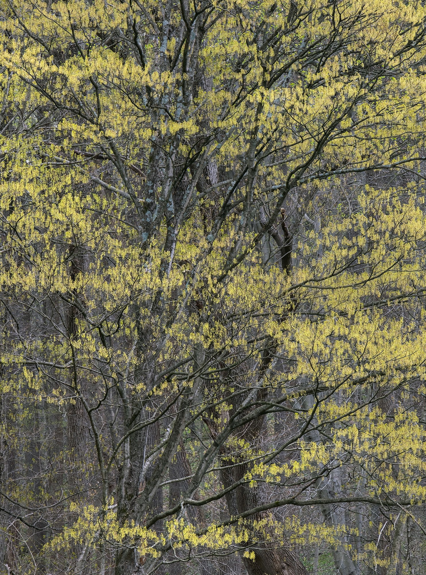
Another from my excursions in April looking for the colorful early spring leaves as they start to emerge. This scene is a crop from the left side of the original image taken in Shenk’s Ferry Wildflower Preserve in PA. It is a beautiful place full of numerous wildflowers and I plan on going back next April.
Specific Feedback
Does the area toward the LLC being mostly devoid of leaves bother you? My first impression was wishing a few more leaves were there, but then decided that I like the glimpse of the woodland behind those two main trees as it seems to add some depth to the image. I thought about cropping a little more from that side, but wanted to see what everyone thought about it. Anything else you notice please feel free to mention it.
Technical Details
Nikon Z 7, Nikon 24-200 @ 200 mm, f 13 @ 1/13th sec, ISO 100, Kase magnetic CPL, cable release & tripod.
Critique Template
Use of the template is optional, but it can help spark ideas.
This fits nicely with the series you have been posting.
I find I am most sensitive to balance in the corners, and since both the lower corners are sparse this looks fine to me.
The imbalance is above the corners, and that doesn’t jump out to my eye at all. I don’t think I would have thought anything about it if you hadn’t pointed it out. I agree that the depth adds to the image, and wouldn’t crop any more at all.
Ed, I think this is your best image from that morning. I think the emptiness in the LLC and LRC is balanced out nicely by that horizontal strip of yellow leaves.
This is a wonderful capture, composition and presentation. I agree with Michael on the LLC or the empty area you referenced, in that I think it all balances out nicely. That bit of openness at the bottom actually lets the whole scene breath a little bit and the viewer gets a greater sense of location and context. Beautifully seen and captured.
The only suggestion I have - and this fits in the personal choice section, would be to increase the luminosity and/or sat/vib of the emerging leaves. As presented this looks beautiful and very natural. I have a tendancy to push things a little - YMMV!
I’ved loved all the images from this series! Well done sir!