The photographer is looking for generalized feedback about the aesthetic and technical qualities of their image.
Description
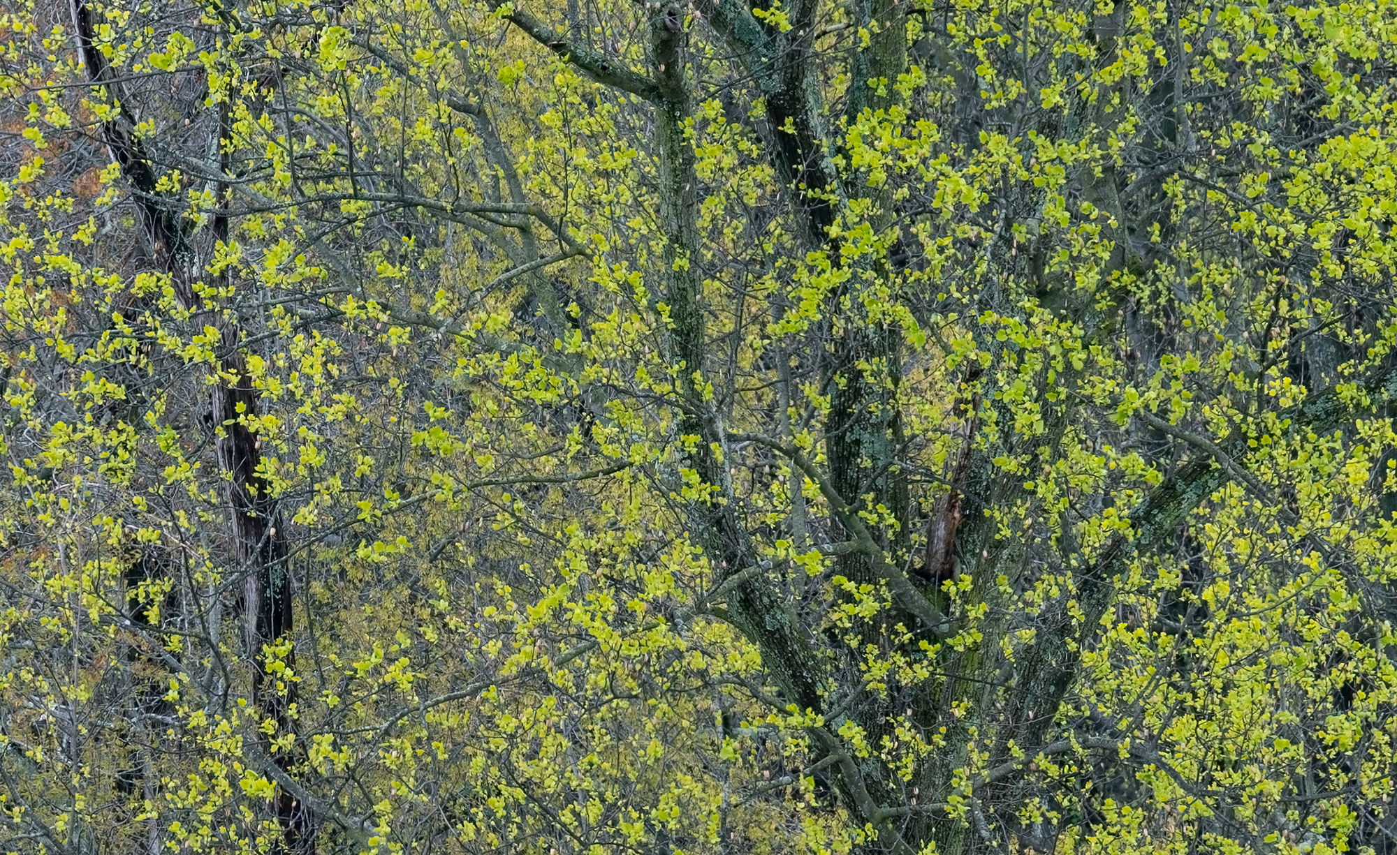
This is another cropped scene from a raw file of a colorful grouping of trees; situated across some farmland that I found; while returning from Susquehanna SP in MD. It would have been nice to get closer, but I did not want to trespass across the field. I liked the fact that you can still see little snippets of the BG woodland through the emerging spring leaves.
Specific Feedback
I am on the fence about dodging the tree on the left side so that it is not quite as dark. Any thoughts? Other than that I am fairly pleased with the image, but if you notice anything please feel free to mention it.
Technical Details
Nikon Z 7, Nikon 100-400 @ 380 mm, f 11 @ 1/25 sec, ISO 100, Kase magnetic CPL, cable release & tripod
Critique Template
Use of the template is optional, but it can help spark ideas.
Very lovely, with a very pleasing arrangement of branches/trunks. It evokes a very pleasant, quiet spring morning for me and I would consider a graduated adjustment to lighten the area on the right. The difference across the frame is interesting and not a negative, to me, but it is such a lovely tapestry that evening it out feels good. But it’s lovely either way!
Spring color is one of my favorite topics. The image is very nice. The only thing I might suggest trying is to add a little color separation between the foreground and background . The background trees look to me as if they are an orange/red. You could use the point color tool to select them and push them a little further in the red direction and/or add a little more saturation, to distinguish them from the foreground green trees
Another lovely intimate image of trees and their new sprung green leaves.
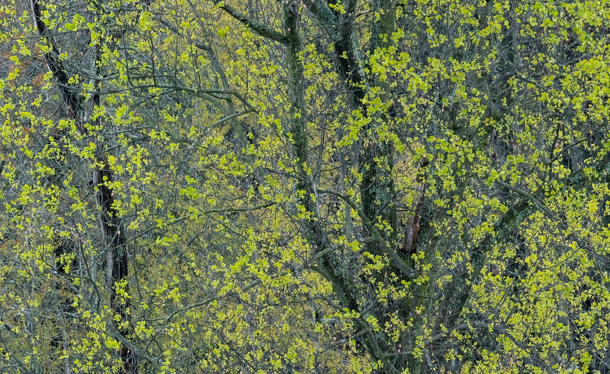
I actually love the dark nature of the left tree trunk and if anything I would burn the right trunks to match the left. However, I am seeing a little bit of magenta cast on the left side of the image where all the dead branches are and the left side feels different than the right side. I’m not sure if I’m describing it correctly but maybe I’ll have a try at redoing it to actually see what I’m seeing. It may be my monitor as well. In any case, this is really nicely seen and composed and you’ve got wonderfully soft light. Here is the redo:
Negative 40 on the tint slider just on the left portion of the image to remove the purple hue
Thanks so much everyone @Ben_van_der_Sande, @Diane_Miller, @WillR, @Michael_Lowe and @David_Haynes for your thoughts on this image; always appreciated. I am thinking about making a print of this so your C&C has given me some ideas. I just have to get my brother to make me a larger file as this was a substantial crop. @David_Haynes : Thanks for taking the time to do a rework with your suggestion. I like what you have done.
Sorry, I’m way late on this one, but couldn’t go on without commenting.
For me, I think this might just be my favorite of your series from these outings. A couple of the previous images had a kind of yin-yang effect, or had gaps/spaces left open, minus the emergence of colors - (not a bad thing mind you, just different comps, approaches.) What I’m really enjoying here is the complete “veil” of coverage; quite literally a snow-storm of emerging spring greens almost as an independent layer - or veil. The tree structure beneath is strong, but not overbearing and I think the two elements are balanced beautifully; including the solitary trunk on the left.
Glad to hear you want to print this - it should be gorgeous!