Please share your immediate response to the image before reading the photographer’s intent (obscured text below) or other comments. The photographer seeks a genuinely unbiased first impression.
Questions to guide your feedback
What is your initial response to this, either aesthetically or emotionally? Does it convey a certain mood?
Other Information
Please leave your feedback before viewing the blurred information below, once you have replied, click to reveal the text and see if your assessment aligns with the photographer. Remember, this if for their benefit to learn what your unbiased reaction is.
Image Description
This is a composite of two ICM images of the same scene, moving in two different directions.
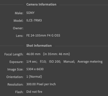
Technical Details
Here’s the camera settings, FWIW:
Processing in ACR and PS. Mostly basic targeted exposure adjustments, layering in PS (darker color blend mode for 2nd image), saturation & contrast adjustments.
Specific Feedback
Looking for aesthetic feedback, mainly. I want this to look like spring, hence the softer contrast.
Critique Template
Use of the template is optional, but it can help spark ideas.
I certainly get a feeling of spring and energy out of this, Bonnie. The kind of sharp borders on the green and the consistent direction of flow seem to speak of a strong wind and the shade of green is distinctly early spring. The brightness of the image also helps convey a feeling of spring to me, so I’m ending up with a sunny spring day with quite a brisk wind. It’s a very pleasant image to look at and I think it’s one that would last on the wall.
Yeah – energy and light! (Good energy!) Clever processing! On first glance I would not have guessed it was a composite, as it has an organic wholeness to it. But then I start wondering how you did it. I shouldn’t do that. I’m just going to enjoy the energy! Well done!!
Hi Bonnie,
I really like this image. The greens are perfect for spring, and the sense of water or ice or something encasing the subject or separating the viewer from the subject feels perfect for that transitional period of growth and also some April showers remaining possible.
ML
Brilliant image Bonnie! I get impressions of Japanese bamboo swaying in the wind. Love the quiet energy of the image. Tranquil Zen-like vibes to it. It also feels like a water reflection abstract too.
The high key treatment works perfectly. The green pairs nicely with the blue tones. The colors do give off Spring energy. Wonderful work!
It looks like a Cezanne in a way. He would build up an image with geometrical shapes of color. I like it but I think photography shouldn’t try to mimic paintings. It’s a big subject though and I don’t want to start anything.
Love these colors, Bonnie, as well as the proportion of ground to figure. It’s a bright and cheerful image on first impression.
I gotta admit, though, that the diagonals don’t add to the image for me. They seem unnatural and out of place with such a natural subject. But really, it’s only my opinion and if they work for you or anyone else, so be it.
That’s what came to my mind, also - a strong wind through spring foliage.
I think the organic wholeness may be because the two images were made in quick succession one after the other. The light and colors were the same in both. And it’s fun to wonder how it’s done!
My husband thought of ice or sleet, also. It’s the diagonals, I think - it looks like ice sometimes does. I hadn’t thought of that.
I can see the bamboo analogy, too, although I hadn’t thought of that. Thanks for the EP!
Oh, but you did start something! I’m not offended, but I would point out that I think that those of us that make abstracts/ICM/composites aren’t necessarily trying to mimic painting. We’re doing what we find interesting and it happens to look “painterly”.
More broadly, why shouldn’t photographs try to mimic paintings (or have their work simply end up looking more like a painting even if that wasn’t the intent)? Why shouldn’t we use our tools in any way we want?
Igor, a lot of people share your view. I agree with Bonnie. When I do something abstract, I’m not trying to mimic a painting. I’m just trying to create something that engages me and engages viewers.
Abstracts tend to be ambiguous. Ambiguity can prompt viewers to fill in the missing details in their minds. Abstracts can surprise me. More documentary photos seldom do. I like being surprised.
This isn’t something I’d ever be inclined to argue about.
Agreed. However I am not arguing between ambiguity and narration. Straight photography can be ambiguous. Check out the work of Minor White or even Edward Weston. Their work is as you say “surprising”.
My initial reaction to this is that it is full of vibrancy, life, and good energy. I love the greens and the chaos. This is definitely an energizing and uplifting image and makes me want to get up and do something active.