What technical feedback would you like if any? Anything. This is an HDR image.
What artistic feedback would you like if any? I am wondering if this would be a stronger image if there was a person standing on the flat rock in the foreground.
(If this is a composite, etc. please be honest with your techniques to help others learn)
If you would like your image to be eligible for a feature on the NPN Instagram (@NaturePhotoNet), add the tag ‘ig’ and leave your Instagram username below.
Hey Terry! I like the composition of having the ephemeral drainage start in corner and lead ones eye through the scene. The view definitely has some nice light. I hope you don’t mind but I did some quick edits in Photoshop. I though it best to show you the results. Selective color adjustment to shift the colors around the sun to remove some greenish tint. So I added some magenta. Also in selective color. I added yellow to the blues to minimize the strength of those blues in the distant mans. Then I added a curves adjustment layer…basically a S curve. The I added a Orton effect with a mid tones luminosity mask. The result if different. Not necessarily better.
Cheers,
Ken
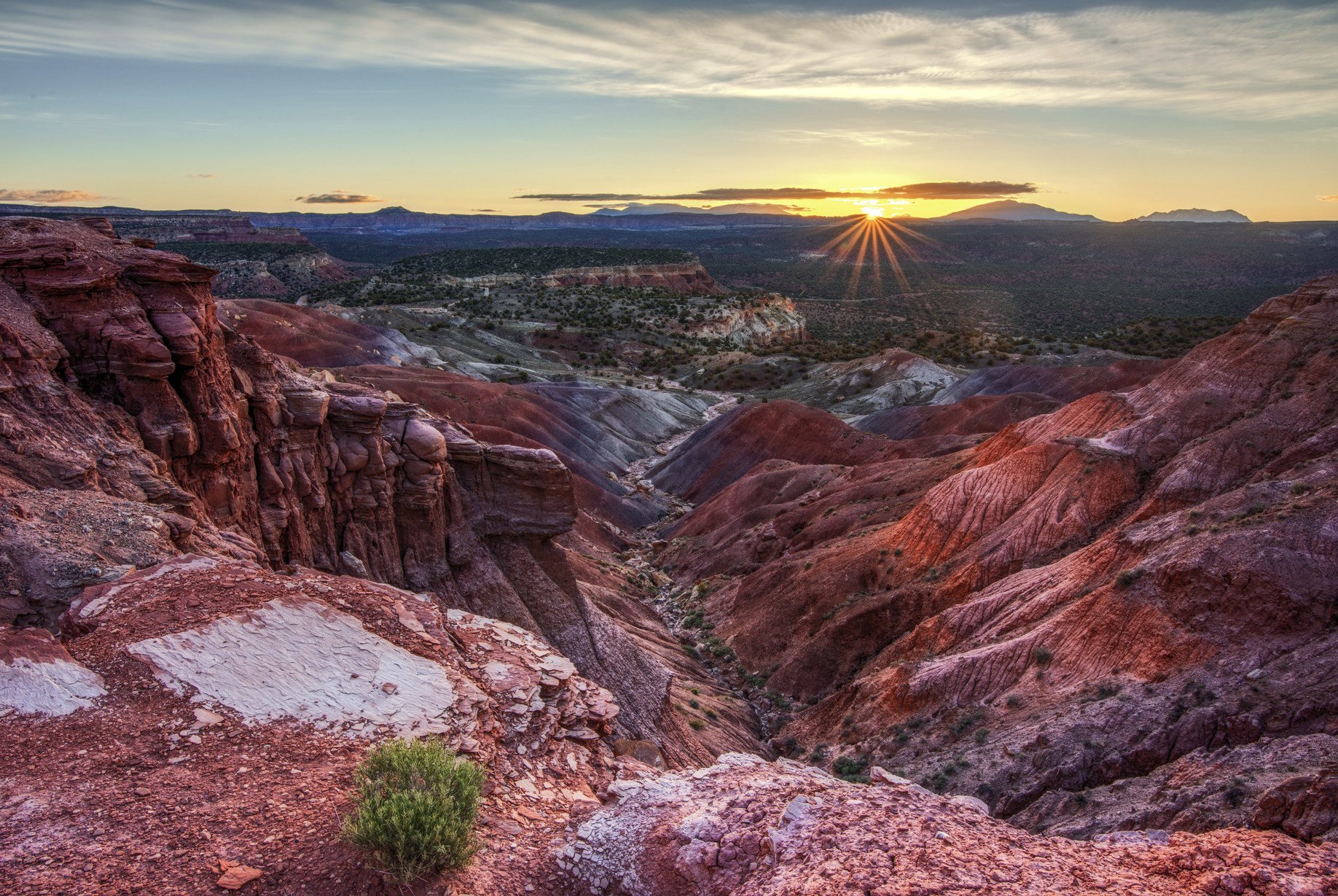
Terry, I prefer your original image as I find the colors more natural. The only change I might make is to clone out the green bush in the foreground. To me, it is a bit of a distraction. Would a person make the image better? Not necessarily, but if it did contain a person, I’d want to see the person about 1/3 to midway into the image to give a sense of scale. This, of course, may not be possible. Bottom line. I like the image as is. No real nits.
That was my thought as well. Green on red can be effective but it’s too close to the edge of the frame. I like the overall composition with the arroyo leading towards the sunrise. I prefer the original. BTW, the white patch to the left of the bush is also an attention getter.
Terry, I love the composition you have here, it just pulls the viewer into the scene. I also prefer your original processing over the more contrasty rework by Ken. And nice sunstar BTW, you tripped the shutter at just the right moment.
In terms of tweaks, I would add some stronger vignetting, especially along the bottom edge. I would also burn down the mid-tones in the LLC where you have the bright patches mentioned by @Igor_Doncov. These tweaks would focus more attention on the center of the image. Also notice how these tweaks make the green bush stand out more in the image as well.
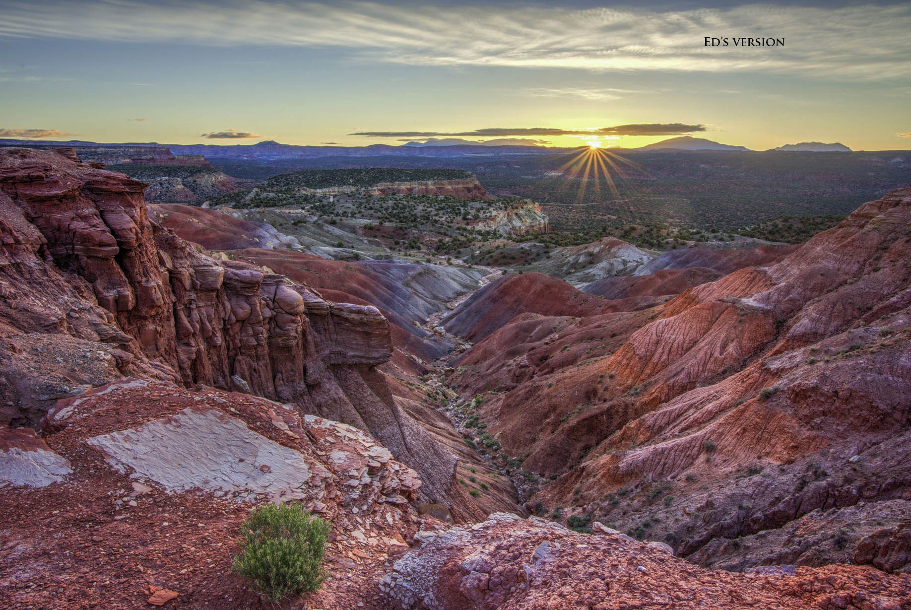
Regarding your question of whether a person standing on the edge would make this a stronger image. I’d say it depends on for what purpose you intend to use the image. Instagram, or a camera club judge, would love to see a guy in a red jacket standing there. As a classic southwest landscape, my personal opinion is there is plenty of good stuff going on here in the landscape itself, that a person is not needed. I think the burning in my rework makes the green bush more prominent, which creates a stronger foreground element. I’m not even sure whether it would sell better with or without a person, it depends what market it is intended for.
Beautiful desert sunrise landscape image. The sunstar looks great and I like how it’s directly connected to the little green bush up front. I like what both Ken and Ed did to the foreground bringing out the light and shadow a bit to make that connect to the sun even stronger. Sure, it’s close to the edge, but I think that little bush also works give this grand landscape a little more depth.
Processing wise, I like Ed’s rendition that evened out the luminosity a bit front to back. The only suggestion I have is to pull way back on the blue, specifically targeting the far mountains to the left of the sun. At least for me, that’s the only part of the image where the color doesn’t seem right.
Oh, as far as a person. Agree with Ed, it’s really only matters on what the intention of a print or stock image might be. In the case here, I see no reason to have a human presence.
Terry, this is a beautiful image as is! Well done. Of course, we all have our individual subjective nits. Mine is that the sun and starburst is so bright it draws the eye right there and the beautiful landscape in the middle of the photo is lost. So here is my turn at editing: I brightened the center of the photo slightly and darkened the sun and starburst slightly. Also I darkened the bottom rocks a bit to keep the eye drawn to the center.
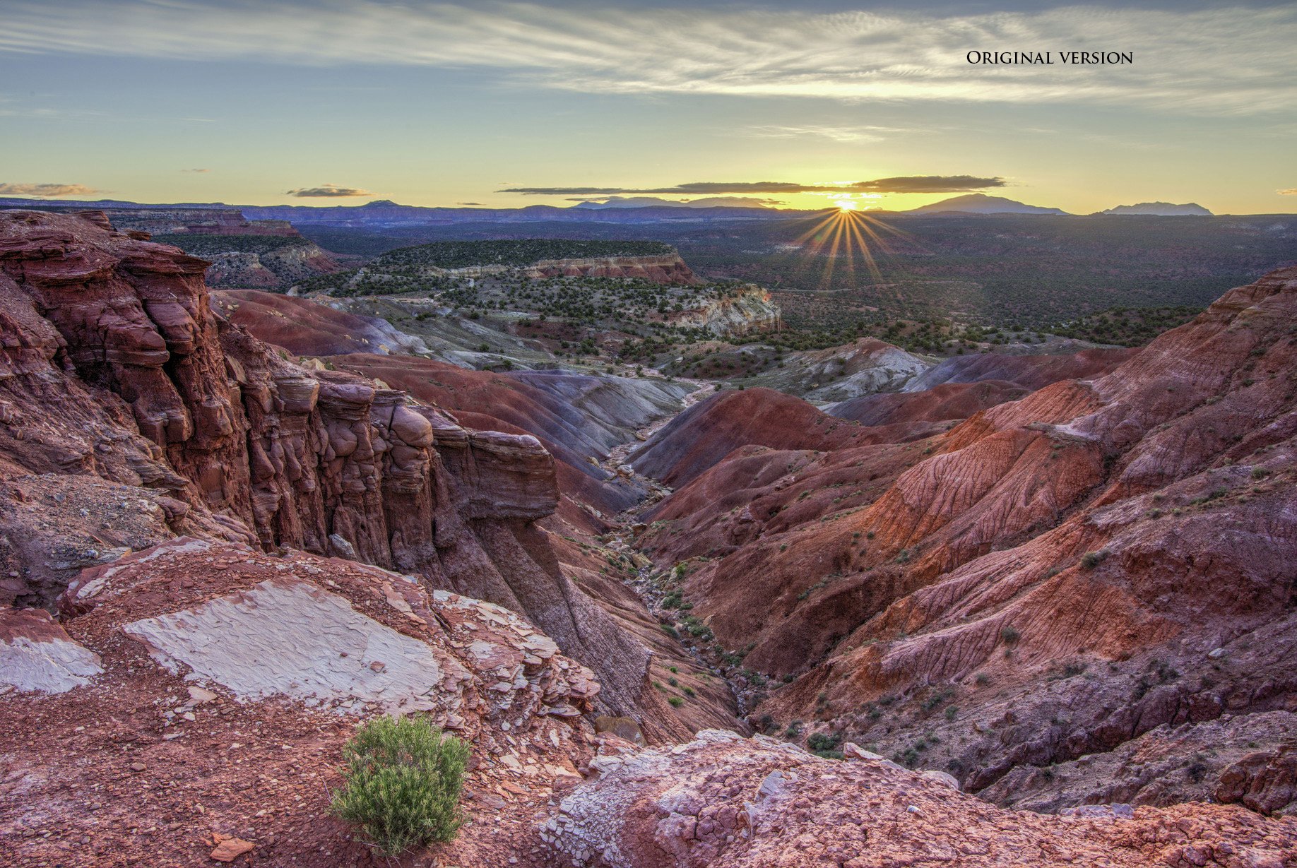
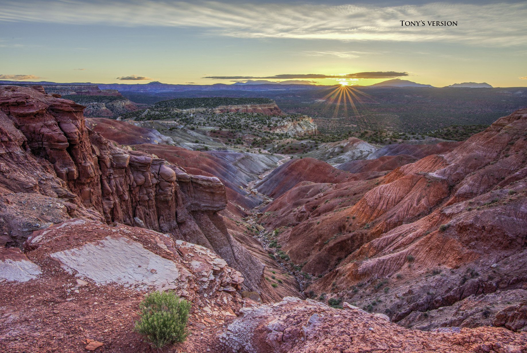
Beautiful scene, for sure. I like some of the suggestions and not some. I like @Ken_Henke’s color adjustments, and some of @Ed_McGuirk’s adjustments but not all; same with @Tony_Siciliano 's. I also made a tiny crop off the top (to rid that little strip of blue), and a tiny crop off the right side, then reduced the contrast in the middle part. It’s so hard to compare all the changes so I downloaded all of them, along with the original, added mine, and labeled all of them so they can be compared side by side.
Thank you to all for the comments. I can’t tell you how helpful all of them are. It is great to see the differing opinions and styles. I am experienced at photography but still a neonate when it comes to Photoshop and will have to research how to do some of this. I can say though, that every comment was very helpful and enlightening.