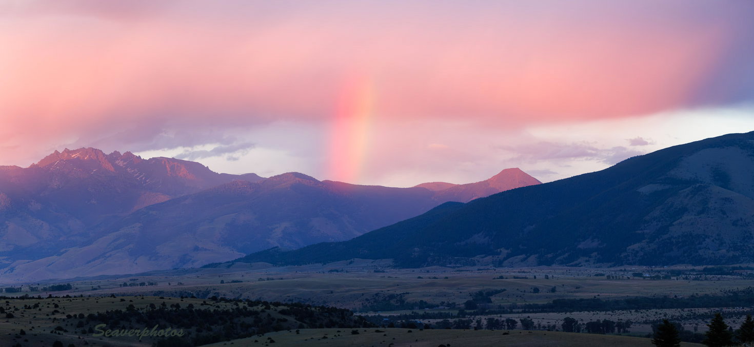
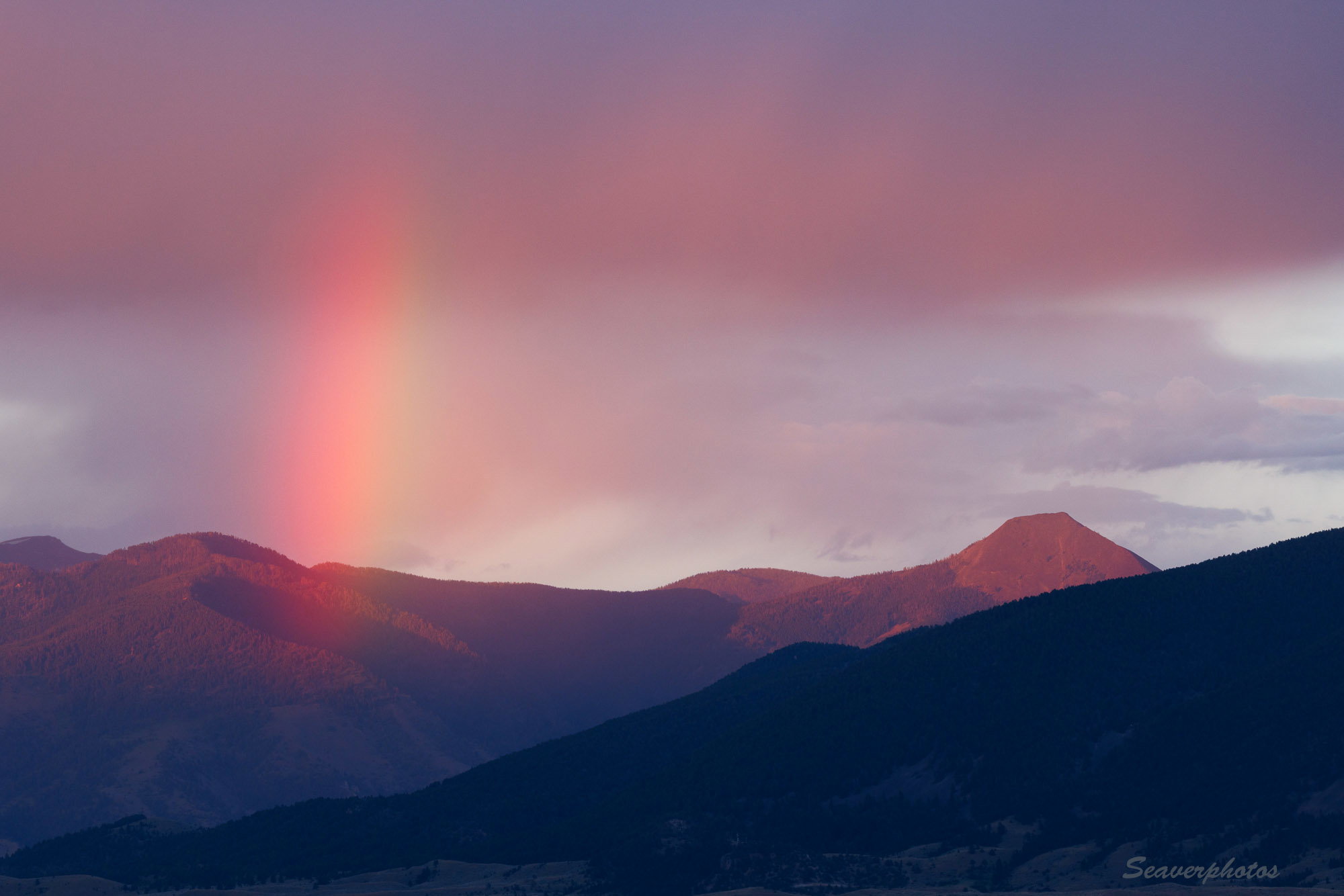
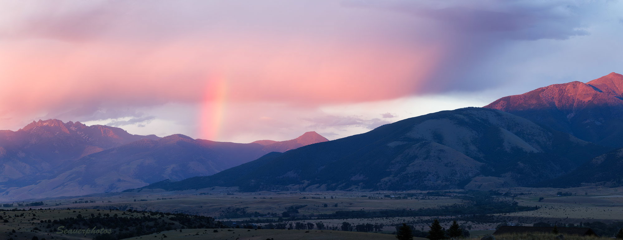
I like both images, and they’re different enough that I’m not sure a comparison is useful. I think the combination of the sunset illuminated clouds and the rainbow make a unique color palette.
In both cases, I think the side of the mountain in shadow could be either lighter or darker. It’s a little too light for a silhouette, but doesn’t have enough detail if it’s not a silhouette.
For the pano, you might try a crop from the right. While I like the sunlit peak there, it’s sort of off by itself on the edge.
I honestly can’t choose a favorite between these two images as both are beautifully done; although I am slightly leaning toward the pano. Both scenes contain the important elements; which are the rainbow along with that wonderful red glow both in the clouds as well as the mountain. The first is more intimate, while the second is more expansive. I quite like that warm light on the mountain along the right side of the pano as I think it does a wonderful job of balancing the light on the left side of the frame. Sorry that is not much help, but bottom line is that I don’t think you could go wrong with either version. My final thought is that the pano would make a lovely print and look great hanging on the wall of your Montana home.
I also like both – a lot – but if I have to choose I’d go with the pano, just for the context and lovely expansive scenery. The rainbow itself seems more subdued in it, though. Could it be brought out a bit more?
And Mark, somebody here some time back mentioned a book about atmospheric optical phenomena – was that you? I’ve meant to look it up and have forgotten the name but today a friend mentioned “The Nature of Light and Color in the Open Air”. Wondering if that was it, or if there are others recommended?
Both are great images. They are so different from each other that a strict comparison is difficult. I prefer the panoramic version but it’s my personal preference, I’m not saying it’s better.
The rainbow is an asset in itself. The fine mist is doing a great job. Layered triangles of the mountains with their tops lit in pink are drawing me in.
If I may, I would propose just one slight adjustment - the trees and bushes in the first layer, at the very bottom, are looking a tiny bit too dark. This can be my personal preference because when I have an option between a lighter and a darker version, I prefer the lighter.
It’s my first critique ever, so thank you for indulgence .
@JacekZielinski I greatly appreciate that you’re willing to jump right in and provide a “critique”. Keep it up.
@Diane_Miller, my favorite Atmospheric Optics book is Robert Greenler, "Rainbows, Halos, and Glories. Even though it’s a 1980 book, I see it’s still available from Amazon. A quick look at the title you mention suggests that it probably does a fine job. That fact that it’s a Dover book (albeit first published in 1951) means that it should also be readily available. Yes, many atmospheric optical phenomena are explained by “classical optics” so the explanations have been around for a long time.
I’m gonna have to agree with Will and others that I can’t really compare the two - or pick on over the other, they are that different.
The first is quite bold with the rainbow, which is the main subject here. Yeah, it’s all about light and the light that produced that rainbow; but it’s also about the colors of the time of day, the conditions of the passing storm, angle of the sun, etc. etc. Also, the vertical nature of the rainbow is somewhat unique too. I swear, there’s something odd going on in Montanta with how rainbows work… ha ha!
The second image is more of a grand landscape where there happens to be a nice little chunk of rainbow included. I love the last light clipping all the mountain peaks and having the lower landscape all in shadow, again tells me the time of day 0r at least that the sun is lowered and no longer touching the land, only the mountain tops.
The only suggestion I have would be to tweak the rainbow in the pano. It’s a little washed out - although I think that’s too harsh a word; perhaps just a targeted burn to bring out the colors a bit more.
I’m also a bit undecided about the 3 pines along the bottom right - oh, and once there I noticed the roof top - not a distraction and actually pretty inconspicuous. In the end, the LR edge draws the eye slightly, but I don’t think is an image breaker. I don’t know if this is within your processing limits (many folks wouldn’t do this…) but it could be mitigated with a little transformation:skew pulling those elements out of the frame. If you ever decide to print, you might consider something like that. But then again, not everyone is cool with that kind of editing.
 .
.