The photographer is looking for generalized feedback about the aesthetic and technical qualities of their image.
Description
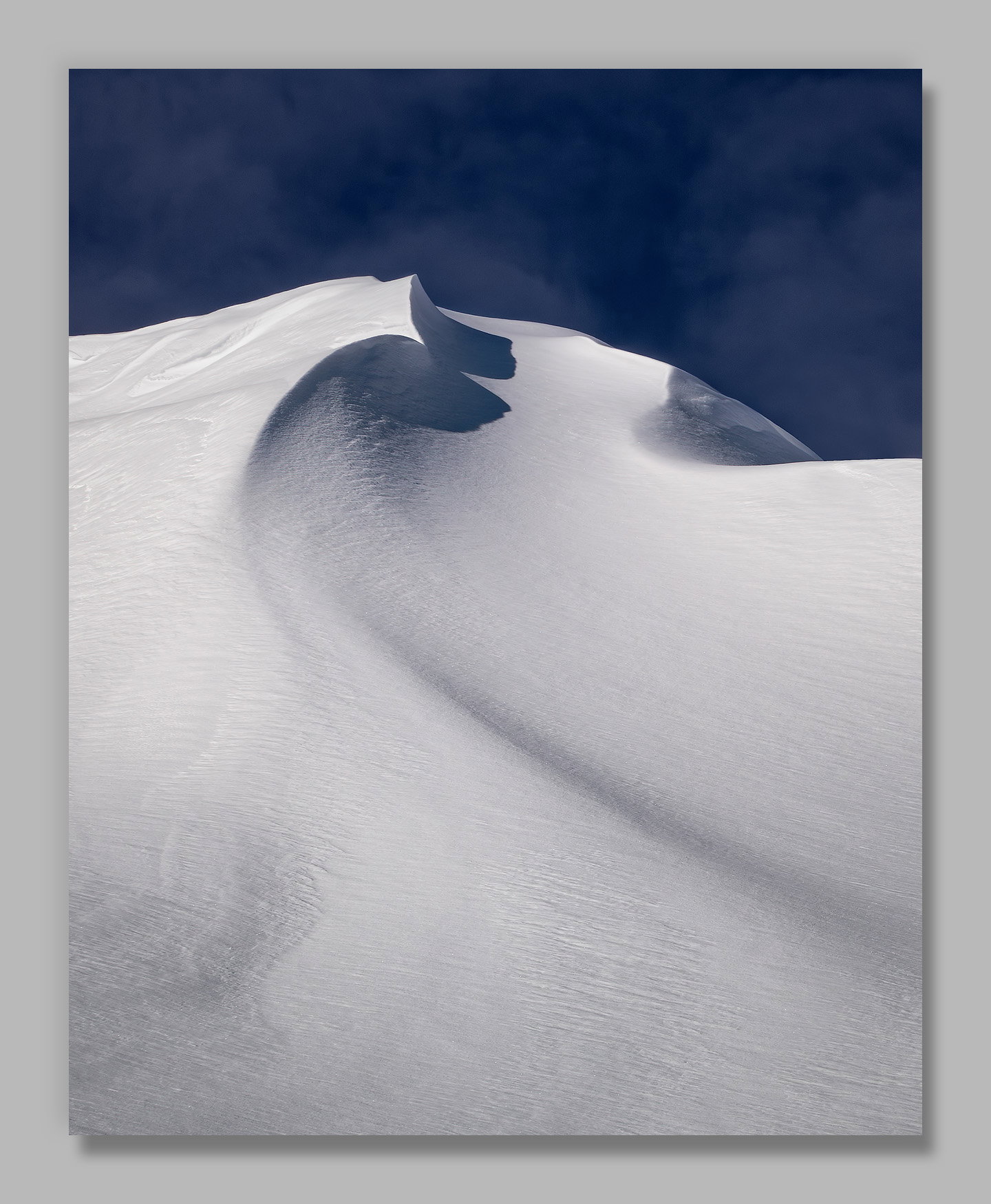
One of these days I would like to put together a project of Cascade snow patterns. I find them fascinating in their variety and beauty. However, I’m trying to stick to a 2x3 ratio and this one had ski trails below and I didn’t want too much sky above so I went with a 4x5 ratio.
This cornice forms on the ridge above where I have most commonly camped when backpacking White River. I’ve admired it before, but it’s usually crisscrossed by ski trails. This time the only trails descended to the left of, and below, this view.
Specific Feedback
The sky was quite dark in comparison to the snow in the original, and I’ve tried to keep that. If you look close there were wispy clouds, and I played with increasing the contrast there. In the end I stuck with the darker processing so that the sky competes less with the snow below. Does that work, or do you think it would be better brought up some?
As always, all thoughts appreciated. It’s the answers to the questions I don’t think to ask that are often the most helpful.
Technical Details
NIKON Z 7II
NIKKOR Z 24-200 f/4-6.3 VR at 200 mm
1/320 sec. at f/16.0 and ISO 64
Handheld
I’ve cloned out a small amount of distant thin branches from a dead tree that poked into the sky just above the snow on the right.
Critique Template
Use of the template is optional, but it can help spark ideas.
Vision and Purpose:
Conceptual:
Emotional Impact and Mood:
Composition:
Balance and Visual Weight:
Depth and Dimension:
Color:
Lighting:
Processing:
Technical:
John, this is excellent as presented. The’s enough texture in the sky to keep it interesting while the whites in the snow are very well handled. There’s plenty of texture in all of the snow The “wave curl” makes a great focal point. Well seen and processed.
Wow – what a gorgeous scene! Wonderful lines, shapes and detail in both the sky and snow. The moody sky fits perfectly and the monochromatic palette elevates it from observation to art. The project sounds amazing!!
Hi John,
I am loving this! The cooler tones of blues and whites are spectacular and work beautifully together. They both have lots of texture and the placement of that small ridge line directs the eye beautifully up to the wave curl in the snow. The dark blue sky works for me as I feel that just reinforces the cold conditions of winter. Again as far as suggestions; I got nothing other that I hope you have a few more to show us.
This is specatacular, John. I always love your images from this area, and this is nicely abstract, while still being allusive to something else.
The blue looks great to my eyes. It’s a high altitude blue, which seems fitting and works with the composition, offering a counterpoint to but not competing with the snow.
John: My first impression from the thumbnail was that this was a dunes shot and I wondered where you had wandered off to. Discovering it is snow instead makes it more delightful IMO. I’ll second and third the comments regarding your capture of the snow texture and color palette. Exceptionally nice work. >=))>
I really like the processing and the hint of wispy clouds. The composition works really well and I love the title. I love a well thought out and composed simple image.
I think the darker sky fits perfectly with this scene as it matches the blue in the shadow at the top of the cornice. The subtle patterns in the snow are wonderful and the swooping line from the LRC leads the eye through the whole scene. I also think the 4x5 crop works great. I am really enjoying your snow photographs and I think they will make a great project.
This looks awesome and I wouldn’t change a thing about it! I love that dark blue sky with all of it’s texture and it really pairs well with the snow and all of its texture.
I can’t choose and you can’t make me . Both are fantastic. I love the blue in the color version and I love the simplicity derived from the monochrome approach,
ML


 . Both are fantastic. I love the blue in the color version and I love the simplicity derived from the monochrome approach,