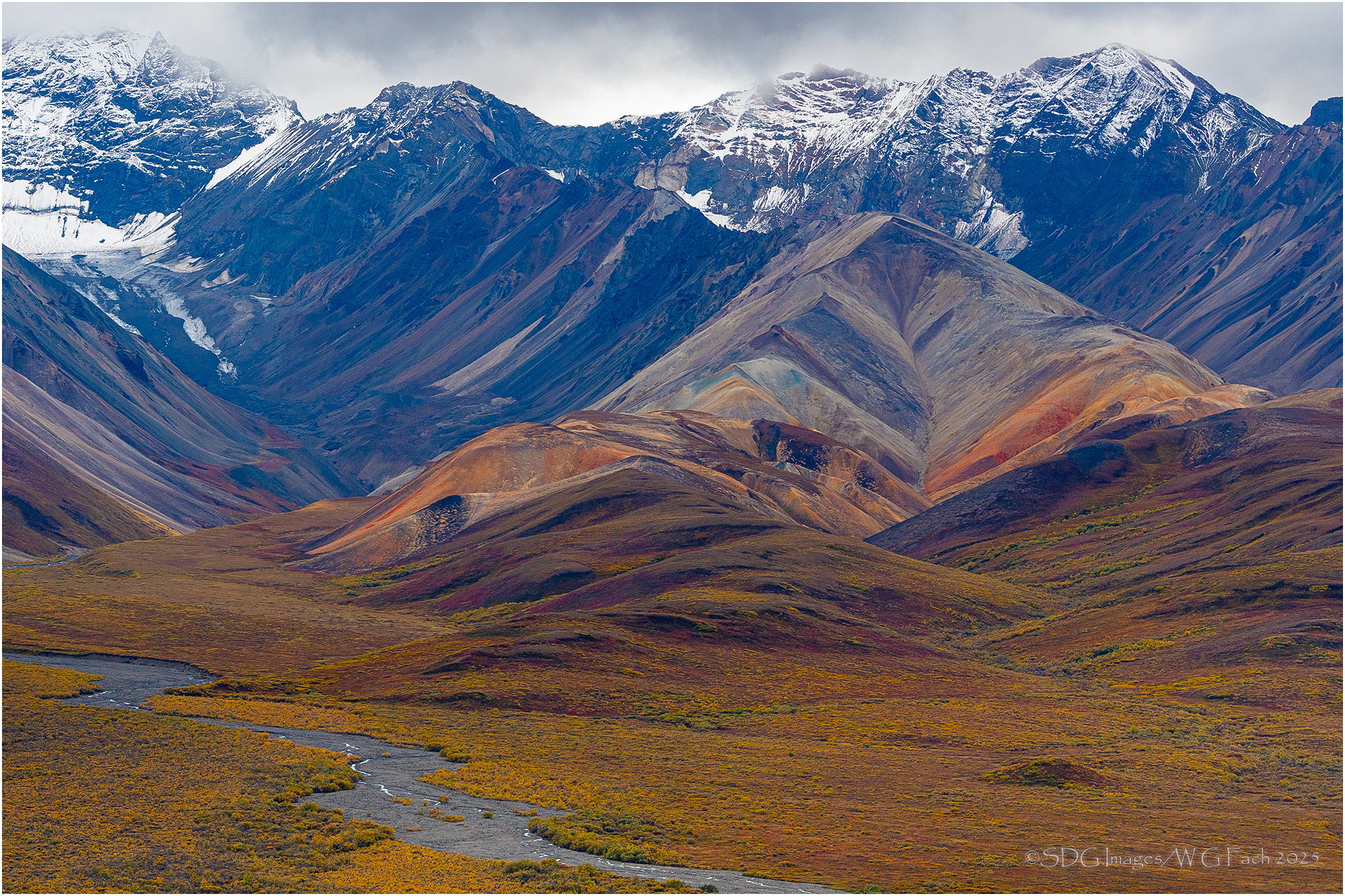
Taken on our Alaska trip in the Fall of 2017 from the aptly named Polychrome Pass. This epitomized the transition from summer to fall, foothills to peaks, and land to sullen sky. One of the most gratifying and enjoyable photo experiences of my life. >=))>
Feedback Requests
The RAW file was somewhat subdued but this is not grossly overstated. Too much saturation?
Pertinent Technical Details
Sony A77II
Sony 70-400 G SSM-II @ 105mm
ISO 200, 1/400 @ f8
Not too much saturation. That’s why they are called the Polychromes! So many colors to feast the eyes on. As you noted we were there about a month before you and the tundra was already starting to show the fall colors in early Aug. . We missed the snow on the peaks which I love in your shot.
My only nit is being a panorama photographer I want to see more to both left and right knowing that this range extends quite a ways in both directions.
Gorgeous @Bill_Fach. I have been through this area once, in late June back in 2002. Gotta go back. The seasonal color and the light are fantastic. Normally I like a more dramatic sky, but in this case, I love that the sky looks monochromatic while the mountains and, even more, the foothills are polychromatic. It’s so eponymous!
ML
Nice composition, Bill. I love the color contrast between the FG hills and the mountains. That said, I am wondering how this would look with the blues reduced or warmed somewhat. The recent snowfall is a nice touch, too.
I looks like a painting with these colors and shapes. I love the contrast between warm and cool and how one leads into the other. The only thing I wish for is seeing more of the sky so the mountain don’t seem crushed in. Really great picture.
Bill, this looks great as presented. Polychrome certainly describes the area! The variety of colors and shapes create an excellent sense of depth. The larger views are much more absorbing, easy to get lost in, with the slopes looking like a painting.
What an amazing scene. No wonder it’s a peak one for you. My only suggestion would be to increase the yellow in the blue mountains and sky ust a tiny bit. To my eye the seem too blue compared to the beautiful warm foreground.
A great scene and a beautiful composition with the stream in the FG and the transition in the mountains. Great colors, not too much I think, but maybe on the edge. More saturation would increase the contrast between warm and cool and that would be too much.
The moody sky adds to the image, this is no landscape for blue skies.
Gorgeous, and no way too saturated! I could even see a touch of warming overall, which would lower the blues in the mountains a bit (just a tiny bit) and punch up the FG.
I love how the stream sneaks its way over the foreground. Colours are dramatic without being over saturated. Wonderful mountains and a sky that fits the scene.