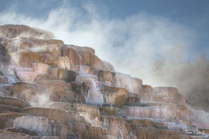
The 2022 version:
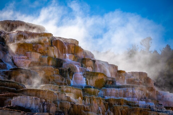
The original 2019 version:
This image is from my trip to Yellowstone back in the fall of 2019. I really liked all of the mist that was present due to the cool temperatures. I set up my camera and waited until the wind blew the mist just right so that the background trees were just partially visible and not complete revealed nor obscured.
Specific Feedback Requested
I posted a version of this image here back in 2019 but I recently took another stab at processing it and this time I took it in a totally different direction.
I’m curious which version speaks to you more (or not).
Technical Details
3 Likes
You caught the scene and the mist so nicely!! Both have their merits! I think I’d go for about halfway in between. I never know whether I should be in a quiet or a bold mood.
I’m wondering about a little CCW rotation, or distortion. Probably just an optical illusion from the steep angle of view.
Definitely prefer the 2022 version. I might take it even further:
I prefer the 2022 version. It places more focus on the travertine mist.
Tom,
Wonderful image. the mist really makes the scene here. And I too much prefer the 2022 version - much better mood and atmosphere and tells a better nature story. The earlier version, sorry to say, looks a bit over processed, especially the saturation. While I like the elevated contrast, I think that and the colors reduced the impact of the mist.
I think possible this could go a little further, but is all in personal choice - not necessarily “fixing” anything. I might want to slightly increase color/contrast in the travertine - very slightly and without altering the surrounding mist. I’m heading out otherwise I might give it a try.
It’s fun - and worthwhile to some times go back and rework images. I know for me, processing tools, tastes do change over time. So thanks for bringing this one back!
Lon
Thank you @Diane_Miller , @Igor_Doncov , @Eva_McDermott and @Lon_Overacker for taking the time to comment!
Igor, I really like your version and I agree that I need to go a bit further with it because when I see what you did, I realize that it feels closer to the overall feel and mood I want to convey.
Lon, I concur with your assessment of the original version. When I first opened the image in Lightroom I cringed and actually couldn’t believe that I had once liked it. I’m amazed how my tastes have evolved over the past few years (in a good direction I hope) and I’ve been reprocessing a bunch of my older favourite images. I take the raw file and process it as if it were a new image and then when I’m done I compare it to my older version of it. For all of the images I’ve tried this on, except for one, I always like the newly processed image much better. It just feels more refined and polished.
1 Like
Tom, I really like your rework. It’s much more realistic, moody, and mysterious. @Igor_Doncov’s additional work adds more mystery to it. Wonderful scene. It’s so great that we can go back and reprocess our images.
Tom, this is a very familiar scene, that you’ve captured nicely. I think the 2019 version is oversaturated which gives a bit more visual weight to the travertine than the mist. Your 2022 version emphasizes the mist nicely, but looks to be lacking a bit in the colors in the travertine. Since adding more color to the travertine increases it’s visual impact, you might also do some dodging of the mist in the upper right to pull a bit more attention there. Of course, it’s your photo and the story that you want to tell.
I much, much, much prefer the subdued 2022 version. In the earlier version the overly saturated colors took away all the attention that should have been placed on the subtle mood with the mist. I agree with @Igor_Doncov that this could be taken even further and would wonder what this would look like as a B&W. Great rework, Tom!


