Second Respost with more refined background:
Repost with darker/less saturated background:
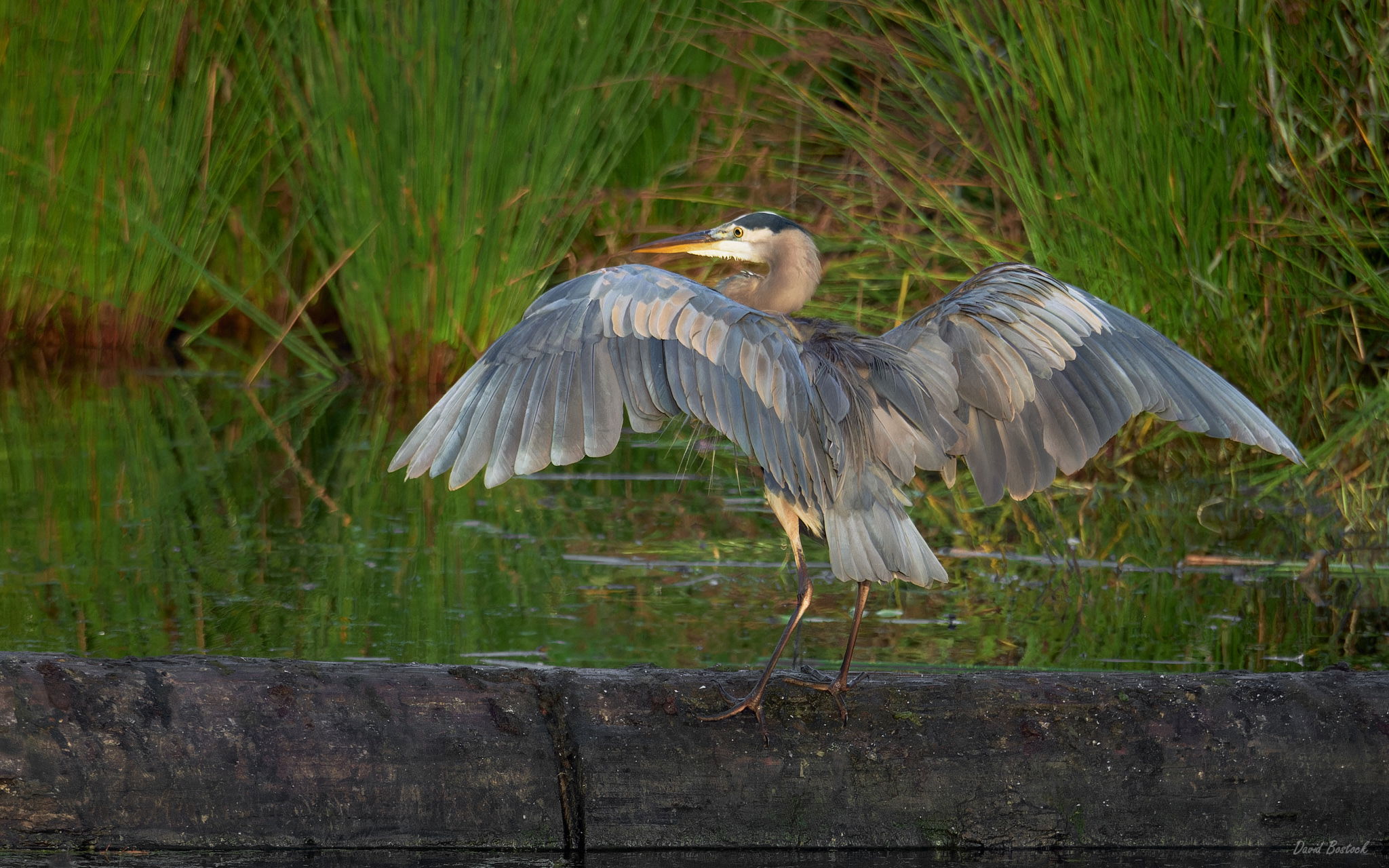
Original:
Critique Style Requested: Standard
The photographer is looking for generalized feedback about the aesthetic and technical qualities of their image.
Description
I was able to track and photograph this fellow from take off to landing on the other side of the pond. This is the only image that works because of the head turn and seeing the eye.
Specific Feedback
Many of you know that I have red/green color blindness. It’s a true drag on photography. I have found a tool that might help me identify color casts. I think it worked quite well on this image, but am very curious if you see anything color-wise.
Also, any other comments appreciated.
Technical Details
435mm, 1/2000sec @f/8, IOS 6400
I realize I could have shot a slower shutter, and lower ISO, but had just photographed some faster moving birds and didn’t have time to change settings.
1 Like
This is an interesting image, David. The color looks good, though I suspect the green saturation could come down a bit as those reeds are very green. Color balance on the heron looks just fine. I do think the white “chin” could come down in brightness a bit as it really grabs the eye.
The reason I called it interesting is that when I first opened the larger version, all I could see were the reeds, my eye kept going right past the heron. After I looked at it for a minute or two, I started concentrating on the heron and the reeds finally moved into the background where they belong.
Thanks Dennis, I appreciate the critique. At least the color cast isn’t there. 
The background is a little green, that was due to the light and the closeness to the subject. I would prefer a bit more out of focus bokeh if possible.
I’m posting a rework above with the background darker and less saturated. Hope that helps. Also darkened the white chin.
Cheers,
David
That made a big difference, David. If you want to experiment with it, if you select the bird and foreground, then invert the selection and use “field blur” on the background, it won’t bleed over into the foreground. It’s touchy to not make it look hokey, so you have to be gentle with it. Putting it on another layer can help, then you can also adjust opacity.
Thanks for the additional note, @Dennis_Plank. I was a tad too rushed for that rework. Here’s a second rework with more refined softening and darkening of the reeds in the background. Posted above.
Cheers,
David
Very nice job, David. Excellent work.
1 Like
Great wing position and the light on the wings is very nice. Good head turn. For me, the second re-post is the winner. Also, excellent detail in the heron. Nice job.
1 Like
Hi David, nice details on the bird and I like the overall environment shown here. Another vote for second repost. I think the contrast of the gray bird with its surroundings makes it easy to focus on the subject while also enjoying the habitat.