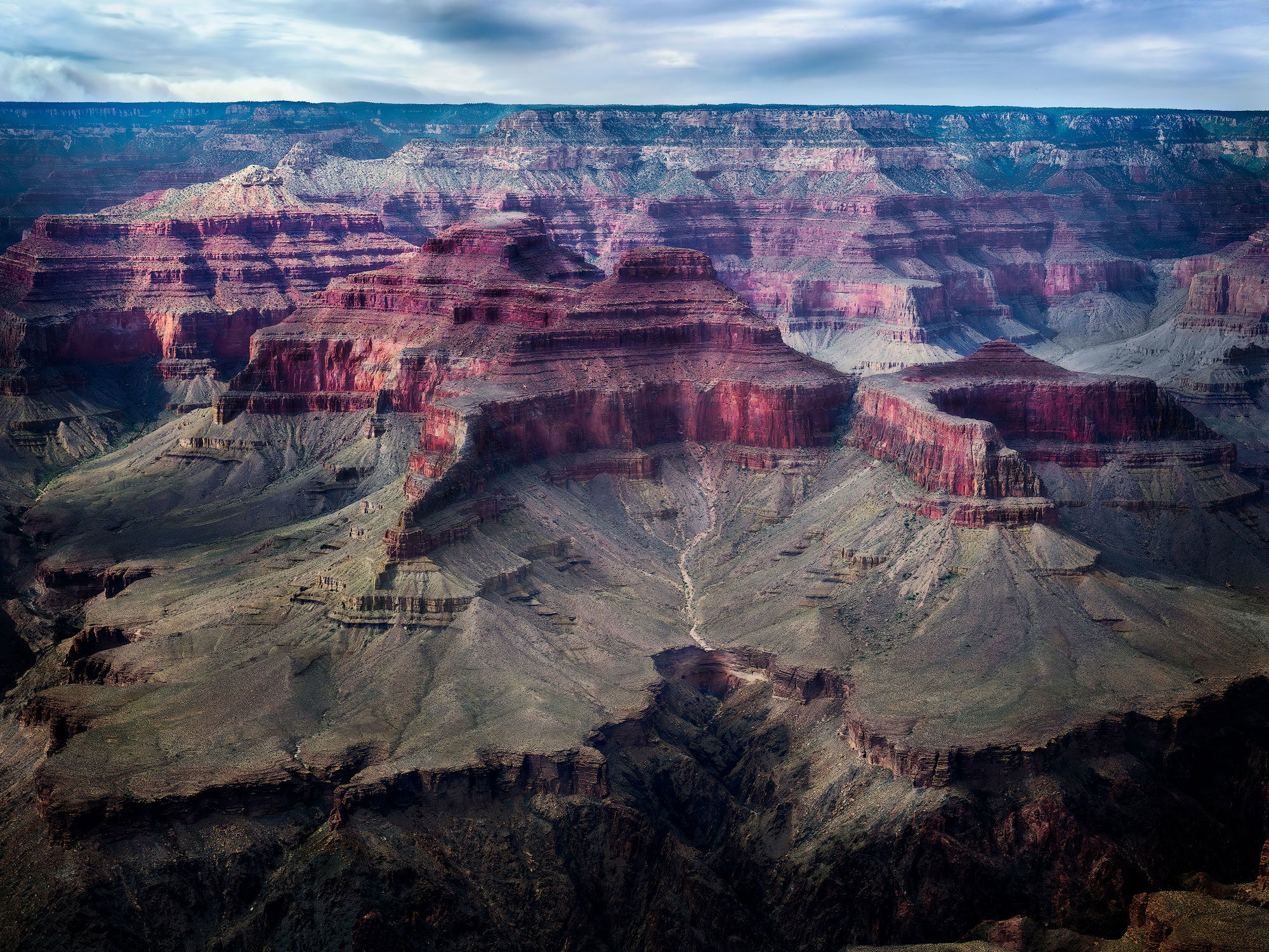
I gravitate towards color and color theory with my artistic vision. Primarily how do these colors make you feel and if there are any color distractions from the main focal point(s)? Depth is important to me. Does this convey depth?
Pertinent technical details or techniques:
This was taken in dappled light. No exposure blends. I have a process that involves the usual curves, dodge & burn adjustments with TK Panel as well as color & gradient map adjustment layers to blend colors. Didn’t use any saturation adjustments.
If you would like your image to be eligible for a feature on the NPN Instagram
The composition conveys a good sense of depth to me, especially due to the large green shelf below the red buttes. The small sliver of outcropping in the LRC doesn’t do much for me. It is a bit of a distraction, and I would suggest cloning it away. I like that you kept the sky minimized here, it’s not interesting enough to include more of it. The composition does feel slightly cramped on the left side. I think it would have helped to go wider and have more breathing room to the left of the green shelf.
In terms of color, I think the green shelf looks great, and I like the more muted reds of the buttes. While its a matter of personal taste, something feels slightly off about the blue in the sky. The skies color and WB seem inconsistent with the light and color in the rest of the scene. I’m having a hard time expressing why it seems inconsistent, but it somehow doesn’t seem to fit.
Michael,
This is a grand view for sure and it does have a nice sense of depth IMO and the interplay of light and shadow works really well for this scene. This is just a matter of personal taste, but the right side seems a little tight and I think you need to crop and or clone that rock formation in the LRC. I hope you do not mind, but I did a repost with my suggestions.