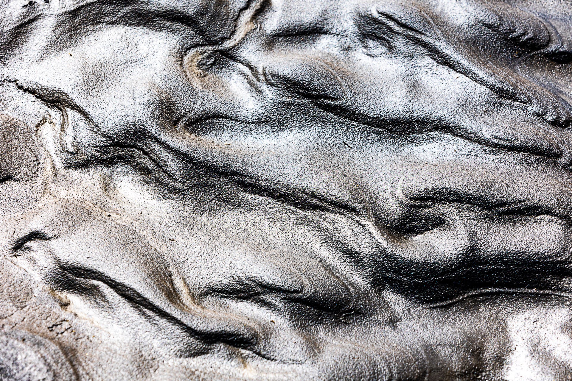
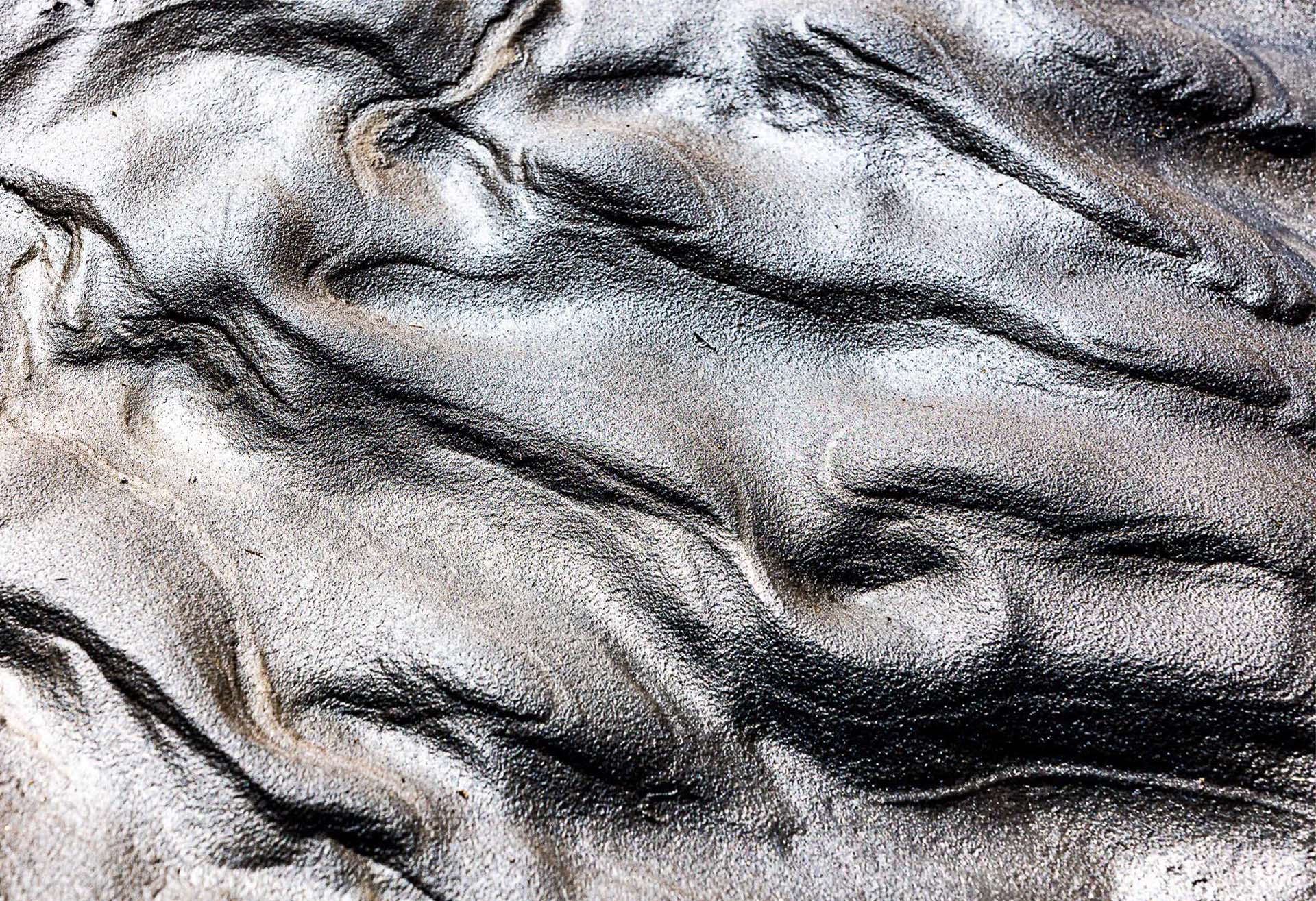
Next to Dettifoss in Iceland, strong water currents sculpted the sand into irregular but very similar patterns. Enough to fill the frame with a nice set of contrasts.
Feedback Requests
I like the abstract nature of something as palpable and concrete as wet sand. Is it enough though to catch one ́s eye and keep it? I think it is. You?
I think too, Xavier.
I think it would work well as a poster. The edges are a little blurry, which is a bit distracting. I’m not sure what could be done about that. But overall, I find it impressive.
The patterns in the sand are great, as well as the metallic shine. There is a strong flow from the ULC to the LRC which is interrupted by more subtle curves reminiscent of animal tracks. The curves, swirls, hills and valleys nicely accentuated by side light do keep my attention.
I am usually fond of the ‘Classical Unities’. Here in particular the LLC challenges ‘unity of shape’. From experience I know that this is sometimes very hard to avoid. But since there is no reference to any known shape in this image a non-rectangular crop might work.
Anyway a nice image, well seen.
PS I took the liberty to make a non-rectangular crop to show what I mean. Hope you do not mind.
Hi Xavier,
This is definitely an interesting, compelling image. I like the reflections too. They give this a metallic quality, which in nature contrasts with what we know on some level to be a more temporary and shifting kind of form.
I do like the crop that removes the bit of texture in the bottom left. It keeps it more abstract and more unified, as Igor suggested.
ML
Xavier, this is a great abstract. The shapes spread throughout the frame are very attractive. a The metallic “glow” and high contrast adds well to the overall interest. The bit of unsharp sand and the brightness in the lower left corner are somewhat distracting, burning-in the brights there would reduce its visual impact.
Thank you all for your thoughtful comments. I will have another look at the picture after returning home from my present travel. I hope Mark’s suggestion will give the best result since cropping might IMHO affect the overall balance of the composition. Wait (for at least one month) and see. Xavier
The curves in this image are stunning , Xavier, and combined with the metallic look make it look more like the results of molten metal than sand. That lower left corner caught my attention as well. I’m not sure reducing the highlights will fix it, but it’s certainly worth a try. Somehow, I always get caught by this same issue doing abstracts-there’s always one corner that wants to be out of focus.
Was it high noon to get that metallic sheen to the wet sand. Love the varying tones and shapes. I do prefer the second crop. I think of this as ephemeral art as the sand is always sculpted by wind and waves and detritus. A good eye to see the possibilities.