(If this is a composite, etc. please be honest with your techniques to help others learn)
If you would like your image to be eligible for a feature on the NPN Instagram (@NaturePhotoNet), add the tag ‘ig’ and leave your Instagram username below.
You may only download this image to demonstrate post-processing techniques.
Mike,
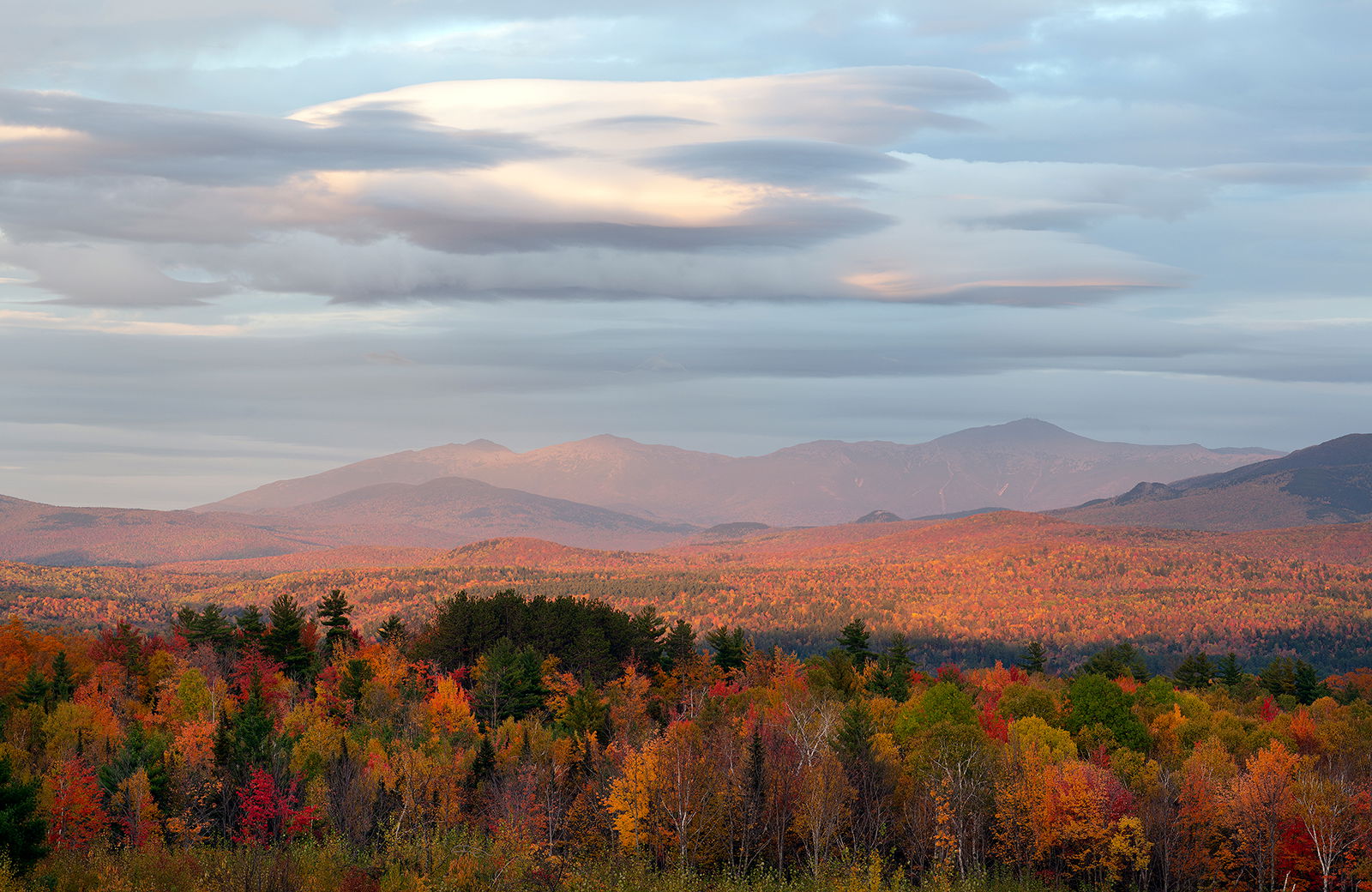
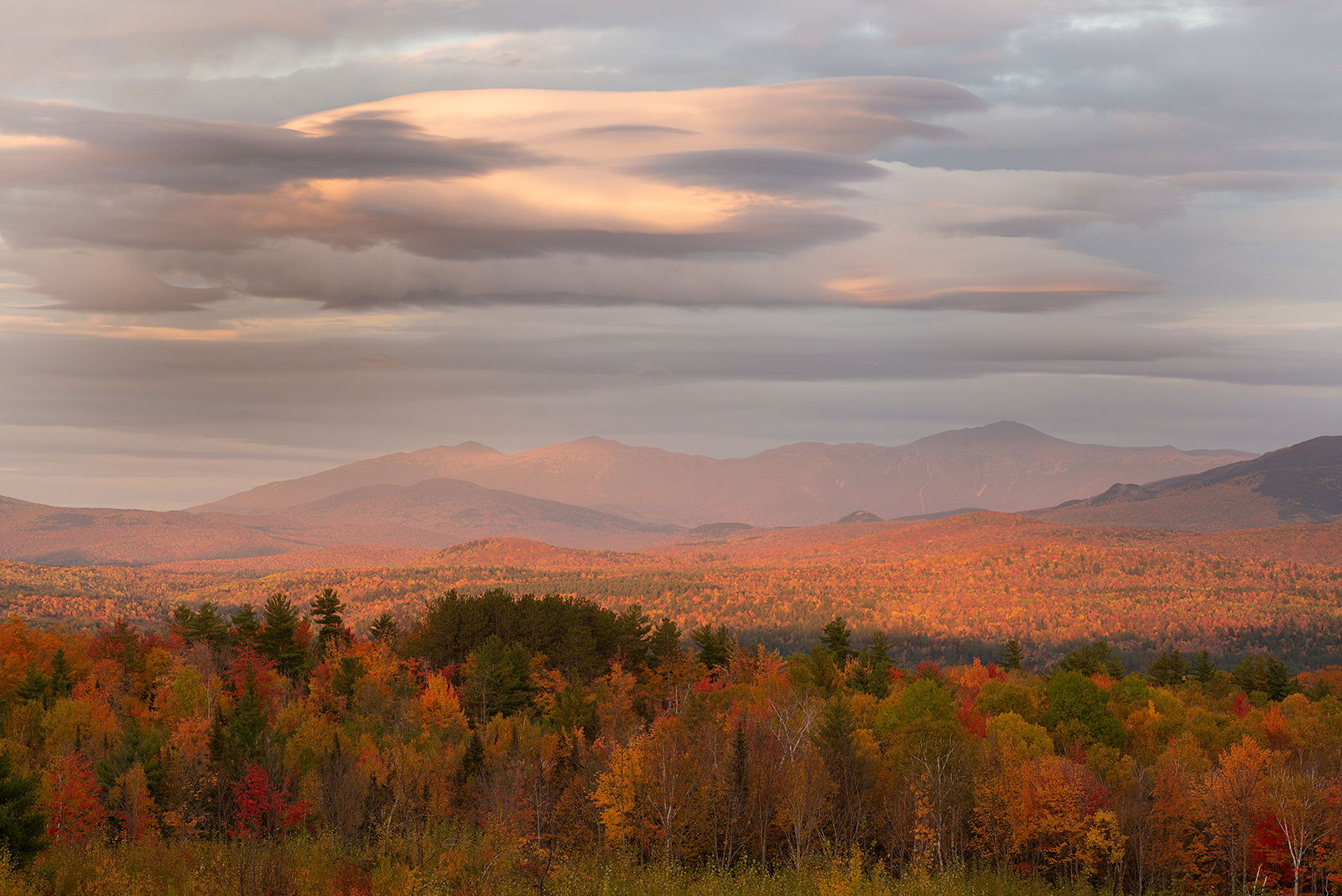
You know me; I am going to go for the warmer WB the majority of the time and this is no exception. I like that bit of added warmth in the clouds and on the BG mountains and trees. That is how I remember this scene that particular evening as the warm light was exquisite.
Cool WB for me as well. The autumn trees do have much more clarity and of all the images shown from here - one that really embraces the autumn landscape! AND still includes the gorgeous sky and warmly lit mountains. At least for me, the warmer WB, the autumn colors are really kinda muted.
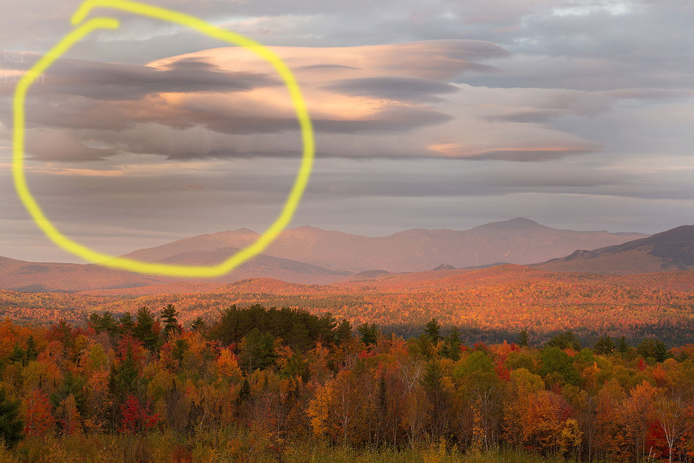
I’m not sure what’s going on in the clouds - is this a result of simply warming the WB? The sky/clouds in the original post seem quite clear and the whole image just seems more beautifully processed. The second version, not quite sure what happened. I’m circling the area that I think changed significantly, other than the autumn trees.
Cool white balance me three. The contrast is greater from blue sky to warm landscape and that’s always a plus for me eyes. Fantastic tree colors and exposure.
Michael, the first post looks much more realistic to me. It also provides better color separation across the land, but especially in the foreground trees. (BTW, if you upload both images to the same post, the viewers can “arrow” back and forth between them, which makes comparing them easier.
If I had to choose between the two, I’d also go with the cooler one. But I would be interested in seeing something in between the two: a bit warmer, but not as much as your second.
Overall I prefer the cooler version. However, I find the foliage at the bottom better integrated into the color composition in the warmer version. That bottom layer clashes with the rest of the image in the cooler version. It’s the warm saturated colors in a shadowed area.
The cooler one works much better for me. I like the composition with the great layering of trees then ridges back to an excellent sky. I am liking this one.
Cooler WB for me too, it adds to the twilight mood and pastel colors. I’m kind of chuckling, because in your prior post a number of people were clamoring to see more more of the foliage below (which you did add in this image). Having shot at this location myself a number of times in the past, I often found myself struggling with the trees at the edge of the meadow, and how much of them to include or exclude. To me what is most appealing about this image is the warm light in the sky and background mountains. Thus, I actually prefer a composition that shows less of the shadowed trees, ie more similar to your prior post.
Michael, You have many interesting replies to this terrific image. I agree with Igor Doncov and would go for the warmer foreground trees, leaving the rest of the image as it is. In warming up the trees, you might want to go halfway between the cool WB as posted and the warmer second version. The sky in the warmer version looks muddy to me. Ultimately, IMHO, after trying out more post processing ideas, you should settle on what is most in your mind’s eye on how the image should look and communicate to viewers.