The photographer is looking for generalized feedback about the aesthetic and technical qualities of their image.
Description
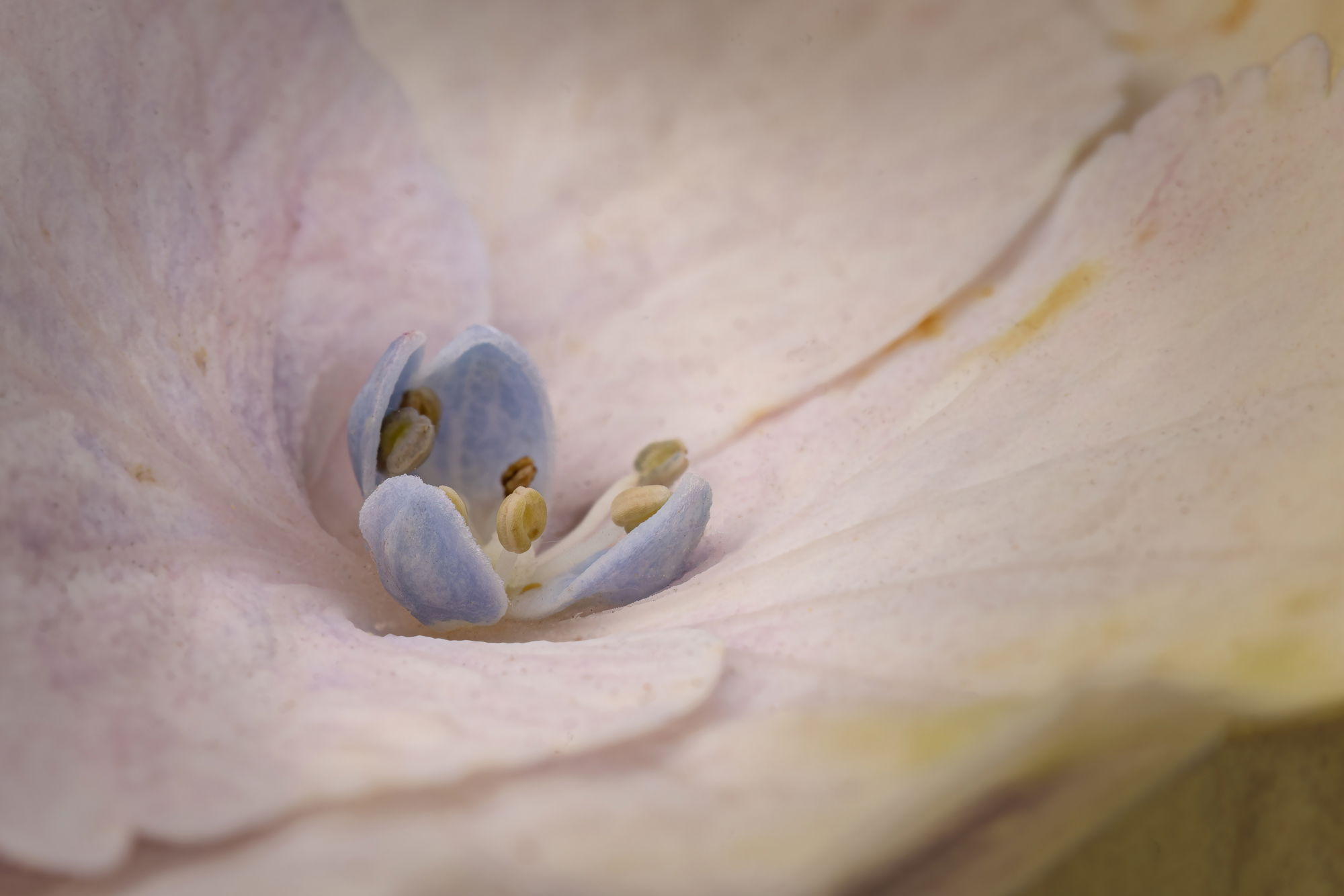
Here is a different flower, caught just as it was opening. The center structure (the actual flower) is less than 1/8" across, but this is a plant with very large flowers. It could be more like 1 mm on many varieties.
A limited stack to catch more detail. Not much done in LR. Some dust cleanup in PS, from leaf blowing the driveway. A little dodging and burning. Full frame as captured.
Critique Template
Use of the template is optional, but it can help spark ideas.
Wow its like you have created an entire flower-scape. Almost like a flower with in flower. I love the subtle colors and textures. The OOF parts works wonderfully here as well. Really nice work.
I like the abstract feel to this image. Subtle colors and the shallow, but controlled DOF help separate the business stuff of the flower from the petals. I like it as presented…Jim
Thanks, @Youssef_Ismail, @Jim_Zablotny, @Dennis_Plank and @Shirley_Freeman! I had a lot of fun with these flowers. The center part is the actual flower and the surrounding petals are sepals – if I have the story straight. The center parts have done their thing now and I may try to find a more conventional composition.
Diane, the subtle colors and limited dof work very well here. The leading lines of the gaps between the sepals coming in from the upper right and the lower left add good eye movement. I do suggest reducing the amount of yellow in the oof area of the lower right corner as it seems not very complementary to the pinks and blues elsewhere.