In 2016 I had the opportunity to attend a workshop with Alain Briot and his guest presenter Jeff Schewe. You might recognize Jeff’s name as a Photoshop and Lightroom guru and book author. Also a very colorful person.
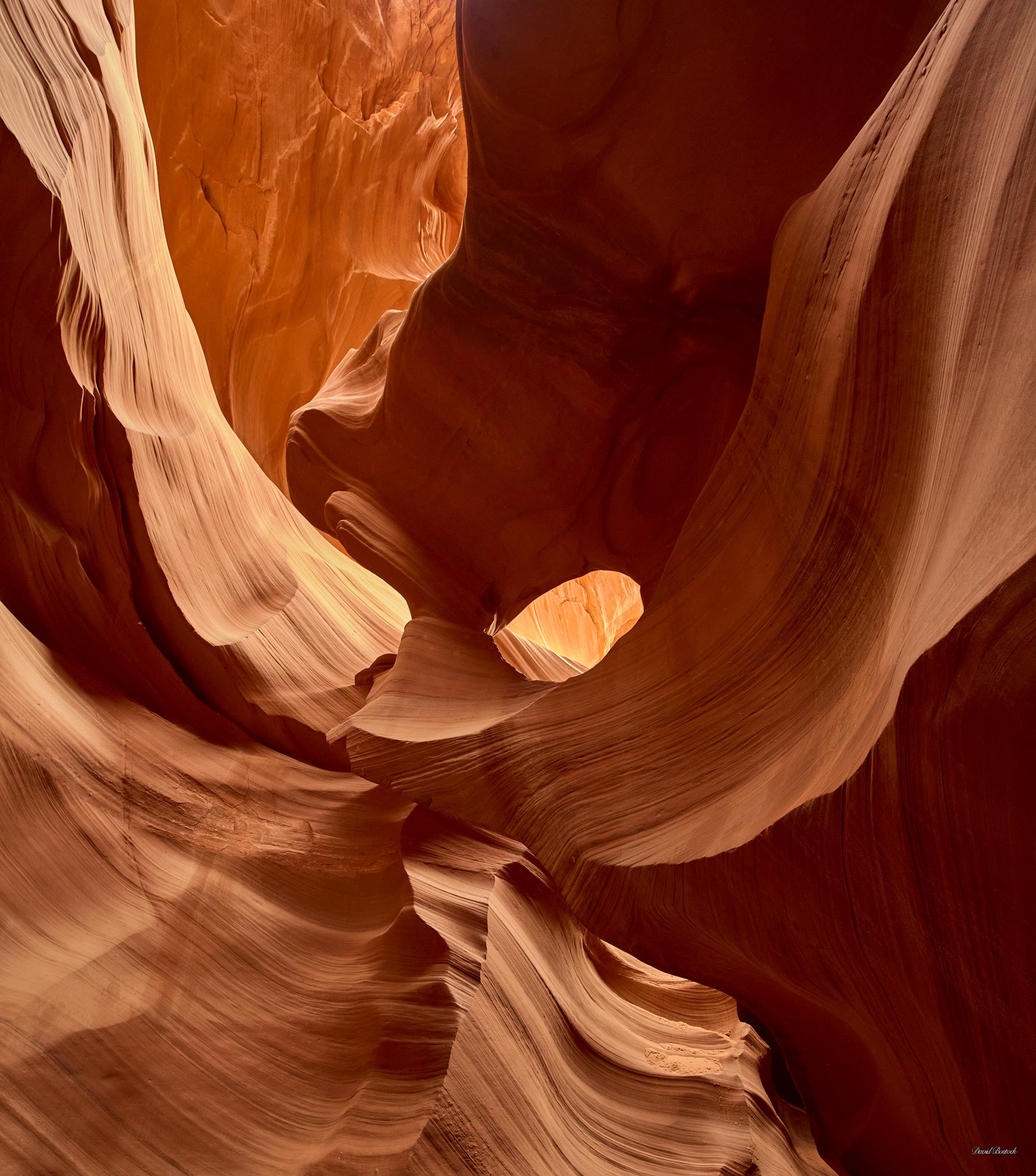
Anyway, I also got the opportunity to go on tours of Upper and Lower Antelope Canyon, also known as the Slot Canyons. These tours are led by the Navaho and at that time there were still photography tours where you could bring your tripod. I wanted to do that, but decided to just go on the regular tour with my camera hand held. I am very glad I did. I took my Canon 5DS R and Zeiss 15mm lens. What a beast but it was the best way to go with what equipment I had at the time. I was fortunate to get a tour guide who also was into photography and she pointed out lots of scenes that I might have missed.
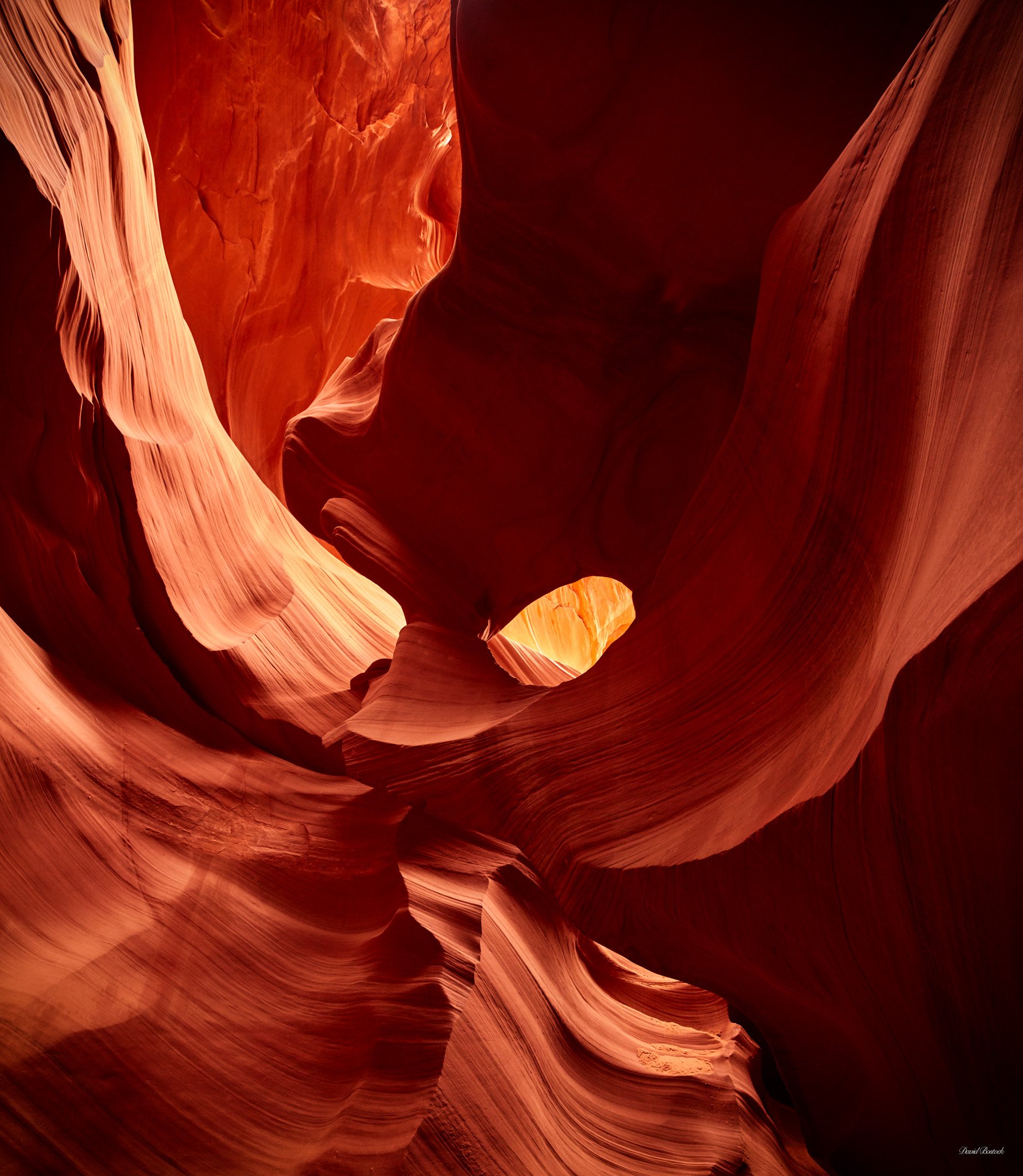
I shot at f/5.6 and auto ISO 100 - 3200. Most shots were at ISO 3200 due to how dark it was. At the time, Canon wasn’t known for its high ISO quality and I was fairly disappointed with the noisy raw files. As technology changes though, I decided to reprocess my images in the latest tech. I was fairly blown away at how much better they turned out. Anyway, hope you enjoy this one. I cropped a bit off the bottom and top to focus on the point of interest.
Specific Feedback Requested
Any comments appreciated.
Technical Details
Is this a composite: No
Canon 5DS R, Zeiss 15mm, 1/125 sec @ f/5.6, ISO 3200, handheld.
There is certainly nice light and great textures here. I would move the tint (color cast) towards magenta and warm the image at the same time (add yellow tint). I would also simplify the composition as the dark and light shapes are not in balance which gives it a busy appearance. You came up with better results than I did with my non DSLR camera and no tripod. I think my guide was offering to throw dust into the light to give the appearance of a light beam. I can’t remember. I felt rushed like you did.
I first visited Lower Antelope Canyon about 25 years ago. Back then you could go by yourself without a guide, and spend as much time as you wanted. I think I was in there for 4 hours, and encountered only a handful of other people the entire time. Those days are looong gone…
For using f5.6 you did an amazing job getting this as sharp as you did, you must have very steady hands. And with current software, you were really able to control the noise very well. My only suggested tweak would be to shift the color a bit redder, but that is a matter of personal taste. As presented the colors are certainly true to what you see in these slots. But a bit redder might add some extra snap.
David, I think this formation is called “Eagle Eye”. I have a couple similar takes. My wife and I were extremely lucky to have had unguided access years ago like @Ed_McGuirk mentions. Back then there were no restrictions as I recall and I used MF with a full size tripod too. When I said we were lucky a week later they had the disastrous flood that killed the 11 tourists.
You’ve done an excellent job with the overall composition but as others have mentioned I could see some optional post processing for color / vibrance. However, as always totally subjective and no nits at all.
Real nice take on this iconic spot. Your comp works well for me. The color looks quite natural and as mentioned above, it is strictly a matter of personal taste and interpretation to move off where it is now. Nice to see images from here as I have never been and doubt I will ever go.
Thank you, @Igor_Doncov, @Ed_McGuirk, @Paul_Breitkreuz, @Harley_Goldman for your comments and suggestions. It’s always interesting to hear from those who have been to a location before. Paul, I never knew that some of the formations had names. I will have to look into that some more.
I posted the original 2016 processing above as it’s more redder than the first post. I personally feel the first post is more what I remember, but I also realize that these canyons call out for a warmer/redder color…
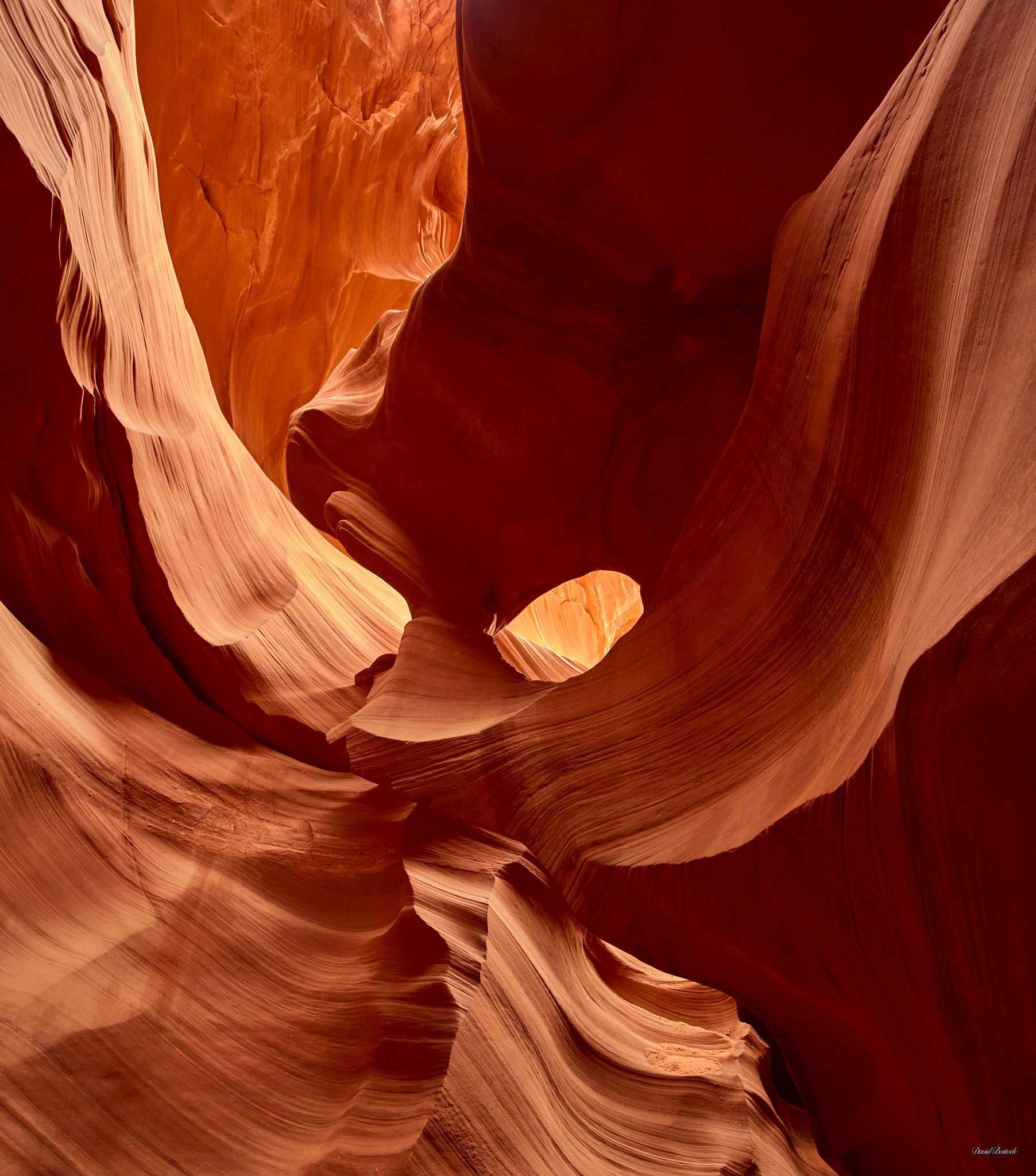
David: I went on a guided “photographer’s tour” where you had to have a tripod and were supposed to have more time but it was still a forced pace and crowded. I loved the environment and scene and hated the experience. This is a really nice image and I think all of the iterations work. I do think the version in between your post and the original works best for me. Top notch shot. >=))>
I took a stab at adjusting the reds a bit and posted my “in between” version above. Being a bit color blind with reds/greens is a distinct disadvantage when working with these images.
Paul and John I like how both of you opened up the colors here. I took your advice but kept it a bit less than you were going for…as stated, it’s all up to subjective preference…
John, it’s so good to see you here. Welcome back. I always think of you each fall when I head up to Trout Lake. Your Google map of the area with pinpoints to stop was great.
Bill, then I am glad I did not pay for the photographer’s tour. Like you, the environment and scenes were fantastic. Not being saddled with a tripod also freed me up to take shots from very different angles.
I love this composition. It has an anthropomorphic feel - I can’t help but feel that I’m looking into the eyes of the stone. Of the three iterations you’ve posted up top, I prefer the third. Personally I wouldn’t want to see the saturation/vibrance or contrast pushed any further.