The photographer is looking for generalized feedback about the aesthetic and technical qualities of their image.
Description
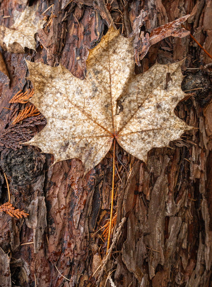
I was recently in BC walking in the forest beside my friends home. I love the forests in BC because there’s so much more to see than the forest in my home town. I came across this weathered maple leaf on this beautiful old red cedar log and I just loved all of the textures and details. It reminded me that no matter what time of year you can find so much beauty in nature.
Specific Feedback
I just would like to know if there’s anything else I can do to improve this photo…any recommendations..or does it work? Thank you!
Technical Details
Focal Length 39mm
f 8.0
Speed 1/640
ISO 5000
Critique Template
Use of the template is optional, but it can help spark ideas.
Rikki, I love the various shades of browns in this image. It would be nice if I could enlarge it more (you posted a small version 738X1000 pixels). It looks fairly sharp considering it is a small version. For me there are some debris that is near the edges of the image that likes to steal attention and pull my eye out of the frame. I’m wondering if you used a vignette on this if it would help hold the eye into the frame better. I like what you saw and captured. I’ve never had the privilege to go to BC. Sounds nice.
I like the composition in this image, Rikki. I do think the “star” of the show could use some added emphasis. @Shirley_Freeman made a nice suggestion. I could also see selecting the maple leaf and bringing out the texture. My favorite technique uses a very old Topaz plugin, but event the texture slider in LR can make the subject pop more. Another trick someone told me about for bird photography that might work here as well is to warm up the tones in the subject just a bit.
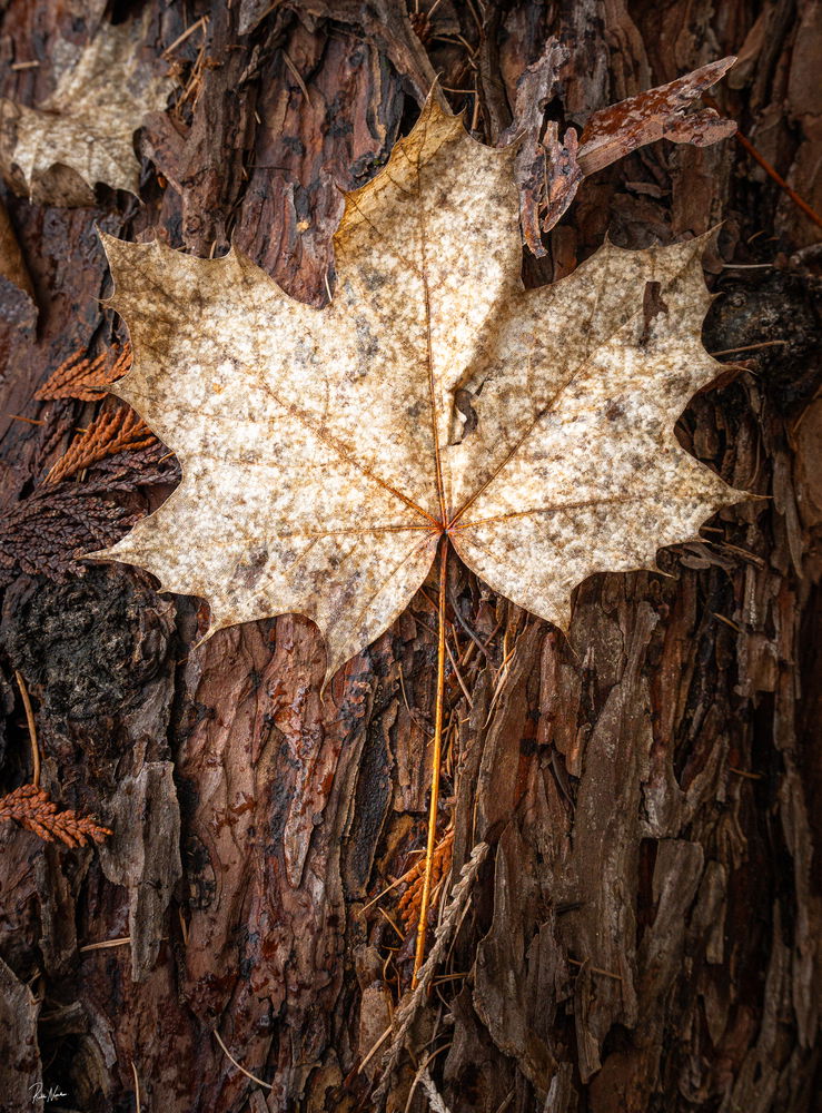
Thank you @Shirley_Freeman and @Dennis_Plank I really like your suggestions. I did want to make the leaf stand out more…sometimes it’s just being bold in editing and going for it. BC is so lovely. Probably like the west coast for you.
I like what you’ve done in the revised version, Rikki.
It’s easier for viewers to compare different versions of an image if you add it to the original post, preferably at the top. You can do it by going to the bottom of your original post:
Clicking on the pencil icon which takes you into the edit mode. Navigating to the top of the edit screen, and clicking on the upload icon which is the horizontal rectangle with the arrow pointing up:
As long as your cursor is at the top of the edit screen it will put the new version there. Since you’re already in the edit mode, you can label the original and the new version as such and add the phrase “and repost” or equivalent to your title. Then just click on the yellow block at the bottom of the edit screen to accept the changes.
Rikki: I like these little scenes and think this is a very nice find and a solid capture and comp. The leaf looks just a little soft and I wonder if your plane of focus was off just a smidge. The rework does look better. Great to have you posting here and looking forward to more of your work. >=))>
A wonderful find, well-presented. The leaf and its BG are both very interesting, and you have framed it well. The second version elevates it very nicely with some dramatic lighting and detail.
If you post it above the original it will be the version considered for Editor’s Pick, for which it is very worthy.
Thank you @Diane_Miller . That is so kind. I am not sure if I placed it right…I was afraid I had deleted the original…but lucky for Discard edit. Haha…
The window that comes up isn’t very big, but you can enlarge it by pulling the top edge up. It’s just like a word processor – you can select text and drag/drop or copy/paste and delete it in the old position. The title also shows up as editable, to add RP or the like.