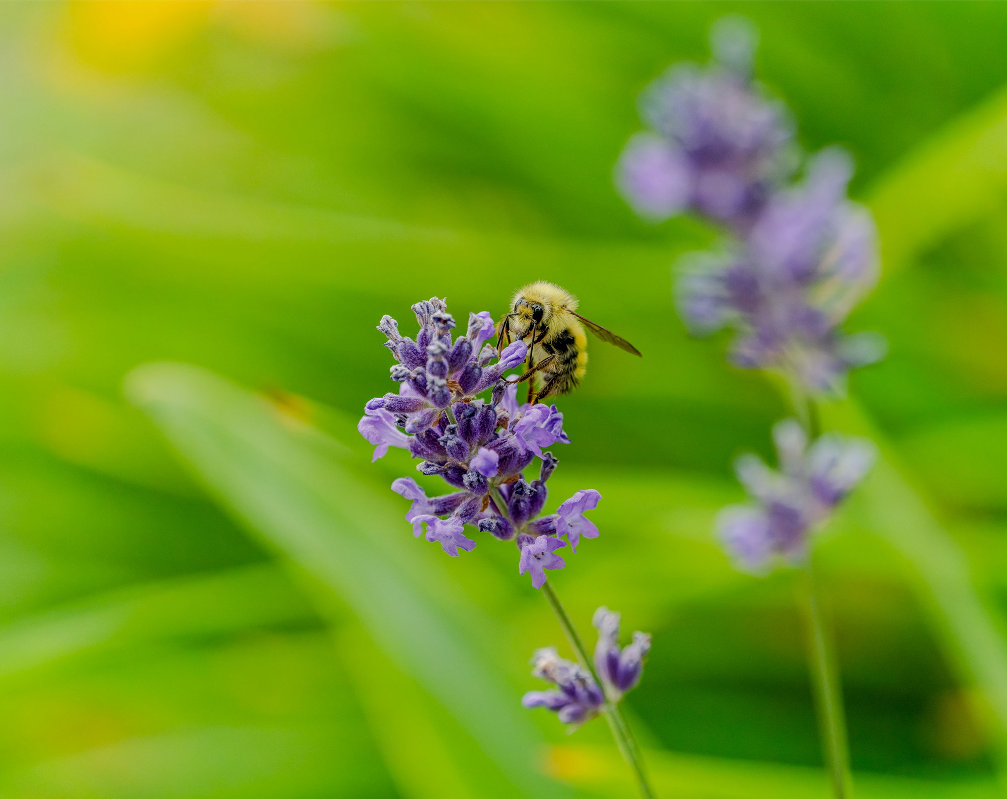
Very nice, David. I think you may have posted the original again instead of the desaturated one as I can’t detect any difference and they have the same file name. Regardless of that, I like the image and the saturation looks pretty reasonable to my eye.
I like how the oof flowers mirror the ones in focus. The bee is very attractive and its focus is excellent. I’d crop some from the left, but that’s just my taste. Great colors too!
Lovely image David! The flowers and the bee work nicely together. I would prefer a little less saturation in the greens…but that’s just me. I also like Mike’s idea of a crop from the left.
David, this nicely evokes summer, with blooming flowers and lots of pollinators flying around. I think the bee and the flower look great, I might desat the yellows in the background. The oof flower behind is a good addition.
David: Ditto what @Shirley_Freeman said. I don’t find the colors overdone at all on this iteration. I’m wondering if you managed to delete the original post as these are the same image? Whatever, the final result is fine work .>=))>
Bill:
Thanks for getting back to me about my photos of the Bee on the flower. Yes there appears that both images look the same, but I’ve had a problem with the site for some time that no one seems to have an answer for. It seems that many of my images are too bright on the screen that is NPN screen. So I darken them ahead of time before I post them so the collar will be more exact. In some cases as with the particular image we’re talking about, they look the same. On my PC monitor, it is considerably darker yet on NPN, I don’t see a difference. At least this time. Sometimes it does make a big difference if I darken my image before I post them.
Thanks
David Schoen