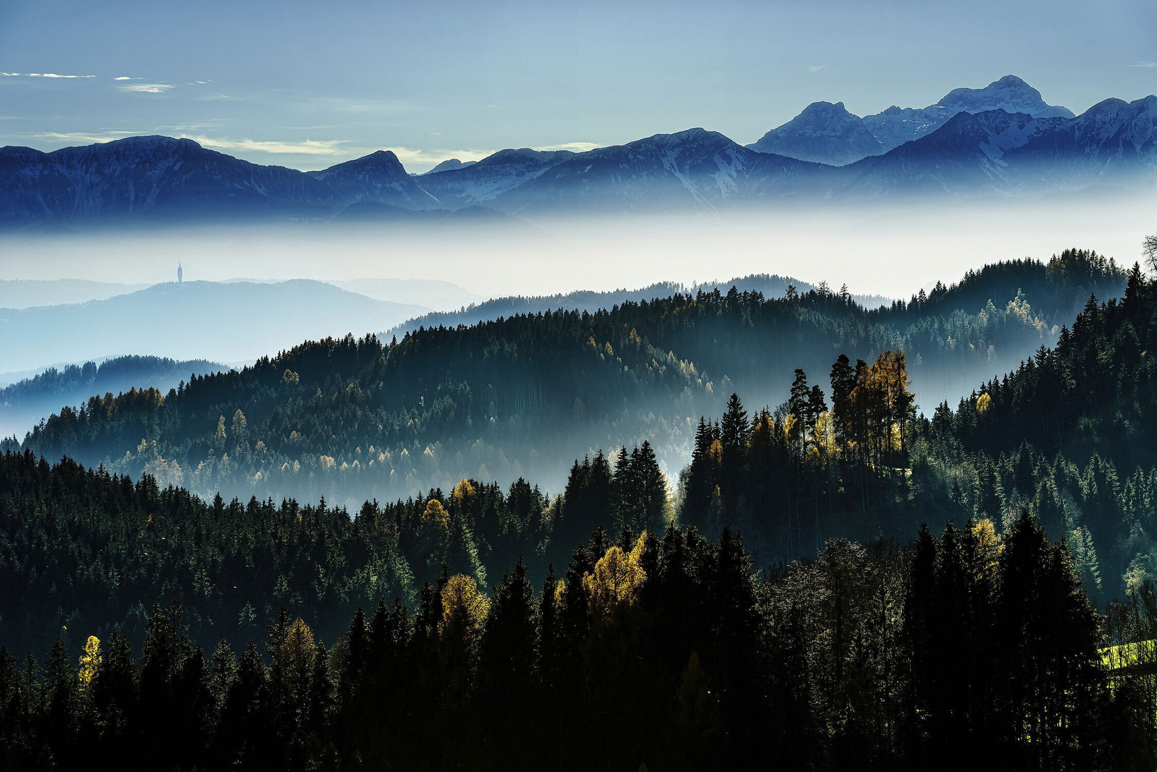
Composition OK? Yes, the tower on Pyramidenkogel in the background should be recognizable.
Pertinent technical details or techniques:
Below you see the original right out of camera and the edited file from RAW. I didn’t add anything what wasn’t there, adjusted the colors and played a bit with luminosity masks.
If you would like your image to be eligible for a feature on the NPN Instagram (@NaturePhotoNet), add the tag ‘ig’ and leave your Instagram username below.
and welcome to NPN. could it be that we have a fellow austrian photographer posting here?
this is a nice shot. i like the backlit trees and the foggy above-the-clouds-mood.
as for your questions:
composition:
i like your composition and the layers of mountains. although i’m personally trying to avoid any human element the tower works really well here.
two small nits regarding the comp:
the green meadow in the LRC is a bit distracting. i understand that cropping it would alter the comp quite a bit - you might try toning it down (if you look at the original it’s less disctracting there).
there’s also a lone tree sticking in on the right edge. you could clone it out if that works with your code of ethics.
processing:
i wouldn’t exactly say that the processing is over the top - i just see standard techniques used here. some of them are used to an extent that renders the scene a bit unnatural. here’s a few things that stick out to me:
the foreground trees lost all shadow detail. you might want to lift the shadows here a bit.
the shadows of the background mountains is unnaturally blue - as in too saturated.
there is a slight halo around the edges of the ridgelines (that usually happens with overuse of clarity).
green meadow & lone tree: yes you’re completely right. Routine-blinded, I always checked the green color of the meadow if it’s not unnatural and sharpness with the branches of the tree…
I like the layers and the backlit forest in this image.
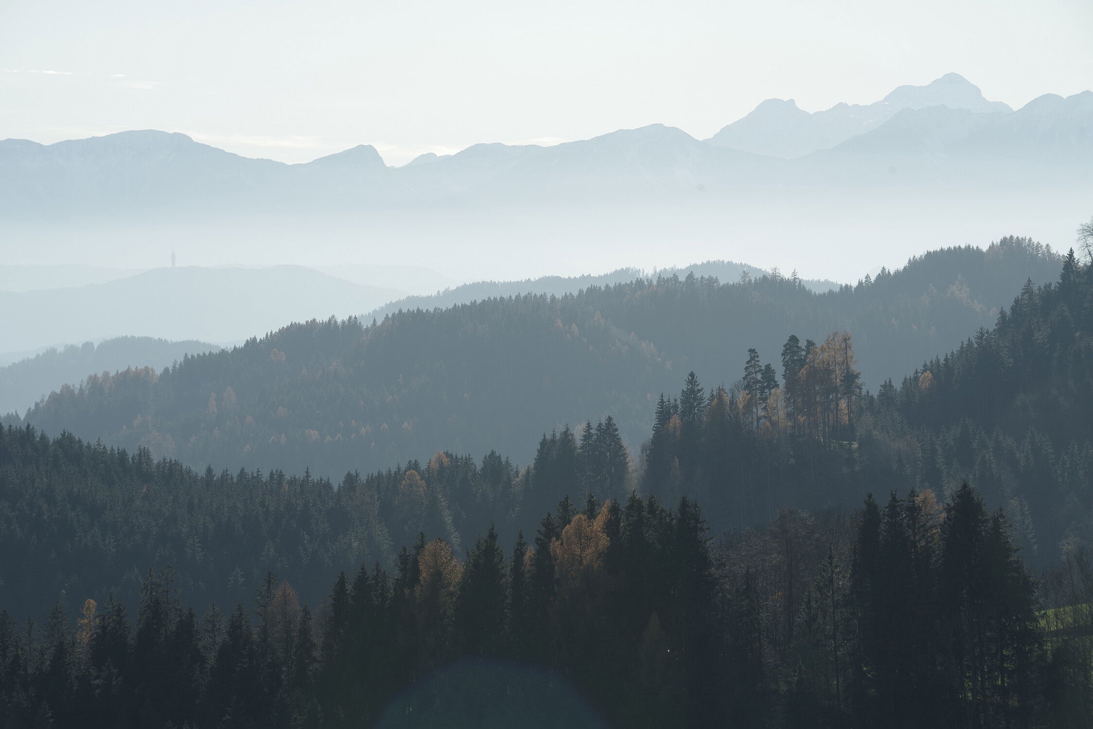
It looks to me as though you’ve used a bit of clarity contrast and dehaze on the background ridge and the sky. Personally I would create a sense of depth by keep the background somewhat hazy but provide more details on the foreground.
Below is an example of the direction I would take.
OK, I understand, the mountains in the background do not fit with the rest, I have removed too much of the haze.
And obviously retain more detail in the foreground.
Thank you Nathan!
Helge, I think you have a nice composition here, and with the haze and repeating ridgelines you have all the ingredients for a good image. But I do think your processing has taken contrast a bit a too far.
I would like to expand on @Nathan_Klein comments. In real life, things in the landscape that are closer tend to be darker and sharper, and things that are further away are usually lighter and softer (less detailed). Our eyes are used to seeing the world this way, and this is what most people perceive as natural looking. In Nathan’s rework note how each ridgeline gets progressively lighter and softer the further away it is.
Alister Benn discusses this concept in depth in his “Luminosity and Contrast” ebook and videos, if you are interested in hearing further discussion on this topic. Alister did a free webinar for NPN, link is below
Thank you Ed for your comment! Viewing the edited version now, with your description in mind, provides a complete different impression. The background-mountains look much closer than they were, just because I have removed the haze.
I know it’s a poor excuse, but actually the mist was near the ground and in the valleys, not very high and the mentioned mountains looked clearer than the rest below them. I tried to emphasis this effect, but I have “verkackt” (German slang for “failed completely”).
For me, one way to tell if i have “gone too far” in my processing is if the blue colors get very dark. due to too much contrast and saturation. In real life, daytime blues are usually lighter toned. Some people overdo blue skies because of this, making them too dark and saturate, which a tipoff to over processed. In your image the most distant mountains are way darker than they would be in real life.