I made some edits incorporating suggestions made by both Igor and John and I think between the two, the new version is much closer to what I had in mind. I think the biggest difference was made when I cooled down the image and added some magenta. Thank you to everyone for the ideas!
The photographer is looking for generalized feedback about the aesthetic and technical qualities of their image.
Description
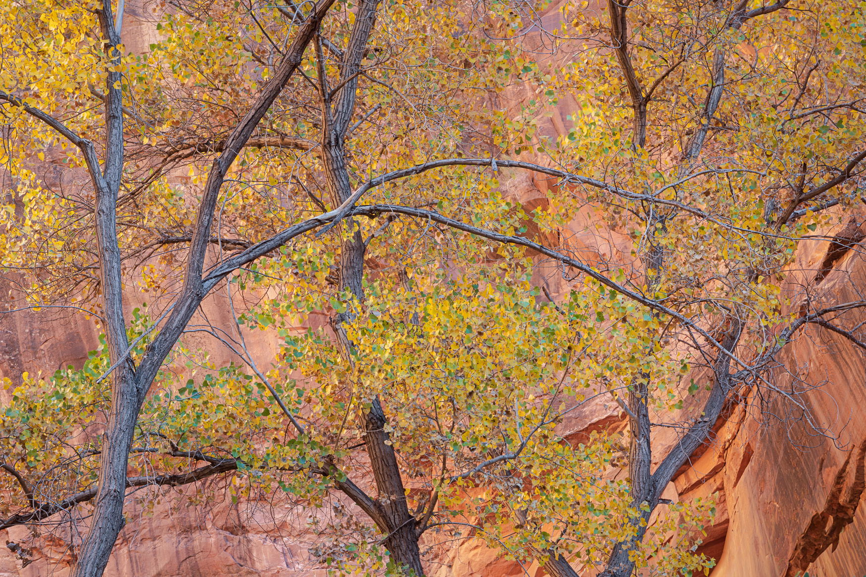
Last weekend I spent nearly three hours walking up and back down a canyon that is only about 1/2 mile long, all within 10 minutes of my house. I titled this Cottonwood Cacophony because this canyon is so thick with these trees that at times it felt like they were yelling “take my picture!” It’s a relatively narrow canyon and light was bouncing off one cliff wall onto the other, illuminating the sandstone with a rich glow that I had to desaturate in post because I found it distracting. I was intrigued by the interaction of these trees, with the dominant one arcing across the entire scene in front of the others like a mother does with her arm to a seatbelted child when slamming on the car brakes. It seemed as though that tree was trying to hold back the others from rushing forward. I was really hungry at the time so it’s possible that my hunger was causing me to see things that weren’t actually there.
Specific Feedback
As always, love to hear all thoughts about this one. I wish there was more color contrast and I’m curious to know if the lack of color variation between cliff and leaves bothers you.
Technical Details
Sony A7IV
Sony 24-105mm lens @ 105
ISO 100
2s @ f/22
Lightroom/Photoshop
Critique Template
Use of the template is optional, but it can help spark ideas.
Vision and Purpose:
Conceptual:
Emotional Impact and Mood:
Composition:
Balance and Visual Weight:
Depth and Dimension:
Color:
Lighting:
Processing:
Technical:
First off, this is just lovely as posted, and the mix of leaves/trunks/sandstone works very well here. I love the spacing on the trees.
As posted, the only thing I would recommend tweaking is that the right side, especially in the corners, seems just a tad darker and keeps the eye from centering. You might play with dodging that just a tiny bit.
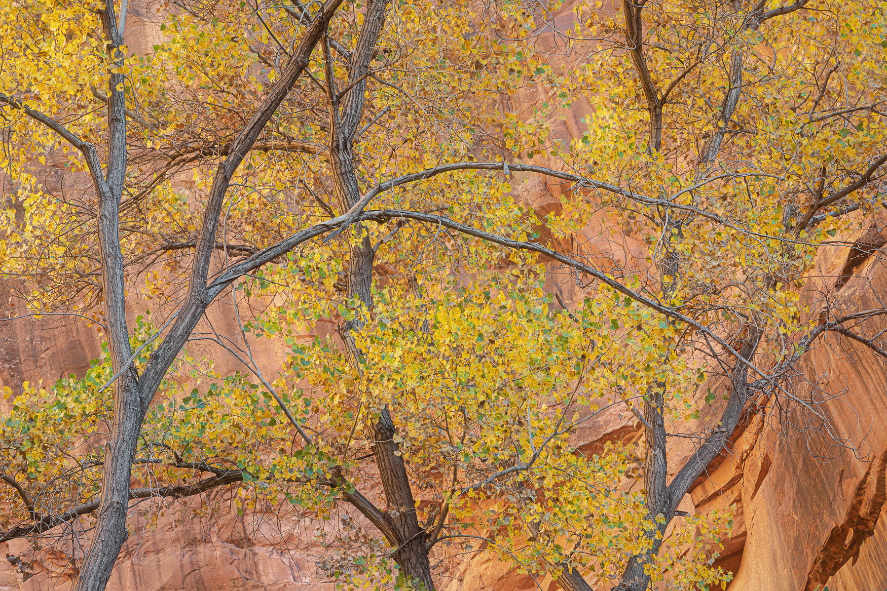
Well that got me wondering, so I played around with brightening the yellow leaves and reducing the saturation of the sandstone a bit. I tried to get a bit more separation without making it garish. It’s an interesting comparison, but I’m not sure it’s better.
I like the overall composition here with the limbs overlaying one another and the yellow leaves as accent points. I have shot these types of scenes a fair amount in the Zion area and I remember the cliffs to be of a different color than here. It seems as though the image has been warmed globally and I think the separation of the leaves from the cliffs could be greater. I would suggest that the color balance move more towards magenta and the image cooled just a bit. I made several changes here but those were the major ones. Incidentally, the pros (Bennet, Tal, Noriega) who shoot in this area a lot seem to really like to saturate and play with tones with this subject matter. So there’s that option as well.
Hi Bret,
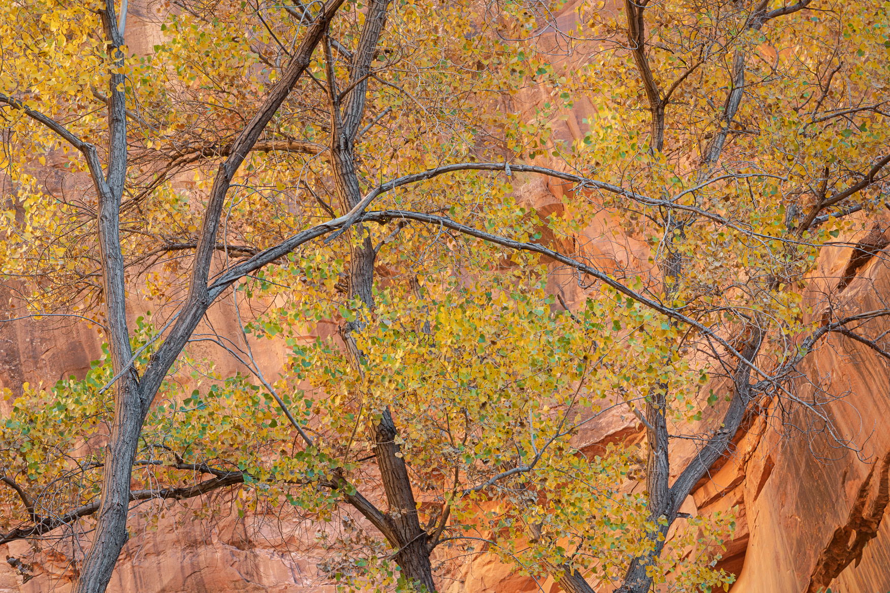
I am loving the way these cottonwoods criss-cross one another and fill up the frame. Both the reworks by @John_Williams and @Igor_Doncov have helped address the separation issue you mentioned between the sandstone and the yellow leaves. I am stuck somewhere in between as I like the leaves in John’s and the sandstone in Igor’s. This looks like a great location to wander in and the best part is it is so close to home. Hunger will do that to you sometimes.
Brett: Oh this is fine! Certainly aptly titled and superbly composed and presented. The tweaks by @John_Williams and @Igor_Doncov are nice refinements but the original works for me just fine. Top notch shot. >=))>
Very beautiful shot, Brett. I love the colors and how they blend together with a slight touch of yellow highlight against the sandstone. The composition works well with the framing of the tree on the left. My only remark would be that my eye is drawn to the dark spot on the LRC as well as the dark trunk in the middle tree. Overall, great job!
Bret, you’ve got so excellent visual motion in these tree trunks. That helps me explore the leaves against the sandstone. Your revised version shows off the leaves much better. Since everything else is fairly low contrast, I wonder about desaturating and/or reducing the contrast in the wall showing in lower right corner?
Thanks, Mark. It’s interesting that you mention desaturating the LRC; I did that in the revised version! Maybe not enough, though. I hadn’t considered reducing contrast, though. I’ll give it a shot.
Excellent, Bret. Great eye to see this fine composition. I agree with @Ed_Lowe. I prefer the sandstone in @Igor_Doncov’s rework and the leaves and tree trunks and branches in @John_Williams’s. I would personally be happy with the original.
I can’t believe this is 10 minutes from your house. Lucky you!!!
I just love the twin branches moving across the other trees in this image. I do feel that the entire image is too warm and that the cooled off version of @Igor_Doncov is the one I’d choose if this were my image.
What stands out to me in both of your revisions is the lower right corner rock. It’s much warmer than the rest of the rock face and it appear quite a bit darker. Maybe cool that off and dodge it and lower the contrast a bit. Thew other thing I would do is go back for another shot at this when the colors are more yellow than green if it’s that close to the house so you can get more separation.
In any case, This is a wonderful Fall colors image that deserves to played with until you feel it’s right. Just beautiful, Bret!
@David_Haynes Thank you for the comment. I still find it hard to believe I live so close to many incredible landscapes! I’m planning to go back to this canyon this weekend as the cottonwoods are really starting to pop. I’ll also experiment with a couple different treatments of the LRC.