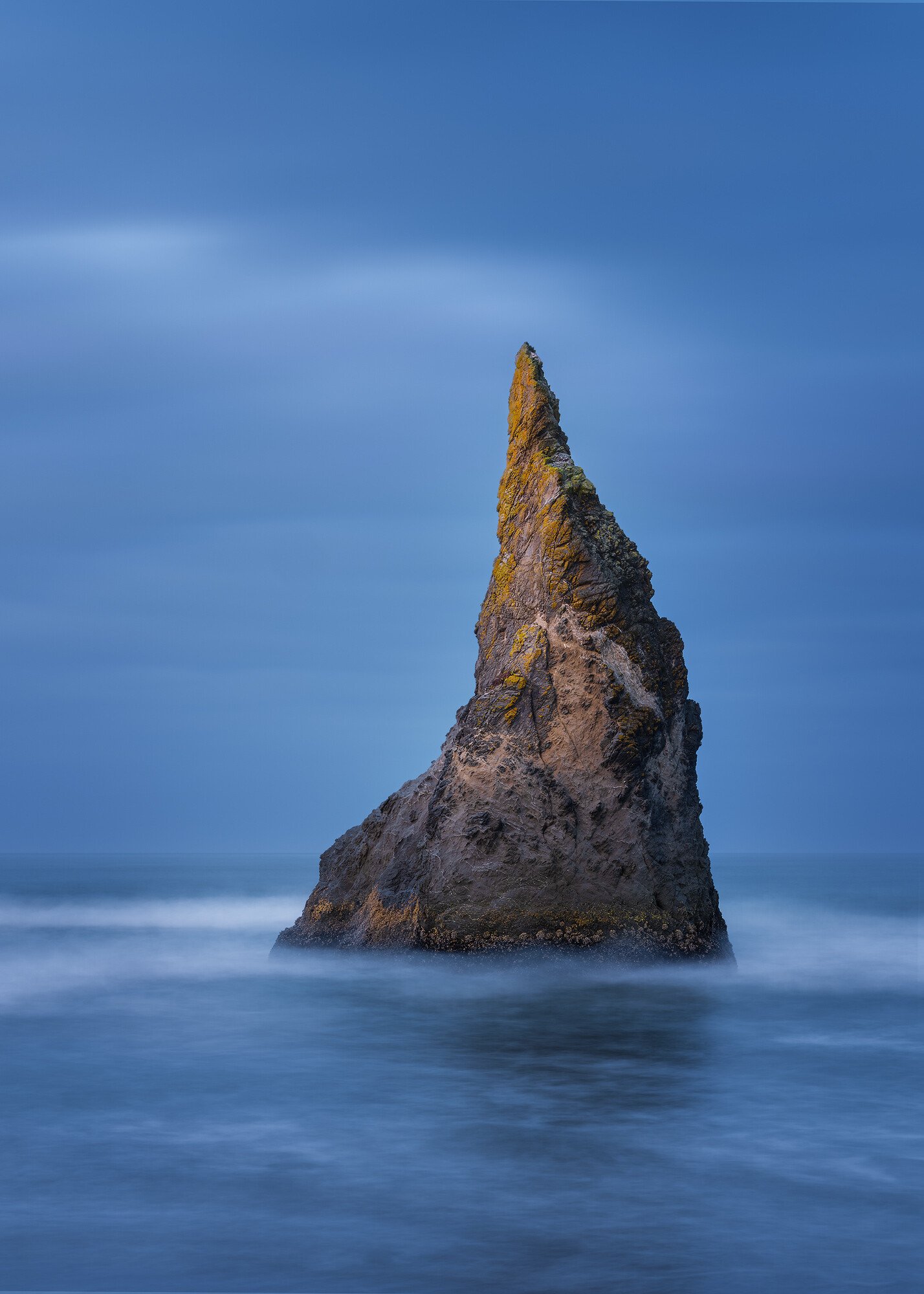
A new fun idea here at NPN. How would you process my image? Many of you might remember the Black & White image of Wizard’s Hat from Bandon, Oregon that I posted a few months ago. We thought that it might be fun to give you all a chance to process the raw file to your own preferences so we can all compare. Should be fun.
By the way, the RAW file is from a Fujifilm GFX100–a 100mp sensor. I converted it to a Lossy DNG file so it won’t take up much space, but be prepared for a large image.
Most importantly, have fun!
Raw File
You may only download this to demonstrate how you would process the image. The file is Copyright of the photographer, you must delete the raw file when you are done. 20221016_075020__DBP3084.dng (15.1 MB)
You may download this raw file to show how you would process the image. Please post a jpg of what you created, along with an explanation of what you did and why you did it.
When you are done, you must delete the original raw file. The original photographer maintains the Copyright on this image and may not be used for any other purposes.
Awesome, I can’t wait to try this. Unfortunately it will have to wait; it’s almost 10:30 at night and I need to get up early for work but I’m so looking forward to it!!!
Awesome, @Keith_Bauer, just awesome. I took this image with the intent of processing in B&W, but if I had processed in color, I would have chosen to keep that wonderful blue hour light that you worked here.
I can’t resist this sort of thing. I find it quite fun to process someone else’s image because I don’t have a personal relationship with the scene and that frees me up to be more bold than usual.
This scene feels quite dramatic and ominous to me because of the contrast between the exclamation of the jagged, sharp sea stack and the soft water and sky. My impulse was to go with b&w because this is about shape and textures, not color (although that blue hour color is lovely!). Finally, I wanted to accentuate the light on the sea stack face, both by increasing the light and darkening the remainder of the frame.
What I did: In ACR, cropped to 5x7 to get rid of that little rock on the right (and I just like 5x7 vs. 2x3), moved the histogram to the right while lowering the darks, brushed some highlights on the sea stack, increased the saturation (using the Calibration slider) in anticipation of b&w conversion in PS.
In PS, ran a TK Panel Darks triple play to bring out detail on the stack, converted to b&w using a high-contrast red filter then adjusting more, dodging of lights 1 and 2 (as defined in the TK panel), curve to reduce overall exposure for everything darker than lights 2, added vignette, and finally color graded to a warmer tone. Here’s the PS layers:
@Bonnie_Lampley, I thought my version was moody. You took it way beyond, in a great way. I love all the processing and the feeling. Excellent all around. I may have to revisit my own version.
Beautiful edit @Bonnie_Lampley , I really like what you did and I enjoyed reading about what you did. It always fascinates me how many different ways one can edit an image and what tools can be used. Also, I agree with you on the 5x7 ratio! I use it a lot on my vertical images as well because the 3x2 often feels too narrow.
@Keith_Bauer , I love your edit too. The blues are very nice. I can’t wait to have a go at this over the weekend.
Okay, here’s my take. I wish I had such wonderful raw edits to work with out of my own camera! Not sure I can do it as much justice as @Keith_Bauer or @Bonnie_Lampley.
I’ve been working in square crop a lot recently, so that was my first instinct. I made some adjustments in LR then brought it into Silver Efex Pro and made some minor tweaks along with selecting the Fujifilm Across simulation. Then I brought it into PS and did an Orton Effect and did a luminescence mask for the highlights.
Really great to see this series going. I like it as an exercise in post-processing creativity. I really liked your image and I wondered what did it look like before B&W conversion. And it’s really nice as well! Here’s my take - I went with color, a 5x7 crop (slightly tighter than @Bonnie_Lampley ) and I left it fairly low contrast. The frame looks like a magazine cover ready to be filled with headlines to me.
I went with complementary colors, enhancing oranges on the rock. As for techniques - after Camera RAW adjustments to balance the light I went with some lightness work (contrast, vignette) as well as color (small light bleed from the lefthand side) and small amount of high-pass sharpening only to the main subject. I also ended up with straightening image ever so little (around 0,4 degree).
Hi David! I remember this post from before, I really like your edit as is and I also love what @Bonnie_Lampley did to it, beautiful. I hope you don’t think this is sacrilegious but that rock so much reminds me of a fossil of an animal that this is my take on it…
An ancient elephant or rhino…
Or a coyote or wolf…
First, I love your original and quite honestly I’m quite certain I couldn’t improve on it. Second, I for sure would be unable to do what Keith, Bonnie, David M. or Andrzej have done. @Bonnie_Lampley , all I can do is echo Jeff’s simple response… Yours is one amazing transformation.
Ok, I did pull in to PS to try my best, but alas, I am not up to the challenge.
Did you click on the download link for the RAW (DNG) file or did you click on the image and use the download button?? You need to click above the image that has the DNG link.