The photographer is looking for generalized feedback about the aesthetic and technical qualities of their image.
Description
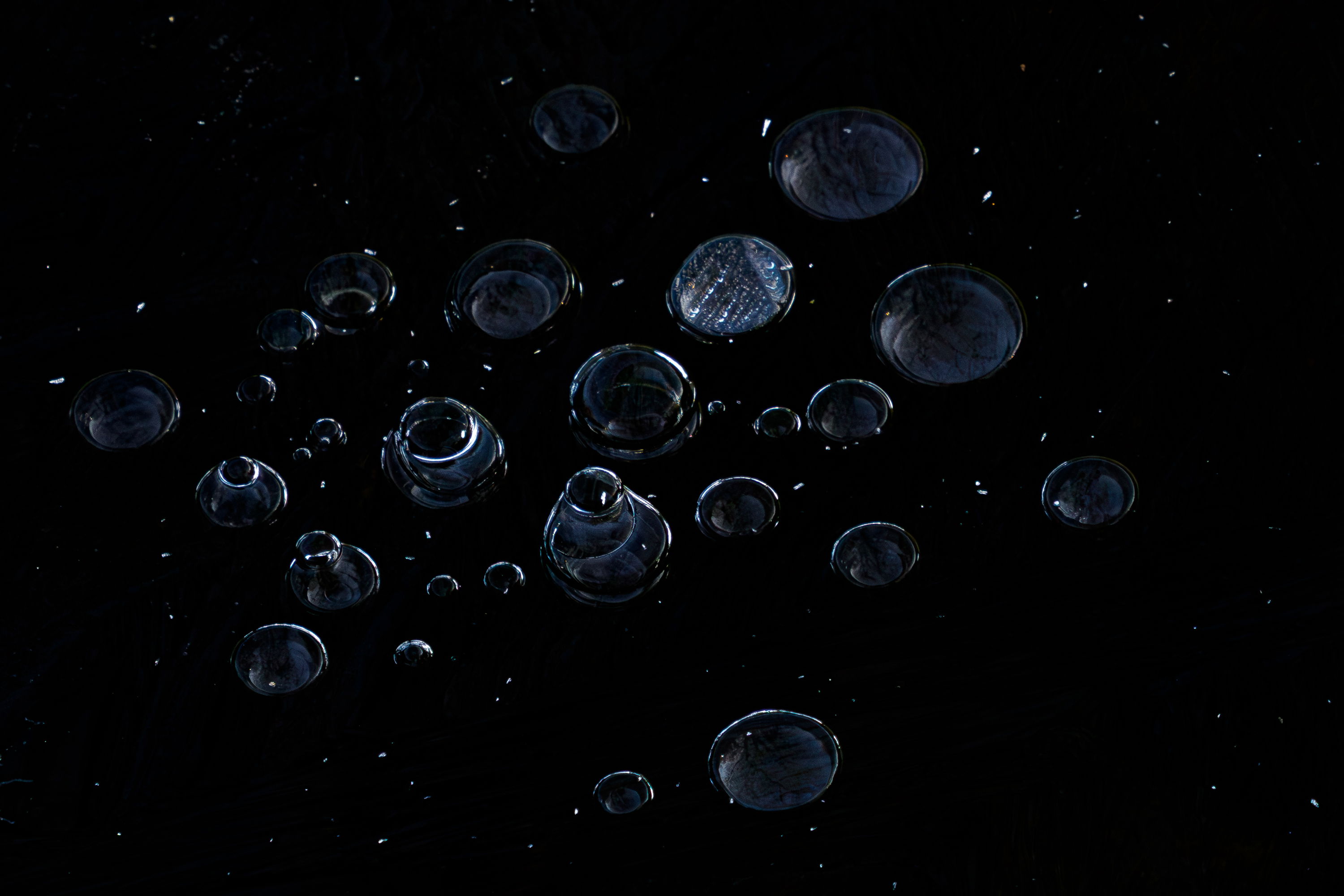
Winter is still not over here, and the lakes are still frozen. Unfortunately, I wasn’t able to photograph the water bubbles directly from above, but I like them this way too. What do you think? I really love lowkey and higkey pictures Perhaps this one is to dark?
Stephanie, this works as a low key image. I do wonder about two things; 1) removing many or all of the bright little spots scattered around, they catch quite a bit of attention, and 2) I’d like to see more detail in many of the larger bubbles. Some darks dodging inside the bubbles would show that better with minimal change in the overall darkness.
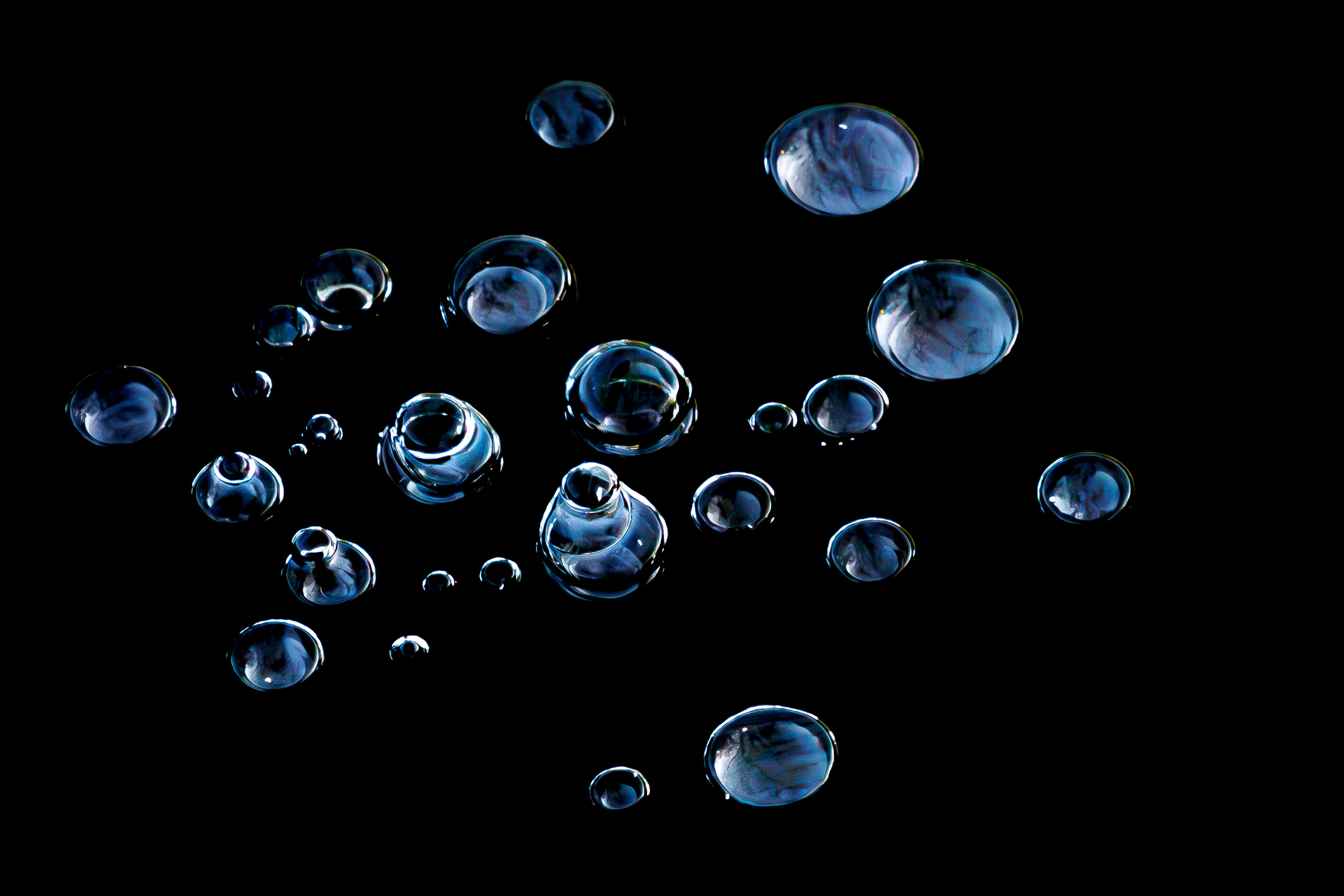
Thanks Mark - I understand what you mean. Normally, I don’t remove existing elements from the image, but I tried it here just this once. The bubbles are now more expressive, so I think you’re right.
You now have two completely different images, Stephanie. I really liked the original and was thinking of the larger bubbles as galaxies and the specks as stars to go with your title, so the specks didn’t bother me at all. However, the result of your edit, though it no longer suits the title in my opinion, is utterly gorgeous and being an abstract, there’s no need for it to resemble anything but what it is. Bringing out the detail in the bubbles also helped change the whole feel of the image. The only things I can suggest are to crop a touch off the right, particularly in the second image to remove a bit of the empty space on that side, and possibly to put a light stroke around the outside of the frame to separated it from the background for those of us who use the dark mode for viewing.
I like @Dennis_Plank 's rework - except that the “bubbles-within-a -bubble” bubble should have stayed, to my eye. You could brighten that particular bubble a bit more and it might be even more interesting. Crop some from the right, agreed. Great with the black BG.
I do like the revision. Removing most of the isolated bright spots was also my initial idea. Now it looks like a group of bubbles floating in empty space. I would perhaps rather add some extra black space on top and on the right to emphasise emptiness and suggest motion.
Stephanie: It’s pretty amazing how you do indeed have two different results from the same capture. I do think I prefer the rework. I’m not sure I would have guessed this was ice so there is a really nice “what is this?” factor going on.
On a separate note, when you repost an image it’s always good to edit your title to indicate a new version has been posted. It’s also better to edit the new image into the original post so that the images show up next to each other instead of further down in the thread. I’ve edited y0ur title but you can do it easily yourself by activating the pencil icon next to the title. I’m thoroughlyenjoying your work. Keep 'em coming. >=))>
Thank you very much for your review. Some points on the site are still unclear to me, such as how to place the edited image below the first one, or where I can view the image gallery of individual photographers. Perhaps you could tell me where I can find information about this. Best regards
Stephanie, yes, the rework has a dramatically different feel. I like how “clean” it feels and how the bubbles stand out. To add a new version to your original post, click on the pencil icon beside the reply button. You’ll see text that starts with “