Aesthetic: Feedback on the overall visual appeal of the image, including its color, lighting, cropping, and composition.
Conceptual: Feedback on the message and story conveyed by the image.
Emotional: Feedback on the emotional impact and artistic value of the image.
Technical: Feedback on the technical aspects of the image, such as exposure, color, focus and reproduction of colors and details, post-processing, and print quality.
Hi Andre,
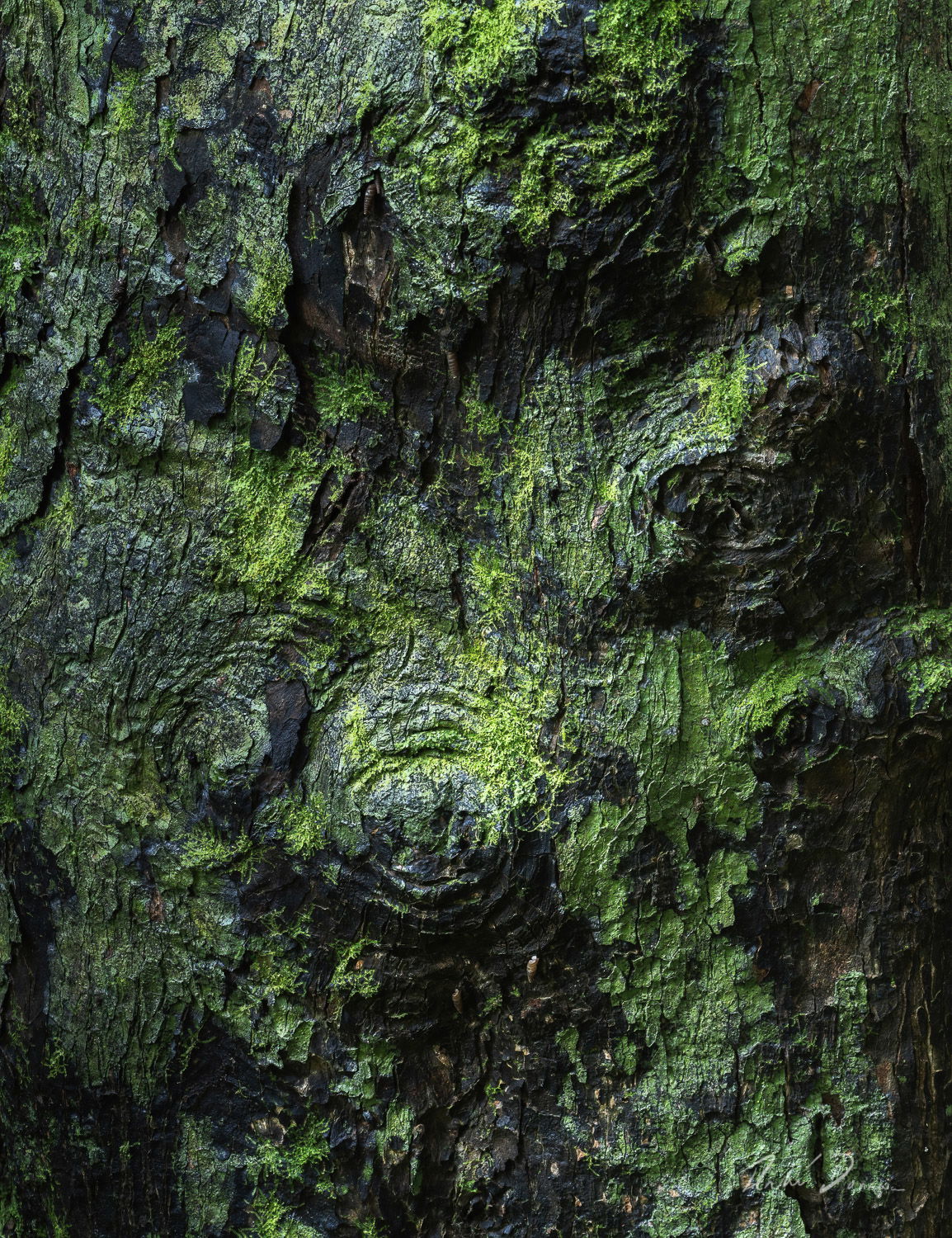
this wet mossy bark looks interesting. There are so many textures and details to explore.
At first glance, I thought the temperature was a bit cool. But I guess this white balance fits well with the wet impression of the scene.
If I had to change something about the image, I might pull back the highlights slightly (Probably a little more at the edges than in the center of the picture).
Great find - fascinating growths on top of an already fascinating tree. Reminds me of just cleaning up after the grandkids and Playdough; the blues and greens smashed together and stuck to table in small, random spots and sizes…
I too was thinking about the bright edge up top - but then after your comment I see better now the directional lighting and it’s making more sense to me. The only thought from me is a slightly tighter crop maybe left and bottom as the moss and knolls are most important in the UR 3/4 of the frame. But that’s just me.
This is great! What’s “Knot” to like?
OK, that was lame.
I can’t help but feel that the effectiveness of the color was made possible in part by the burnt bark, that charred undercoat makes the moss stand out in a rich way.
And could it be that the burn event helped with the growth of the moss?
Of course your skill deserves the most credit!!
I love how the light comes across the knots and moss, it certainly brought a lot of emphasis to the surface shape of the trunk as well as the highlights in the color.
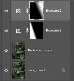
Just a thought, but what about doing a couple of linear gradients on the sides but at a slight angle to sort of give the light a slight diagonal direction across the surface from top left to bottom right as depicted below.
I’m not saying that this should be done, just suggesting that it should be considered.
Either way, it’s a wonderfully pleasing image to explore and just enjoy viewing.
Edit: I meant to ask, do you know what the little spiral cone shaped things are? (shell of something has has already emerged, or something else?) Thanks, Andre!
@Lon_Overacker@Merv Thanks for the comments. I included knolls in the name because it looked a bit like an aerial shot. The shells look like they are some type of snail. I’ve never seen them before. Thanks to everyone for their suggestions. I decided to try a re-edit. I managed to get more colour separation and details with this one. I also used a tighter crop. Knot a problem with the puns Mervin:)
It’s awfully nice to have all the “options” suggested in the feedback isn’t it?
(I’m stuck on the words Awfully and Awesome after reading your comments to Matt ).
Glad you don’t mind my lame puns…
I like the crop you chose, it brings out the details more and you’re right, it does have an aerial look to it.
Nicely done, Sir Andre! (That has a nice ring to it, it rolls off the tongue rather smooth!)
Hi Andre, love the greens and blue shadows in your image. I really like your edited version. The lighting helps focus my in the center of the frame. Yes this one does remind me of an aerial image from Iceland. Awesome work!
Andre, I’m thoroughly enjoying the tree’s “face”, even as it’s somewhat distorted… The greens are nicely relaxing and the mix of light and dark works very well.