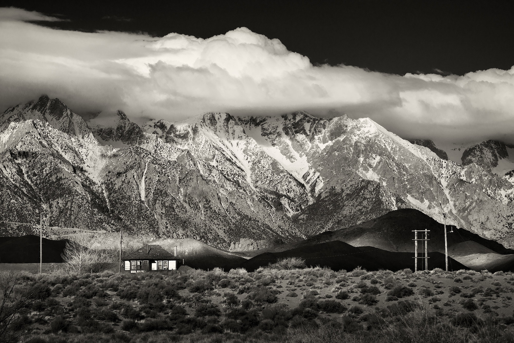
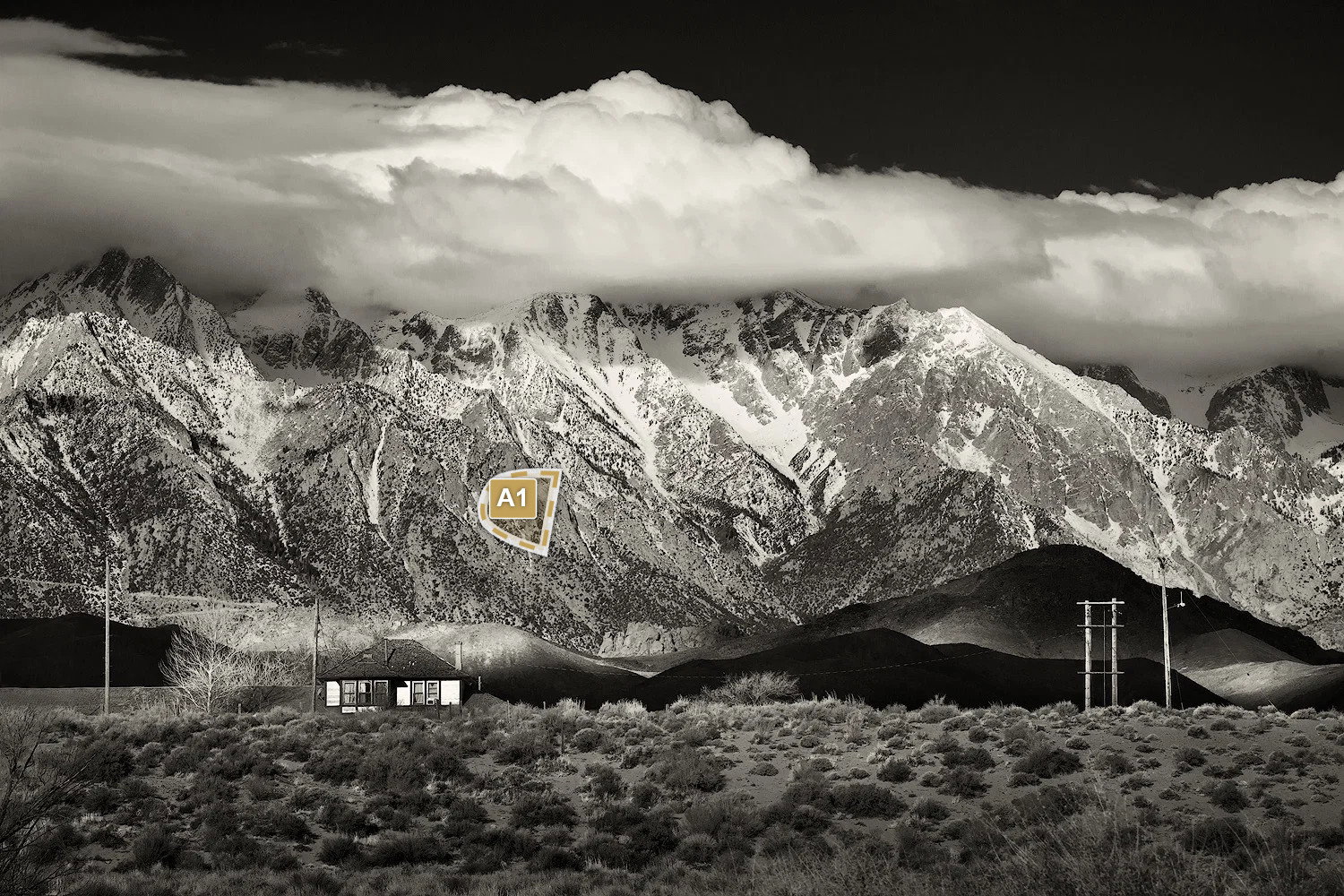
What changed: Lightened the dark shadow Dennis P. pointed out, plus another one towards the upper right. While I was at it, I dodged the clouds coming in from the left as they looked a bit too flat and gray.
The photographer is looking for thoughtful feedback on the image as a whole, especially around the areas noted below.
Feedback Focus: Artistic / Expressive
About This Image
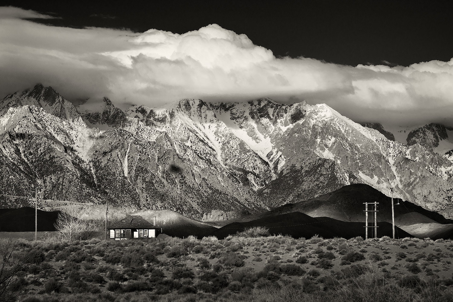
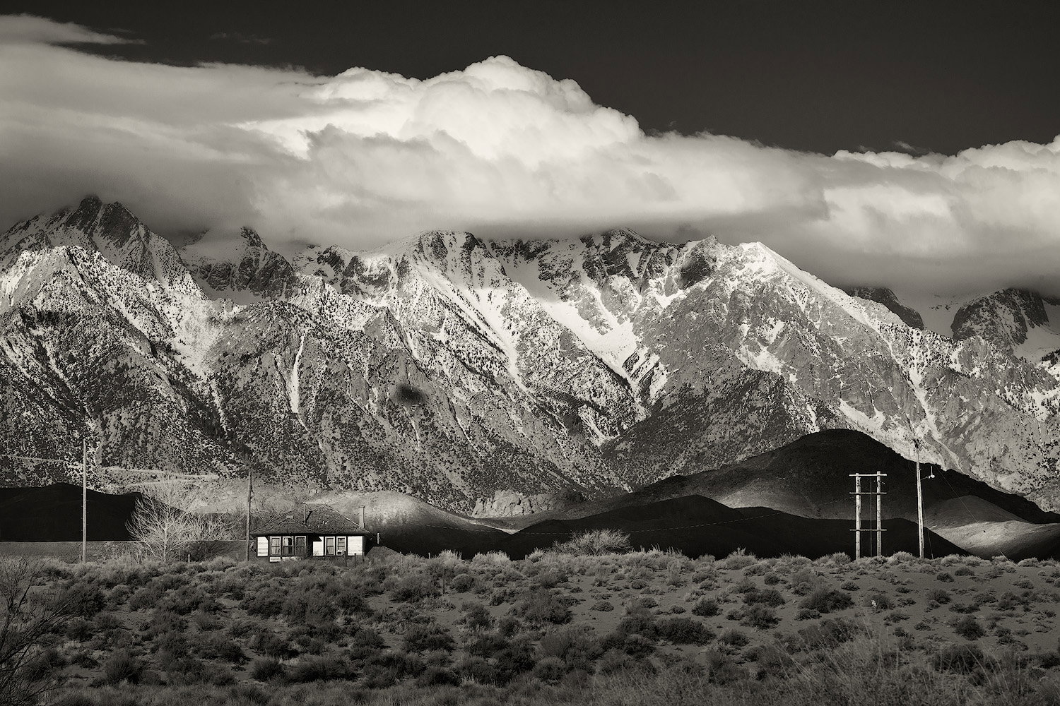
This is from a trip along the east side of the Sierra Nevada a few years ago. We were poking around along the Owens River near Lone Pine in the (sort of) early morning. The clouds were cooperating to give some lovely shadows on the mountains and drama in the sky. The juxtaposition of the man-made against the huge mountains and natural drama really caught my eye.
Feedback Requested
I was looking to show the smallness of the man-made structures against the immensity of the mountains. Any comments welcome.
Hi Bonnie
Great spot and nice composition.
The building is a nice focus point and the cloud layer is a nice feature.
What would master Ansel Adams have made of it ? As is - you have a great memory of what you saw, but you could (if you want) be very creative with dodging and burning to make a masterpiece.
If you look at the original print of Moonrise over Hernandez it bears little resemblance to the final Ansel masterpiece.
I would think about burning in some of the darker areas of the mountains, and make the cloud shadows on the same area more prominent. The contrast on the foothills is fantastic with nice dark areas and specks of light.
[PS help if needed - otherwise ignore] I Find the easiest way to gently dodge and burn large areas is to create an empty layer above the original in PS, fill it with 50% grey from the edit menu, and set blend mode to overlay . Then zoomed in, with a standard soft brush set to black or white , opacity 8%, flow 15% just darken or lighten the areas by painting on the grey layer in black or white - Non destructively. [/ PS help ]
This great picture has potential to be magnificent - worth an extended play in post processing.
It is crying out to be printed on high contrast baryta paper
It’s marvelous BnW with great composition and tonality. I like it all very much and what attracts my eyes the most are the man-made structures: you’ve shown their smallness and at the same time made them the key elements, the light on them is wonderful.
Just one minor thing is the dark bush in lower left corner. Removing it is probably impossible, cropping off could change the composition too much, so I’m not sure if it’s worth dealing with.
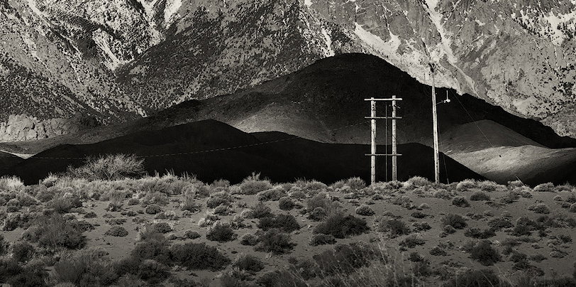
The white dot below the pillars on the right is a bit distracting to me.
This oozes AA “Winter sunrise, Sierra Nevada from Lone Pine” - at least to me! In fact, I’m wondering if the “foothill” at midground on the right isn’t the same hill as in Ansel’s image.
But this of course is your version and this is awesome. I can see where Huw is going with his comments, but I think this is pretty darn awesome as presented! I think he’s right when he wrote:
And so I couldn’t help myself. I made some tweaks. First and honestly this was my biggest nitpick… the roof of the station building mostly blends in with the background hills. The main thing I wanted to do is darken (or lighten) to help the roof be more prominent or more separated from the bg. As it turned out, I manually selected the roof, darkened in a simple Levels adj, and then thought, heck, let’s dodge the surrounding hills… so I dodged a little here and there… then I dodged and burned the foreground, highlighted some bushes, darkened some, trying to give the illusion of ever-changing light, as was happening in the background. Oh, and then I darkened the blue sky up top. At first I went all AA, but then backed off. This of course is a personal choice and I’m guessing you would have darkened the sky had you wanted to.
The snow dusted mountains are perfect. Great contrast, blacks and whites. And I just love the light and shadow play on the midground hills. The power/telephone lines??? perfect, fit right in.
I’m with Huw. Tweak and polish it… then print and frame this!
I had already done that as much as I wanted. I wanted those low, very dark hills to be the most prominent of the mountains. I was wanting the strip of very dark hills with the station and power poles to be the most prominent feature in the frame. Darkening the bigger mountains lessens that, I think. Thanks for taking the time to have an edit, though!
Yah, I saw that bush and couldn’t deal with it well, so it stayed. 10-4 on the white dot - hadn’t noticed that. Thanks!
I can see that about the roof. It didn’t occur to me, but I gave it a whirl in my rework. I also did your other suggestions. I had a curves layer for the immediate foreground which I adjusted to give that more contrast, then dodged/burned targeted areas. I think I darkened the sky just a tad. Thanks!
I am late to the party, but want to say this is a fabulous image, Bonnie. Your rework is spot-on. It definitely has a feel similar to Ansel’s wonderful image.
I have spent a lot of time in and around Lone Pine and in all my times there, I missed this old station. This appears to be north of town, assuming the road on the mountain on the left side of the image is the Whitney Portal Road. Am I correct?
Nicely done, and it would make an exceptional print.
-P
Wonderfully done, Bonnie. I really like the emphasis on the cloud shadows on the foreground hills and the little sun breaks coming through in spots. I think Igor’s crop gives you a two-fer. I always love a two-fer.
Yes, it’s north of town. I think it was sometimes known as the Owenyo station, or the Jawbone line (I just googled it - it has an interesting history). It’s a private residence now.
I think you succeeded admirably, Bonnie, particularly in your revised version. The only thing that pops out at me as needing change is that small shadow on the mountain above the house. It just wants to look like a dust bunny to me. However, since no one else commented on it, maybe it’s just me.
There have been some superb critiques in this thread. It’s always good when an image elicits this kind of response.
Visual Notes for Revision 1
[A1] To my eye this looks more like a huge dust bunny than a shadow
Hi Huw. I don’t know if you’re familiar with him, but there’s a guy named Tony Kuyper that makes plug-in panels for PS that are very handy. He started out with macros for luminosity mask creation, but his present plugins do amazing things including one button to create the 50% mask and select either the white or black brush. You might want to check out his stuff.
I’m late again and that always saves a lot of typing… This is an absolutely classic B/W!! I love the revision, and thanks to @Dennis_Plank, now that he’s pointed it out I can’t unsee the dust bunny. I’d bet the old-fashioned Spot Removal tool would fix it nicely, but the newer alternatives are also worth a try.
The 50% dodge-burn thing is limited to a simple lightening or darkening. I prefer to go into quick mask mode and use a “black” brush to paint an area, then go out of QM to have a selection and make a Curves layer and tweak with full control of tonalities. Then the mask can be tweaked if needed.
Masking is definitely the way to go when lightening/ darkening “circumscript” objects to stop the alterations bleeding onto the background or foreground. I’m reasonable at masks but I’m forever trying to remove dark or light edges (says most about my mask creation). The “feather” feature is good, as well as edge detection or edge shift of the masks.
That said, a soft white/black brush on a “50% grey” overlay layer with low opacity and flow is a really gentle way to dodge and burn if you are not worried about spilling onto areas you want to protect from changes.
I have bought affinity but I’m still old school Ps - and I. find it really difficult to change.
The great thing about this group is that we share and develop processing skills - so everyone can develop a tool and skillset that allows us to approach a problem in many different ways, often trying more than one method to see which works best. Since I’ve joined my “toolkit” is definitely increasing
I’m not a fan of dodge/burn tool in PS - even if you specifically only want to alter highlight/midtones/shadows as it seems to produce unwanted grey areas
It’s amazing what we don’t see when we’ve been looking at something for a long time. I hadn’t even noticed that, but now that you point it out I can’t unsee it. Another revision needed!
Yes, this really works a trick, especially if processing has caused halos. I find that happens at the tops of mountains against a clear sky and the clone tool, set to about 20% and lighten/darken as applicable really takes care of that.