Please share your immediate response to the image before reading the photographer’s intent (obscured text below) or other comments. The photographer seeks a genuinely unbiased first impression.
Questions to guide your feedback
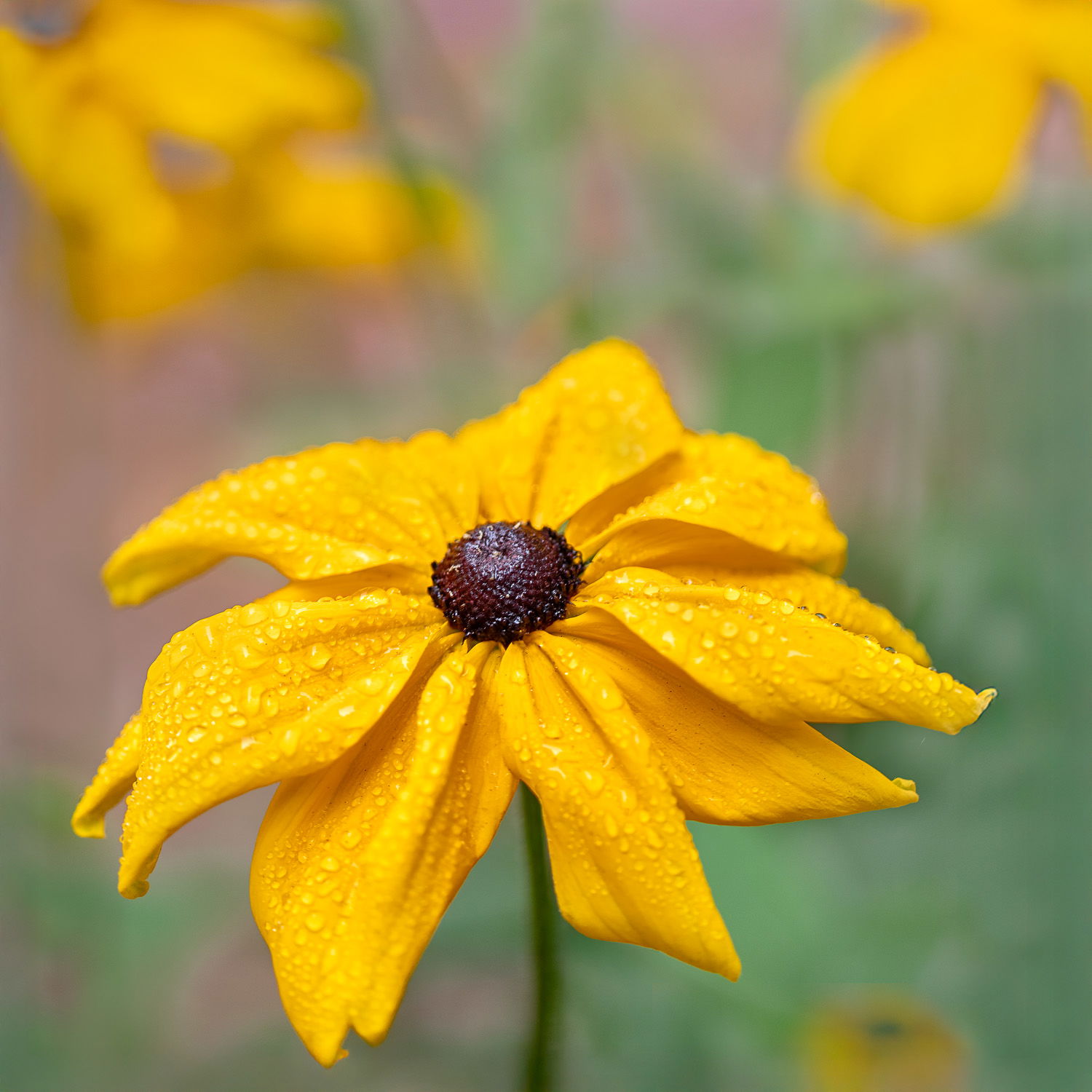
Initial response. Can you tell it is foggy?
Other Information
Please leave your feedback before viewing the blurred information below, once you have replied, click to reveal the text and see if your assessment aligns with the photographer. Remember, this if for their benefit to learn what your unbiased reaction is.
Image Description
From our garden in San Francisco, early morning dew, foggy (as always in August). Taken today, Saturday Aug 16
Technical Details
Canon D5 IV, Canon 100 mm macro lens, hand held, f 2.8, 1/500 sec, focus distance 698 mm?
Specific Feedback
Is the background too distracting from the partly in focus central flower? Should the background yello be desaturated a bit? Any other editing suggestions?
Critique Template
Use of the template is optional, but it can help spark ideas.
This is a very nice look at a very pretty flower. I like the dew drops on the petals and the fall off of sharpness at the back of the flower works well. I also really like the OOF background. I can’t really tell if it’s foggy or not though.
Just read your comments. I think the background works nicely but agree that a little desaturation of the yellows would bring my eye back to the main flower.
Lovely! I thought it was from a recent rain, but fog does make sense. Even up the coast but inland a bit, we’ve had some gorgeous foggy mornings this summer. Would be interesting to compare a bit of desaturation on the BG leaves, or a bit of crop from the top. For my taste, I only need a hint of them because I want my eye to stay on the subject, which is so gorgeous! If you crop, you could keep the aspect ratio by adding a bit to the bottom.
It is an interesting crop to include the yellows at the top. The lighting reminds me of fog which acts like a giant diffuser. Water drops are nice and add to the fog. The saturation of the yellows appears OK to me on my monitors…Jim
Tony: We had some of these in our gardens in the past and I really enjoyed shooting them. This is a great capture of the main subject and the dew/fog drops are a big plus. The bright yellows in the corners don’t work for me. Toned down significantly I think they would be OK but because of their brightness and placement in the frame they pull my eyes away from the main bloom. Instead of this square crop I would make this more landscape and crop from the top to make most of the OOF yellow go away and then tone down what was left. Just my humble 2 cents. >=))>
Hi Tony,
I love the clear clean rain drops on the yellow flower and I love the blurred out yellow flowers in the background that echo the primary flower. Here’s a nitpick if there ever was one! Is there more stem you could show that might add depth the overall photograph? Just a question, but a fantastic photograph nevertheless!
I don’t particularly get a sense of fog in this image, Tony, but I don’t think that’s essential. The composition with the subject so low in the frame and the background flowers so intense tends to pull my eye away from the subject. As others have mentioned, a crop from the top and some modifications on the yellows, particularly in the upper right bloom would keep the viewer’s eye focused more on the subject. The fog drops are wonderful and deserve full attention.