The photographer is looking for thoughtful feedback on the image as a whole, especially around the areas noted below.
Feedback Focus: Artistic + Technical
About This Image
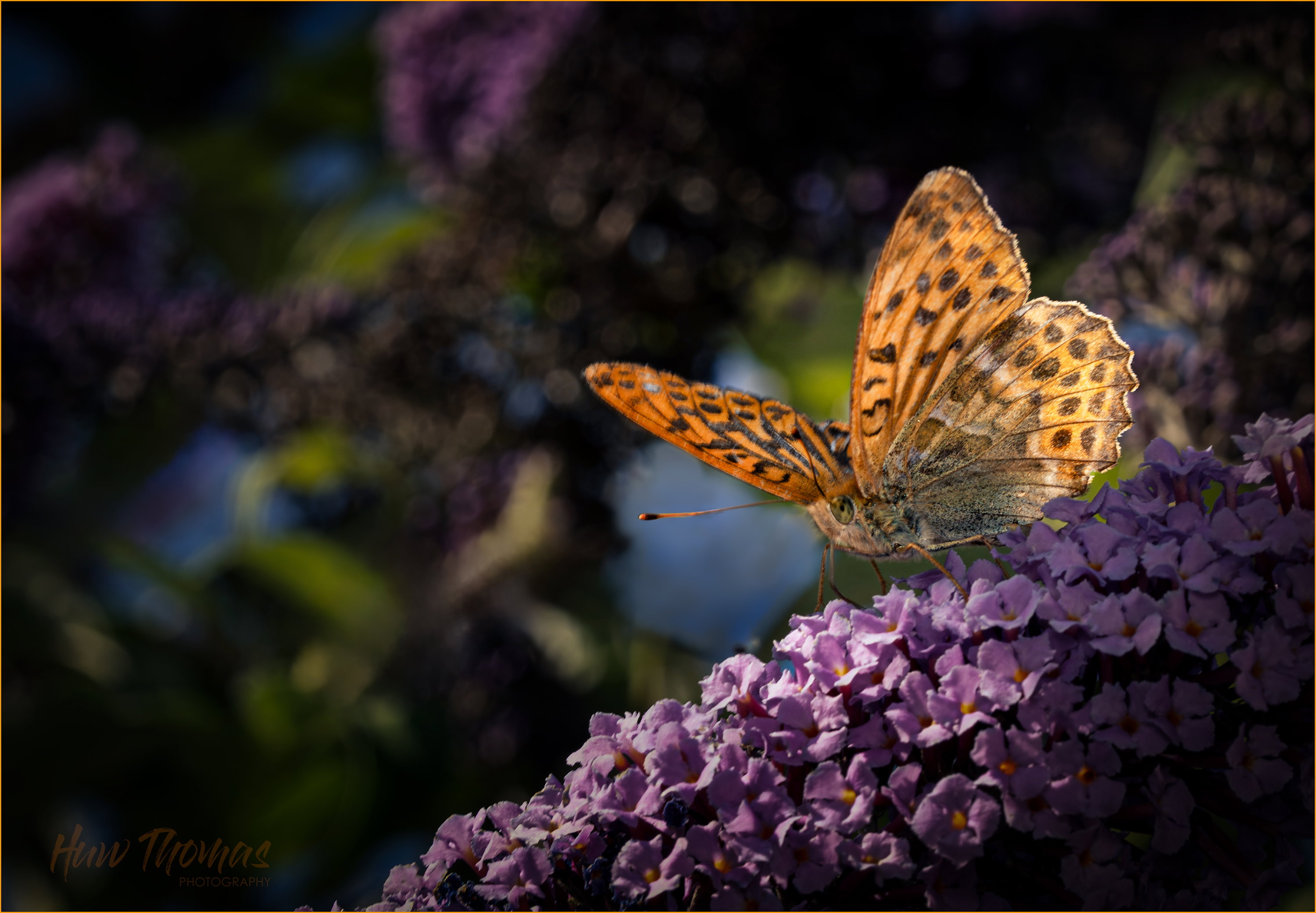
Difficult one today in the garden - never seen this beautiful butterfly before but its is native to this area.
Really strong sunlight, gorgeous but very strong colours and bright day. Had to expose for the highlights and really work the shadows to produce image 1, Tried to darken the surroundings but they’ve gone rather dark to nicely emphasise the colours of the main subject.
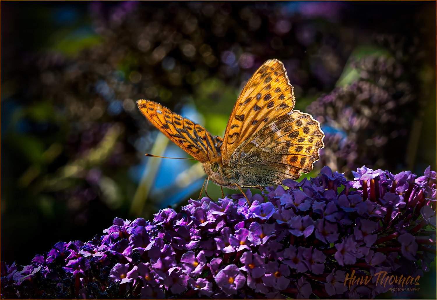
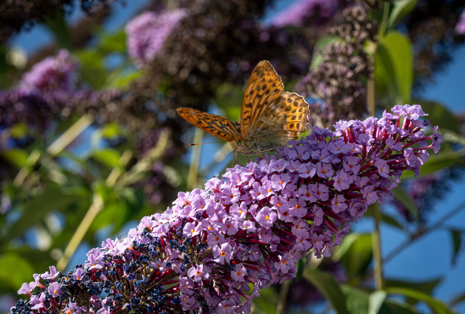
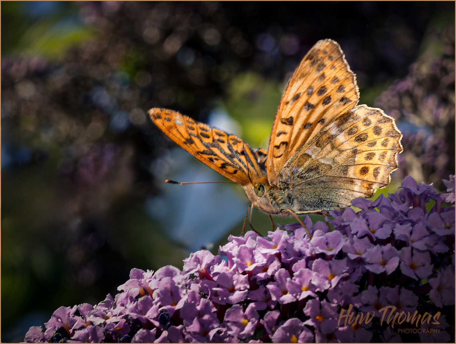
Then went back and tried again with different crop for a lighter feel
Feedback Requested
Can’t really decide which way to go with this one.
Suggestions appreciated.
I think the first option is bit heavily and clumsily processed - I can have another go
Or take the less processed version 2 and see where you go…
Technical Details
Camera: SONY ILCE-7M4
Lens: FE 90mm F2.8 Macro G OSS
Focal length: 90mm
Shutter speed: 1/250s
Aperture: f/13
ISO: 400
Flash: Fired (although too far to make any contribution)
I think you’ve done a good job with the second image. It’s a lot less busy than the first one. I’m not a butterfly photographer, but I do birds and there’s some similarities.
It’s really hard to balance this one because of the shape of the flowers, but if you have a way of doing it, I prefer a little less centralization of the main subject.
There are two elements in the image which I find a little distracting. Those are the two strips over the light blue area above the flower and to the left of the butterfly wing. If there is a way to defocus these, it would help. I know that would be kind of difficult, but maybe it’s possible if your Photoshop skills are up to it.
I like your crop on the top image, removing the spent flowers is important. Maybe desaturate the purples and lighten the background just a tiny bit. I like the way you’ve brightened the butterfly on the top image. Really nice work getting the entire butterfly in focus! I always struggle to get the tips of the antennae in focus with Fritillary Butterflys!
Huw, the repost is a good improvement, showing off the butterfly very well. The bright blue behind it is distracting. If you software allows it, adding a desaturation layer where you dial back the blue saturation and darken the blue could reduce that a lot.
I think the 4 versions are quite difficult to assess.
The two tightly cropped images - in the original the colours are a little over-saturated but the BF stands out a bit more. I don’t mind the more central position. I guess the latest version is an improvement , but the crop may need tweaking?
The two wider crop images, the buddleia flower stalk is a very prominent shape and rather dominates the frame and demotes the butterfly, the later version I slightly prefer - not much to choose between them.
So my favourite is the latest close up, second favourite is the later wide crop.
Difficult this photography business isn’t it?
Really pleased to see this butterfly in my garden though.
If you have different preferences or want to d/l and play, please feel free
I love all the back and forth on this comment string. Your tonality ended up just about where I was thinking in the latest small version, Huw. I’d looked at this yesterday, but ran out of time, before I figured out how I might approach it. The advice you got and your own expertise got you to a good place with the tonality of the flowers, butterfly and background. My only thought was to clean up some of the bright distractions in the background. I played with using the latest healing brush iteration in PS and managed to get the ones that caught my eye, though at the sacrifice of a few hairs on the edge of the butterfly in one place.
Huw: This is quite the rollicking exercise and this latest iteration does seem like the best result. We have lots of gulf fritillaries in our garden and will get the occasional other species. The butterfly bush is so named for a reason and this pristine perch with its detail and color are the perfect complement to the BF. Lots of effort here but an image clearly worth it. Nicely done. >=))>