Critique Style Requested: Standard
The photographer is looking for generalized feedback about the aesthetic and technical qualities of their image.
Description
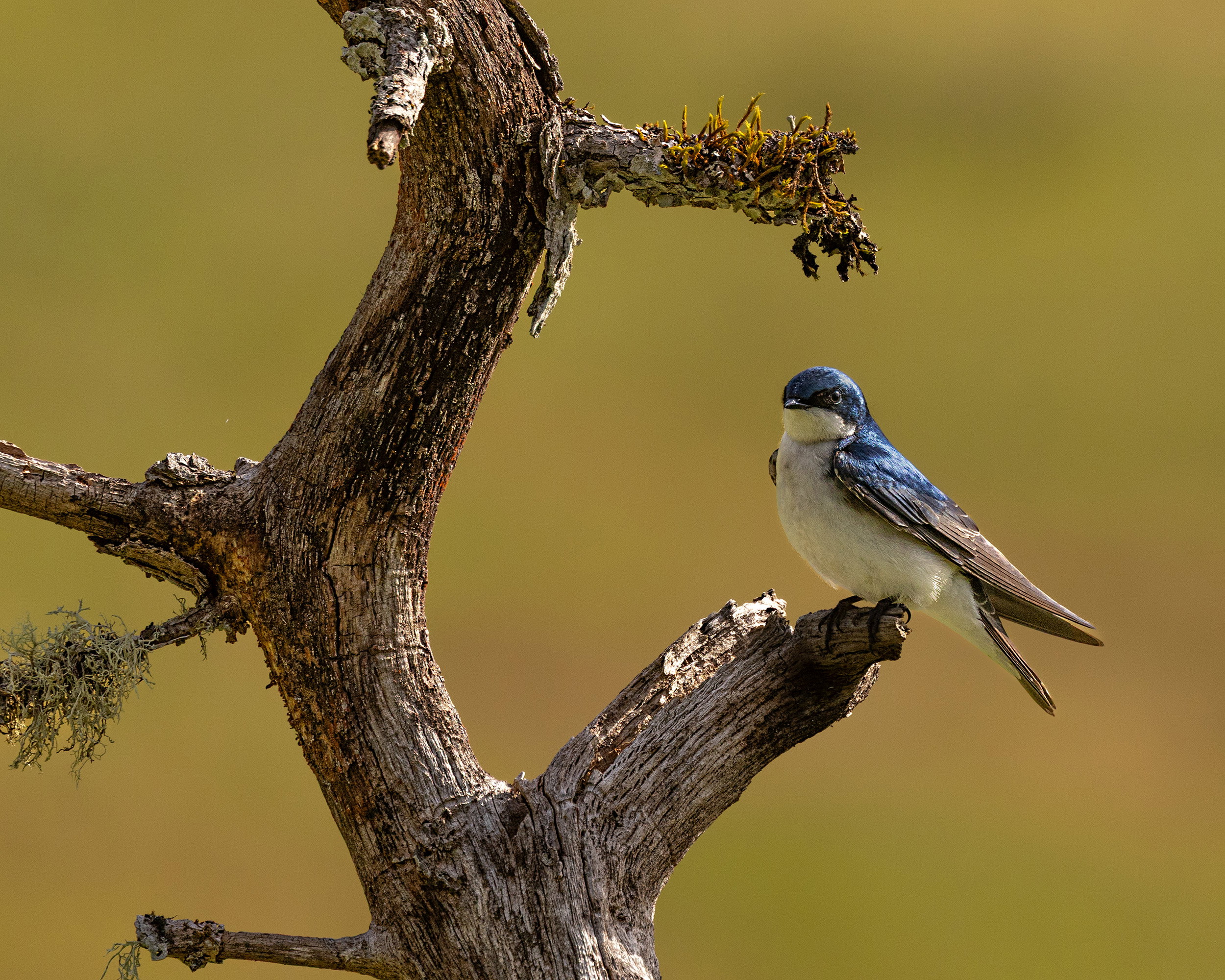
I’ve been keeping an eye on this dead tree for the last 3-4 months hoping a bird would land on it and finally this tree swallow cooperated. I also like the background, a grassy slope at least a hundred yards away.
Specific Feedback
Any thoughts appreciated. I debated whether to remove the lichen twig on the left.
Technical Details
Canon R5; 100-500 at 500 mm; 1/1000 at f7.1,-1/3 EV; ISO 400
I can see why you’ve been keeping an eye on this-the perch is awesome and the swallow is a nice little accent, Allen
1 Like
Great tree for a perch - very curvaceous. I’m fine with the lichen branch on the left - adds more interest for me. Nice pose from the swallow. Might want to consider cloning over the bright spot on the branch right in front of the bird. Looks blown out to me. Really great background as you mention.
1 Like
Allen: the creamy background serves to bring one’s eye to the beautiful little bird on its perch.
Quite a wonderful perch and a lovely Swallow! The branch itself feels crowded by the frame – I’d love to see more canvas on the left, top and bottom. The BG is a lovely color but it feels a little too saturated. Maybe taming contrast overall would mitigate the bright light a bit? This looks like a great place to hang out – maybe with a pocket full of bird seed.
1 Like
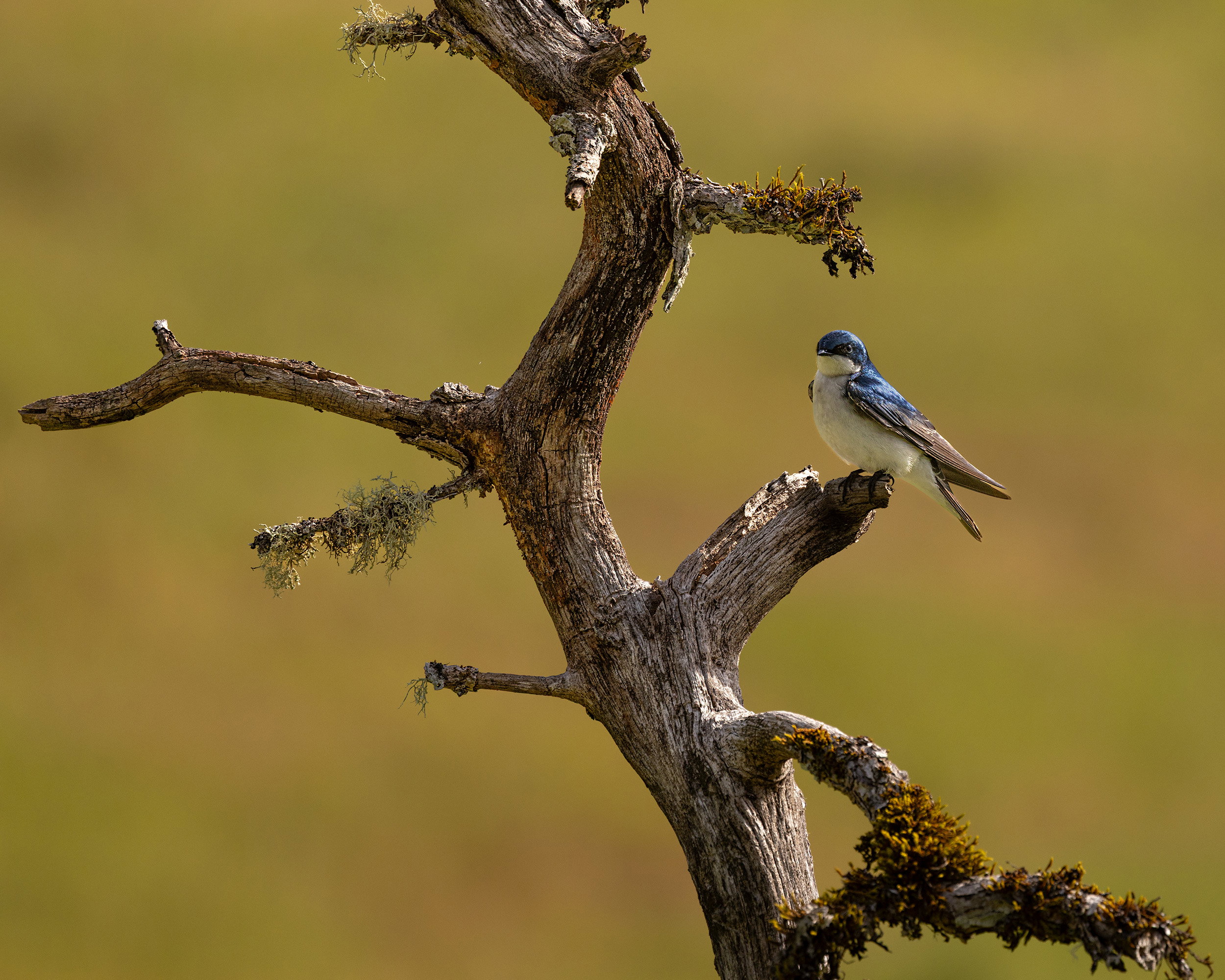
Hi Diane, thanks for your comments. Here’s a version with more of the tree and a smaller swallow. I guess the background is a matter of taste and for me, it’s okay as is and actually it is straight out of camera, I didn’t do any adjustments to the background (though you never know what LR is doing behind the scene).
I love the larger amount of tree, even at the expense of the smaller bird. (After all, Swallows are pretty small!  ) For me, simple borders keep the eye on the subject, or direct it there. Keeping with that I could see taking a little off the top to remove the branch stub pointing to the left there, and enough from the bottom to remove there the last branch branches (as it were…)
You are quite right about LR (and all raw converters) doing a lot behind the scenes. That’s necessary with raw files – the idea of what the camera saw being accurate to the scene is just not the way raw files work. The choice of a Profile is right at the top of the Develop module because it makes important initial decisions about colors and contrast.. Scanning through them is always interesting, and all are intended to just be starting points. A linear profile is the most neutral starting point but is more difficult to work with and needs to be specific to each sensor so it’s not included in the list – it has to be added manually. And then different monitors can be very different too, in color balance and contrast, and are affected by room lighting. And then there is our color perception – it’s a miracle this stuff works as well as it does!
1 Like
Thanks, Diane. I never think about changing profiles, but of course, that’s where these changes at the start are taking place. I went back to the raw file and tried different profiles. My default (apparently) is Adobe Color, but Adobe Standard probably gave the background color you were looking for. I know from reading many of your comments that you like the linear profile. How does one go about obtaining that, if it has to be done manually. Thank you.
Hi Allen. Just in case Diane doesn’t see this right away, linear profiles are free on Tony Kuyper’s website.
1 Like
Excellent, @Dennis_Plank-- I was just about to post that link! I don’t use them for everything but in many cases they are the best way to deal with blown highlights. And playing with them does give a good feel for how flexible raw files are.
1 Like
HI Allen
The Tree Swallow is nicely framed by the tree. The lighting on the Swallow helps to bring out its coloring. Nice work.
Peter
1 Like
Great little bird on a wonderful perch.
Some good comments here. I sometimes get stuck in a rut and just use the same profile for every image. Up until recently, (nudged by @Diane_Miller ) I started checking the different profiles again. I find Adobe “standard” to be less obtrusive than Adobe Colour. It seems to tame highlights well. I also use the free Linear Profiles from Tony Kuyper as a starting point.
I also like @Diane_Miller 's “border patrol” idea.
1 Like