Widow's Thrill + Cooler White Balance Version


Or…should I change the white balance to something more “Traditional” like the version below? (the actual color was very close to the top version but maybe change it anyway?

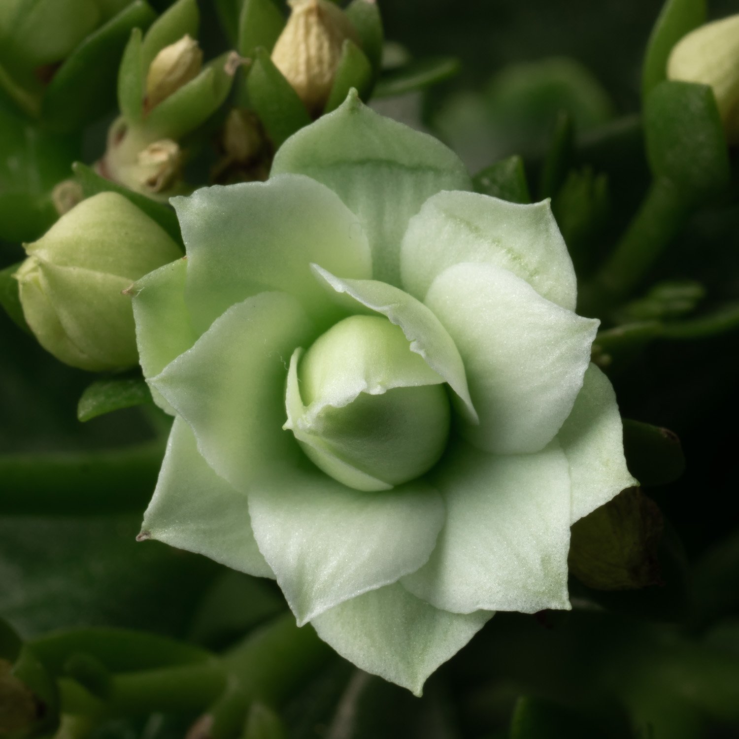
Here’s a shot of the whole flower, a couple of the petals have been creased so it seemed like a reasonable excuse to go for a tighter crop, this wider one was just a test shot.

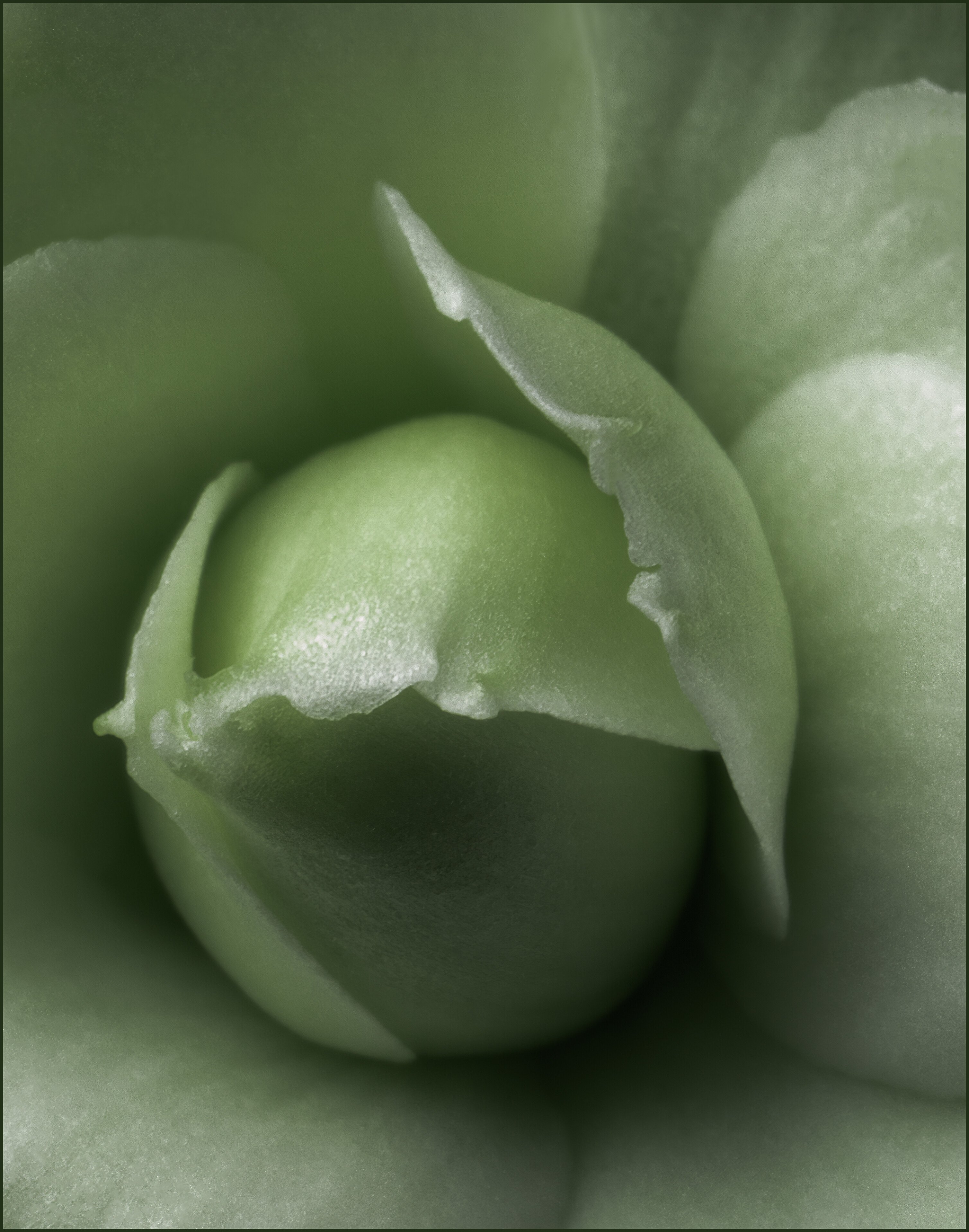
This is a Kalanchoe Succulent flower and it’s pretty small, it’s about 1/2" or 12mm across.
I shot this several times with various magnifications, various lighting and various muslin cloth thicknesses in an attempt to get the exposure as good as I could get it.
My goal was to light it up just enough to show how translucent the petals are but not so bright that the details were blown out.
At the same time I wanted to have good focus all the way through so I took two images and stacked them manually, and while the focus was good on all of it with the stack, it lost that soft focus effect, I chose the single shot with soft focus beginning at about 1/3rd the depth.
When viewed large you can see the details in the petals and how the petals look moist on the inside, they look like they would spurt liquid if they were mashed between your fingers, I did that with a petal from another flower that I wanted to cut off and liquid did drain out of it.
Also when viewed large you can see the seed pod through the petal (the dark area).
I had to tone down the green color from the original because it was too green in my opinion.
With a lot more light than this, the petals appear almost solid white with a tinge of green deep in the flower but you can’t see through the petals with that much light.

Sorry for such a long description.

Specific Feedback Requested

I’m planning to print this one but I’d like some feedback on the overall appearance, the color, details, soft focus, etc.
Note: The top 1/3rd of the flower is in sharp focus but the nature of the petals make it appear a little soft looking.

Technical Details

A7R IV, 90mm Macro, f16, 1/250s, ISO 64, 1:1 magnification, Remote flash at 50%, Flash diffuser with 1 layer of medium weight muslin added, Cropped to 50% or 2:1 magnification (and additional crop for composition). Lr for tonal adjustments and minor spot removal (mostly tiny hot spots), Ps for thin frame and saving.

Thanks for looking :slight_smile:

Happy New Year, Everyone!

2 Likes

Merv, I like your presentation here. Not being familiar at all with the plant, I probably can’t help with the color. I like the shade of green, and the details looks pretty good after reading your description. The lighting and shadows look nice and I think this would make a nice print. Happy New Year!

1 Like

I agree with @Shirley_Freeman on the framing. @Merv , I really like the top one because it shows more detail and depth for me. Great shot

3 Likes

Merv, I vote for the top version.

1 Like

Hi Dean and @Shirley_Freeman,

Thanks for the response, the feedback and the vote.
Note: I added a test shot at the top showing the whole flower, if you’re interested in seeing what it looks like.
This was just something different. This time of year isn’t good for much of anything in the flower category.
This succulent plant was the best looking one of the bunch, it was a little dried out at first but I’ve managed to revive it some.
I enjoy having cactus and succulents around in the winter, mostly because they’re hard to kill :smiley:

My wife is the one with the green thumb, her flowers and plants are always gorgeous during the spring and summer.

I printed this small and on Epson medium stock matte photo paper, the matte finish made it look pretty good.

I think what I like most about this is the two curved lines from the petals in the LRC, they provide a nice lead in to the shadowed area under the center of the flower.
I agree that the green version shows more depth and detail.

Anyway, something different and off the beaten path :slight_smile:

Thank you both!! :slight_smile:

Merv, thank you for sharing the full view as it gives perspective. I think your tight crop was a good idea. I too do not have a green thumb! Grew up and worked around farming till I was in my early 20’s so you would think I would be very much green thumbed.

1 Like

I’m way behind here, trying to catch up, but I have to stop on this one and say how much I love it!! The crop is perfect for the delicate shapes, as is the DOF! I prefer the color on the first version but with an image like this I think you could do anything you want with the colors and have it be amazing.

I love succulents, for their patience with me. I could kill a plastic fern.

1 Like

Hi Merv. Like Diane I am a bit late and trying to catch up with NPN after being out of action for a while. I really like the original of this one with lovely gradations of tone, colour saturation and especially of focus. I think you have done a very good job of all three of those aspects and your crop here. Cheers

1 Like

Thank you @Shirley_Freeman, @Diane_Miller & @Phil_G, I really appreciate the words of encouragement and inspiration.

Side note: As a reminder to thank you, I left a tab open just for that purpose but somehow I missed my own reminder, I’m calling it a senior moment. :slight_smile:

Thank you!!

1 Like