The photographer is looking for generalized feedback about the aesthetic and technical qualities of their image.
Description
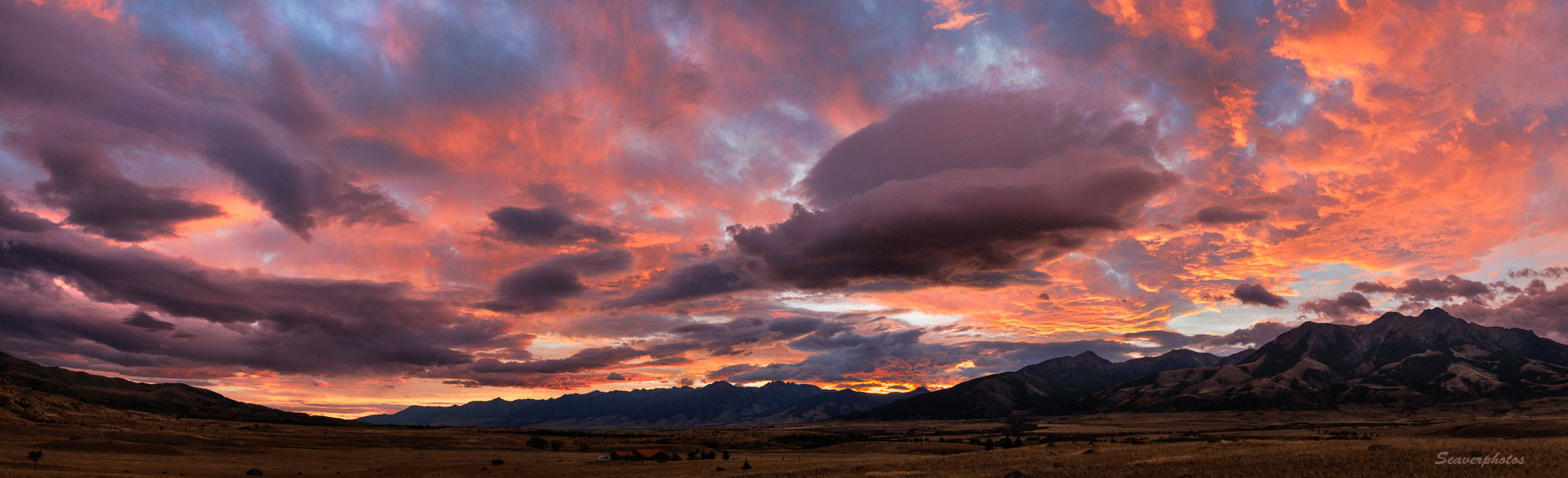
Sunrise yesterday was amazing, with clouds at all levels, but high enough to let the sun light them from below. This 4 shot pano is an attempt to get all of the levels and colors into one photo.
Specific Feedback
Since overall it’s fairly dark, I do wonder how it would look as a print, but lightening it washes out the colors as it improves the visibility of the darker land and low clouds.
Technical Details
R5, 24-105 @ 35, 1/30 s, f/8, iso 800 tripod
Critique Template
Use of the template is optional, but it can help spark ideas.
Vision and Purpose:
Conceptual:
Emotional Impact and Mood:
Composition:
Balance and Visual Weight:
Depth and Dimension:
Color:
Lighting:
Processing:
Technical:
It shouldn’t be too difficult to mask the sky and then tweak the foreground tonality. The mountains appear to have some detail that could be pulled up. The immediate foreground would be easier to bring up.
It’s a nice image and certainly worthy of further tweaking and a print.
Mark, I think the word “Stunning” sky works here on this one for sure. @Preston_Birdwell is correct on masking the sky and pick up the landmass is a fun post processing idea. If not masking alone a bit of ND filters in NIK is another maneuver too.
A truly amazing sky…
Hi Mark,
This had to be stunning to witness first hand as that wonderful sky put on that beautiful display of color. For my tastes I would leave the sky as is and try lightening the landscape and mountains just a touch. I think with a little tweaking this would make a gorgeous print. I am particularly liking that one cloud in the center of the frame.
Big Sky country indeed!! Wonderful colors! I think you could tweak the FG just a bit lighter, but it’s obviously pre-sunrise and the darker land isn’t a big issue. Excellent capture!
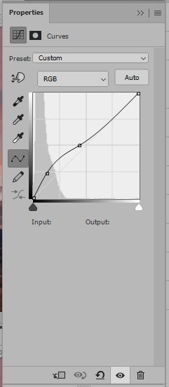
I agree that especially for a print a somewhat brighter land would be good. Thus, I “learned” that inverting the sky masking in LR, gave good latitude in adjusting only the land’s brightness. Then, finding what I thought was the right amount became the challenge. The update is my result, and I may tweak it further…
I rescind my previous comment on the darkness of the FG, there was quite a bit of additional detail there that does make the photo better, and while I think you increased the luminosity the right amount, I do notice a loss in the color. That wonderful pink-orange tint of the light coming off the clouds in the darker FG version is no longer there, at least not as much, in the reworked version. If there is a way to bring some of the beautiful color back I think will seal the edits.
Here is what I mean, I selected the land in PS using TK Masks, I added a small bump in a curve adjustment layer set to Lighten, or Lighten Color. It keeps the nice tones while also brightens the FG.