Critique Style Requested: Standard
The photographer is looking for generalized feedback about the aesthetic and technical qualities of their image.
Description
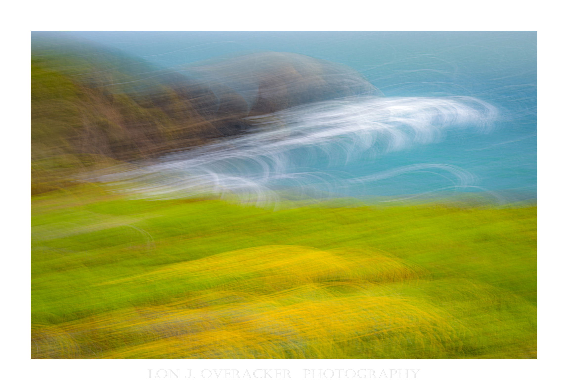
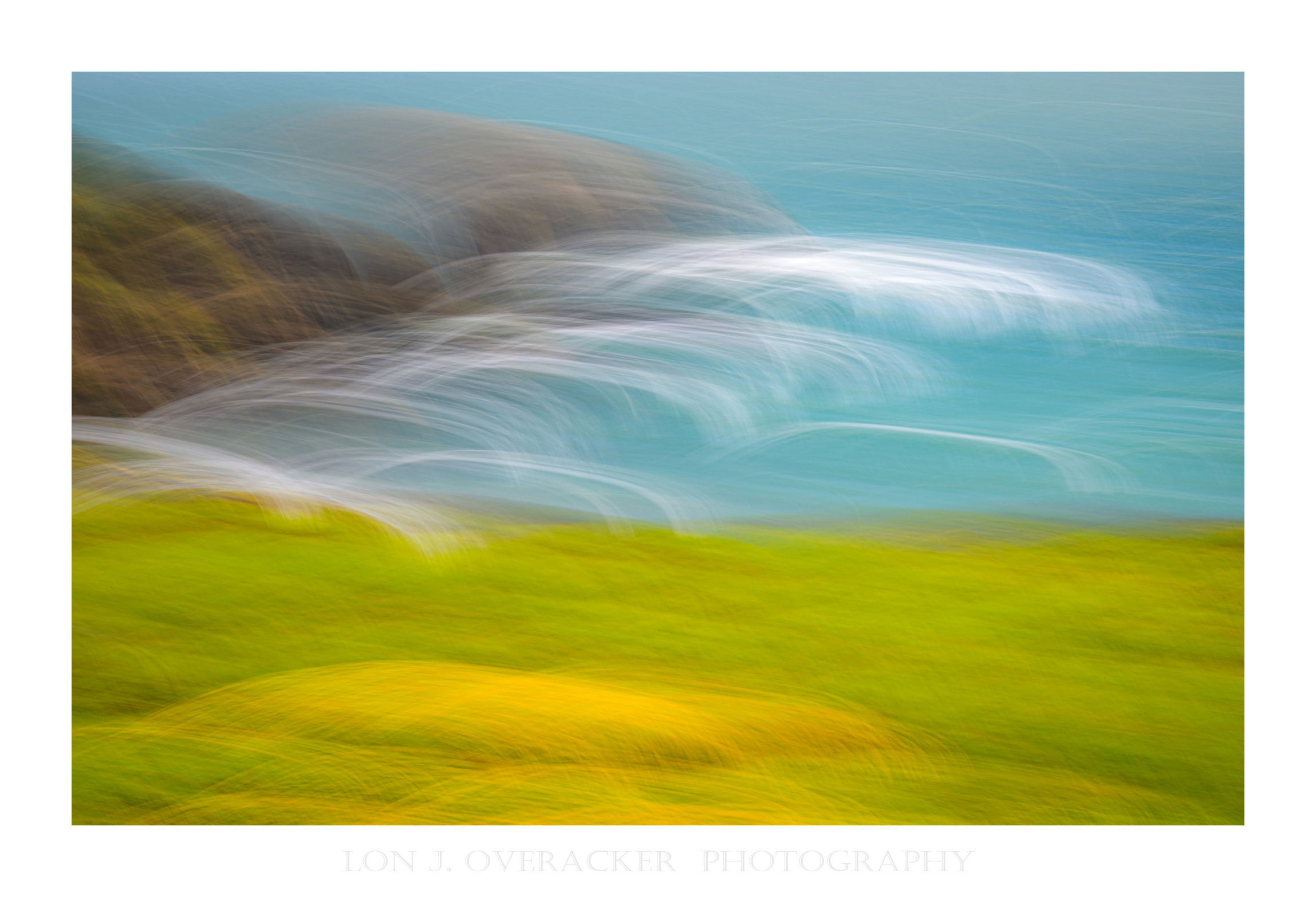
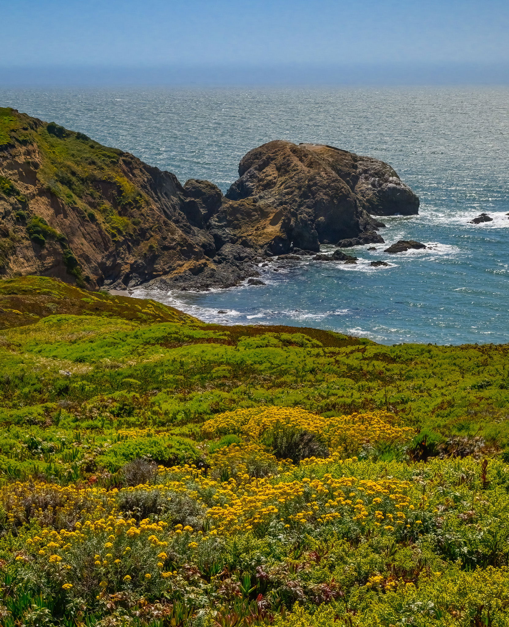
Ok, one more ICM from our NorCal event at the Marin Headlands. After everyone had left, I took a short walk out on the bluff to see what I could find. It was just past here I found the patch of summer wildflowers where I’ve posted several images. This particular scene as the general landscape view off the Pacific Coast just north of the GG Bridge. I was really, really windy and of course midday, bluebird skies… so naturally I tried my best to make lemonade from lemons. The straight landscape image is a 2-image focus stack at a HIGH shutter speed just to see if I could get a good landscape image. meh… But really I’m just posting that for reference of the ICM’s.
I don’t often do ICM’s of the bigger, broader landscape. But after returning to these I thought, hmmm, maybe worth exploring. Not so abstract you can’t tell what the bigger picture is, but enough motion to make it abstract, I guess.
Specific Feedback
Very curious to learn if this works for anyone, at any level?
How are the colors, processing?
Do you prefer one abstract over the other? why?
As always, thank you for your time and comments!
Technical Details
Nikon Z8, Z24-120mm @73mm, f/22 @1/5s, iso 50.
Single ICM frame
Landscape image: 2 image focus stack f/8 1/2500th iso1250 - attempt to freeze the grass/flowers on such a windy afternoon - resorting to high iso and shutter speed just to freeze the flowers.
Critique Template
Use of the template is optional, but it can help spark ideas.
- Vision and Purpose:
- Conceptual:
- Emotional Impact and Mood:
- Composition:
- Balance and Visual Weight:
- Depth and Dimension:
- Color:
- Lighting:
- Processing:
- Technical: