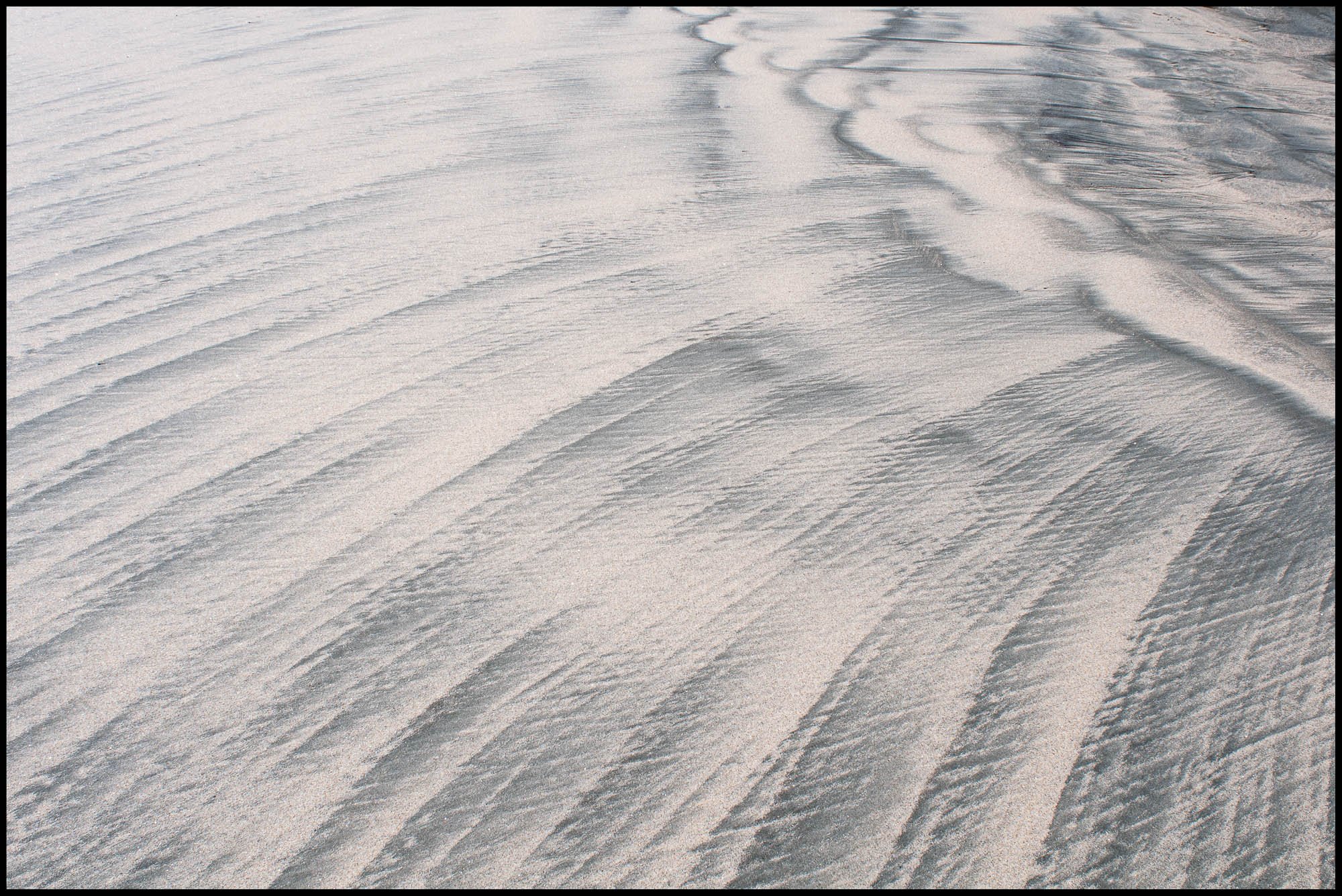
When I came across this sand pattern that remained after a high tide it seemed to me that the tide had left its fingerprint. It occurred in an area of cross currents hence the radial pattern.
Type of Critique Requested
Aesthetic: Feedback on the overall visual appeal of the image, including its color, lighting, cropping, and composition.
Conceptual: Feedback on the message and story conveyed by the image.
Technical: Feedback on the technical aspects of the image, such as exposure, color, focus and reproduction of colors and details, post-processing, and print quality.
Specific Feedback and Self-Critique
Any comments are very welcome. I guess I’m mostly interested to know whether this is of any general appeal or is it just another boring sand pattern? To me it is the story of a tide and the ‘print’ left behind until it returns to finish the design.
Phil, for me this is all about how you photographed the scene, cropped, or rotated the image. Regardless of how, but I really like the perspective of the sand starting in the extreme URC and the overall flaring of the sand from the ULC to the LRC. A very fine abstract scene.
This is fantastic! Agree with Paul - love how you frame this, the proportions, etc.
The fanning out, or the radial extenstion of the lines is wonderful. I love the analogy of a finger print - True because every pattern in the sand is unique and different - a moment in time. The difference though is that it is washed away at the next high tide/wave, so one of a kind like a finger print, but most certainly fleeting.
I tried flipping horizontal. And a great exercise for the discussion of the left to right flow. As presented, I like that the left side is open and all the movement flows towards the upper right. If you flip it, it feels more like the radial lines are flowing out of the UL, spilling out like an alluvial fan of some degree. Very cool.
@Phil_G , having spent many (delightful) hours on beaches looking at patterns, I say “good work!” It ain’t as easy as it seems like it might be. I very much like the orientation of this and the flow captures me. Initially I’d felt like it was too light, wanting more contrast, but I think it really works as is. You could try what @Lon_Overacker suggests and live with both orientations to see which works for you. Is it just “another boring sand pattern?” I’d say not. I’d enjoy having this in a place where I looked at it regularly.
Aesthetic: Feedback on the overall visual appeal of the image, including its color, lighting, cropping, and composition: I like the feel of the way the sand sweeps from left to right, it pulls the viewer up and through the frame. The color contrast between the dark and the light sand is quite nice as well. I suppose for me the only thing that would help is if there was a “hero” of the photo where the sand was leading the eye.
Conceptual: Feedback on the message and story conveyed by the image: I think you have successfully conveyed a very nice tidal footprint here - nothing much more to add!
Technical: Feedback on the technical aspects of the image, such as exposure, color, focus and reproduction of colors and details, post-processing, and print quality: Everything seems nicely in focus and nice and sharp.
Thankyou @Lon_Overacker, @Paul_Breitkreuz, @JohnSnell and @Matt_Payne for your kind comments.
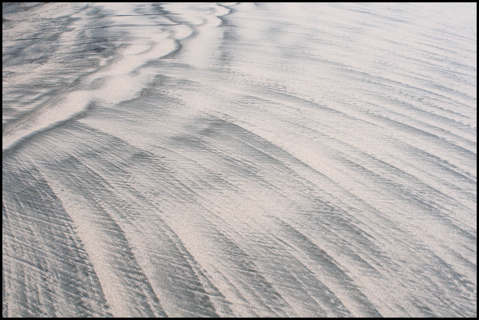
Lon, flipped version below but it just doesn’t seem to hit the spot for me compared with the original. Which do you prefer (just to assist my learning about different presentations)? Must admit, I don’t usually think about doing this.
Agree, just not the same. There is a completely different impression though. When flipped, those lines/patters seem to be “flowing out” from that corner. But also in the vain of “left to right” orientation, that upper corner kinda blocks the flow. I’m sure that makes no sense, but I agree with you, the original just feels better.